

Most static ad example lists are a gallery of screenshots someone liked. This one only shows static ads that brands have kept paying for.
Every ad below is a single image that was still running on November 1, 2026, and every one has been live for at least 524 days. The median is 624 days. Brands turn off ads that don't earn their spend, usually within weeks, so a static that survives for well over a year is one of the clearest public signals of a winner you can get.
For each of the 25 you get the creative, how long it has run, where it ranks in the brand's own account, how many ads use it, what's on the image, why it works and one thing to steal. The data comes from Adspo, and every card links to the full record.
Product-first statics: the product and its proof points
The most common long-running static is the simplest: the product, big, with two to four short proof points around it. 15 of the 25 ads in this post are tagged as product shots.
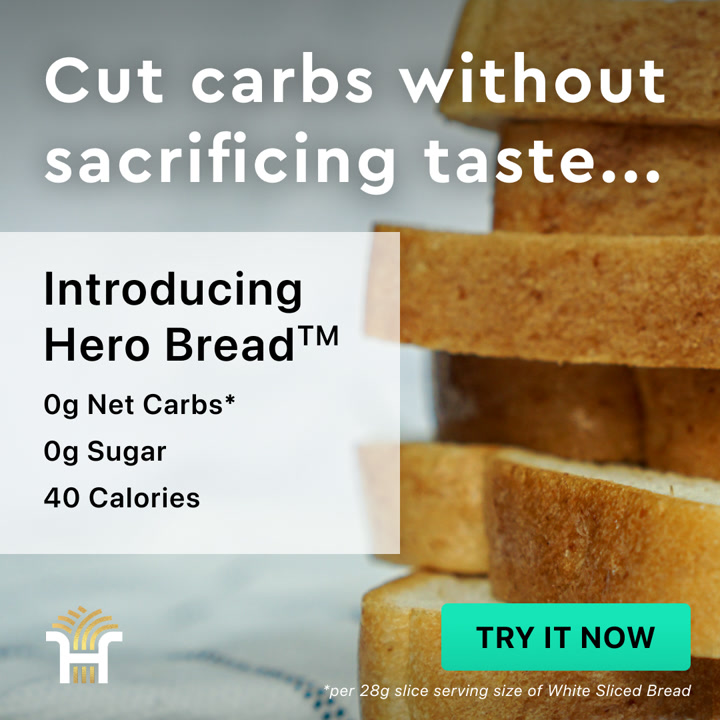
1. Hero Bread: three numbers next to a slice of bread
Hero Bread's oldest active static is a plain stack of sliced bread with a headline and three numbers.

Ad data:
- Running for: 1,662 days (since April 2022), still active
- Impression rank: #7 of Hero Bread's creatives
- Format: Image: product shot + features
- Markets: US
- Ads using it: 3
- Landing page: Hero homepage
The hook: "Cut carbs without sacrificing taste..." on the image, and "Feel Free to Eat What You Love" as the headline.
Why it works: The headline names the fear (low carb bread tastes bad) and the photo answers it with normal looking bread. Then "0g Net Carbs, 0g Sugar, 40 Calories" does the selling in three lines, with a button-style "Try it now" on the image itself.
Steal this: If your product has a number that sounds too good, put it on the image, stacked, with nothing else competing.
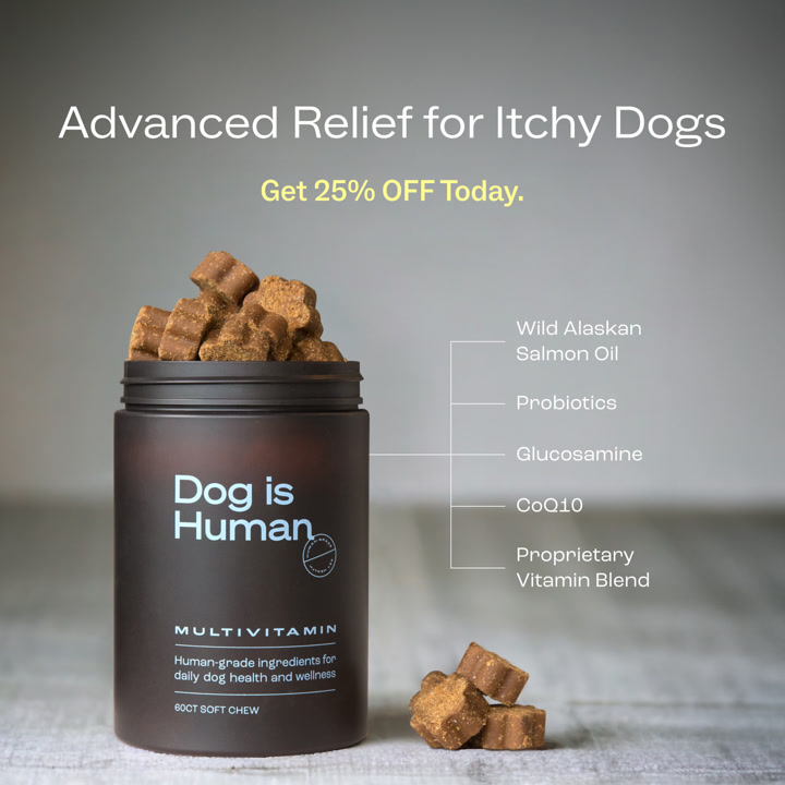
2. Dog is Human: an ingredient callout for itchy dogs
A jar of dog chews with arrows pointing to each ingredient, and one problem in the headline.

Ad data:
- Running for: 764 days (since September 2024), still active
- Impression rank: #22 of Dog is Human's creatives
- Format: Image: product shot + features
- Markets: US and other markets
- Ads using it: 12
- Landing page: Quiz with a 25% discount
The hook: "Advanced Relief for Itchy Dogs. Get 25% OFF Today."
Why it works: It names a problem every dog owner recognizes, not a product category. The ingredient callouts (wild Alaskan salmon oil, probiotics, glucosamine) answer "what's in it" before anyone asks, and the click goes to a quiz with the discount already applied.
Steal this: Lead with the symptom your buyer googles, and label what's inside on the product shot.
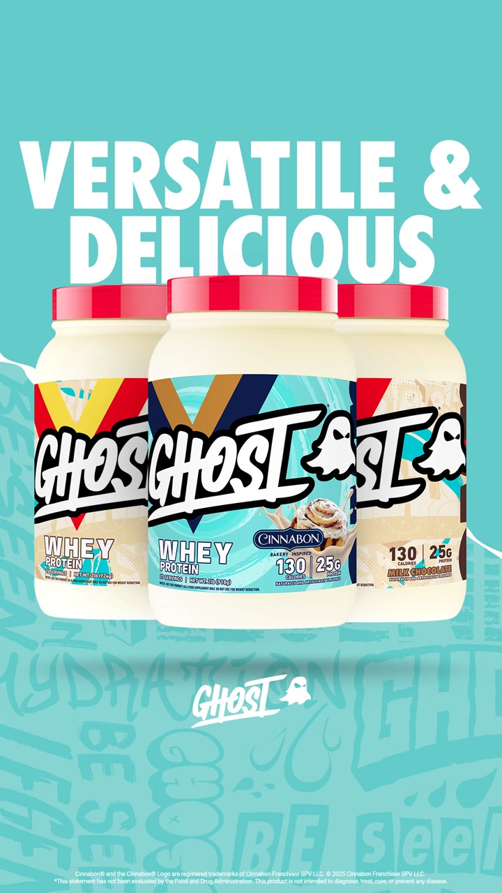
3. GHOST: the tubs, big and bright
GHOST lines up three tubs of whey on a loud teal background with two words on top.

Ad data:
- Running for: 624 days (since February 2025), still active
- Impression rank: #5 of GHOST's creatives
- Format: Image: product shot + features
- Markets: US, Australia
- Ads using it: 8
- Landing page: GHOST Whey product page
The hook: "VERSATILE & DELICIOUS" on the image. The copy adds "25G Protein" and "EPIC Flavors".
Why it works: Protein buyers already know what whey does. What they compare is flavor and brand, so GHOST shows off the packaging and the flavor collabs and keeps the protein facts in the copy. The card also carries 5 variants of the same layout.
Steal this: In a crowded category, make the packaging the hero and save the specs for the copy.
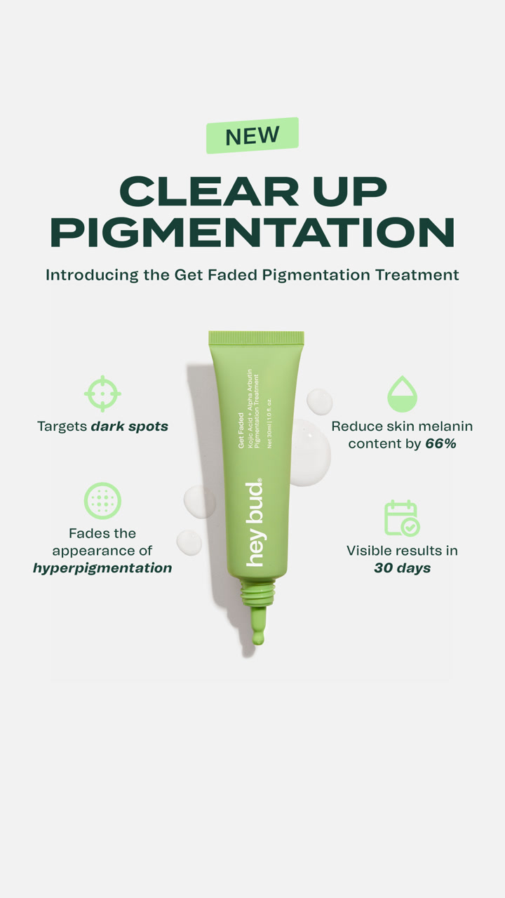
4. Hey Bud Skincare: one tube, four benefits
A single tube on a pale background, "NEW" in a pill, and four benefits with icons around it.

Ad data:
- Running for: 576 days (since April 2025), still active
- Impression rank: #10 of Hey Bud Skincare's creatives
- Format: Image: product shot + features
- Markets: US, UK, Canada, Australia and 17 more markets
- Ads using it: 26
- Landing page: Dark spot landing page
The hook: "NEW. CLEAR UP PIGMENTATION."
Why it works: The layout is a classic "product in the middle, benefits around it" static, and it works because each benefit is short enough to read on a phone. The click goes to a page built for dark spots, not the general shop.
Steal this: Use the four-corner benefit layout, and keep each benefit to five words or fewer.
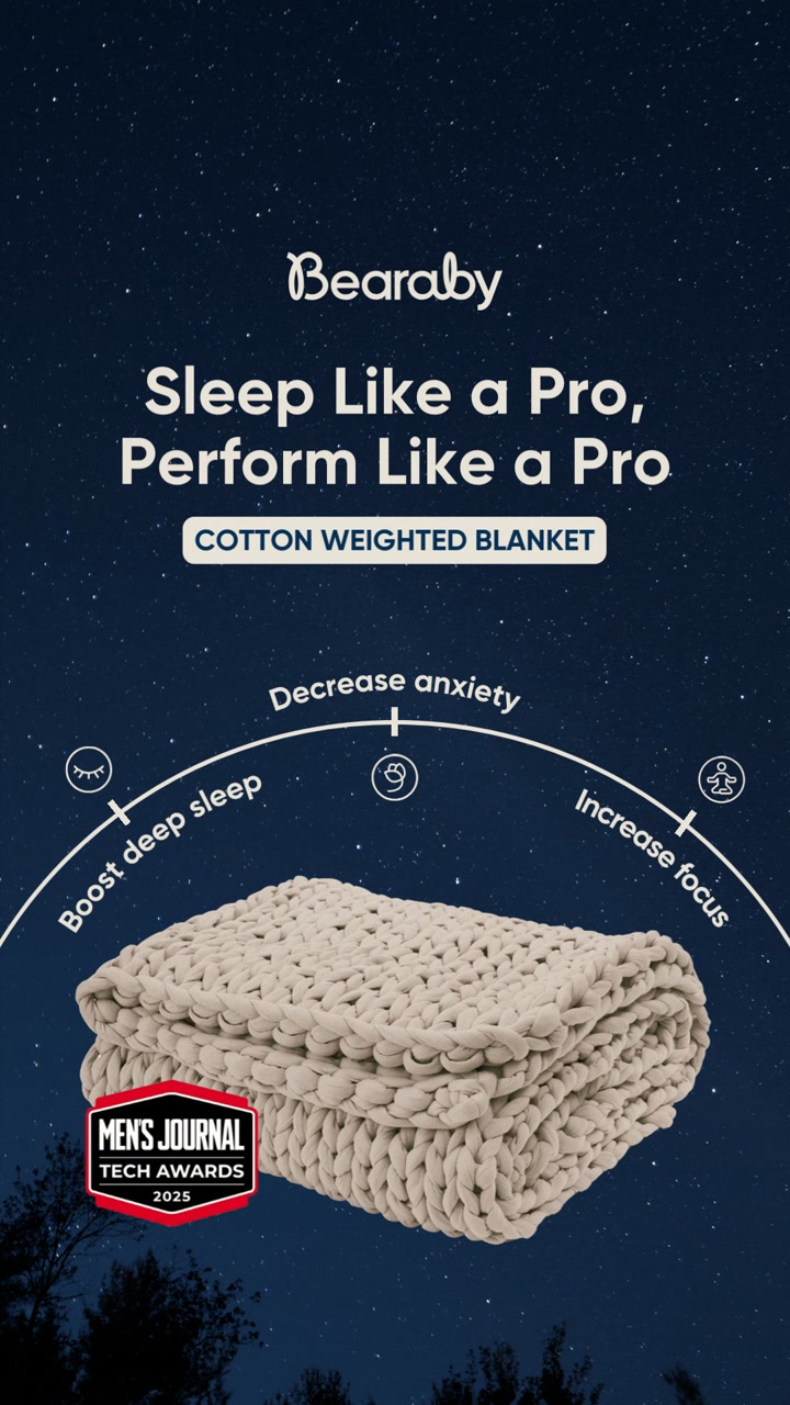
5. Bearaby: a blanket with a benefits arc
Bearaby puts its knitted blanket at the bottom of a night sky, with three benefits on an arc above it.

Ad data:
- Running for: 582 days (since March 2025), still active
- Impression rank: #14 of Bearaby's creatives
- Format: Image: product shot + features
- Markets: US and other markets
- Ads using it: 15
- Landing page: The Napper product page
The hook: "Sleep Like a Pro, Perform Like a Pro."
Why it works: It sells the result for the daytime (focus, performance), not just the night. The arc (decrease anxiety, boost deep sleep, increase focus) reads left to right in a second, and the award badge adds proof without a wall of text.
Steal this: Sell what the product does for the buyer's day, and add one award or press badge if you have one.
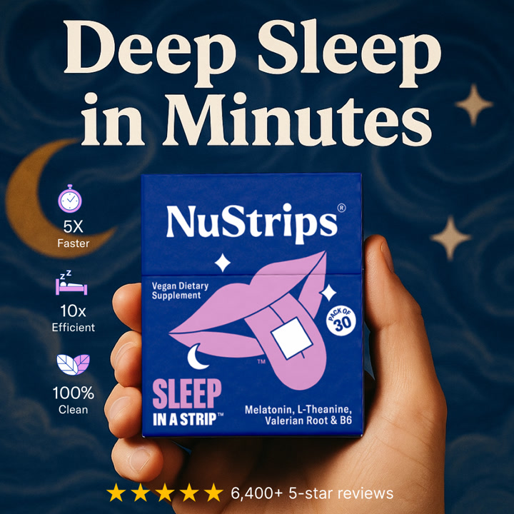
6. NuStrips: a big promise, three stats and a review count
A hand holds the NuStrips pack against a starry blue sky, with a headline you can read from across the room.

Ad data:
- Running for: 578 days (since April 2025), still active
- Impression rank: #17 of NuStrips's creatives
- Format: Image: product shot + social proof
- Markets: US, Canada, UK, Australia, New Zealand, Germany
- Ads using it: 17
- Landing page: Dedicated sleep landing page
The hook: "Deep Sleep in Minutes." The ad headline quotes the press: "'Straight out of sci-fi movie' -Forbes".
Why it works: Strips are a new format, so the image does the comparison for you with three stat icons (5x faster, 10x efficient, 100% clean) and a star rating at the bottom. The copy repeats the "faster than pills or gummies" angle.
Steal this: If your format is new, compare it to what buyers use today right on the image.
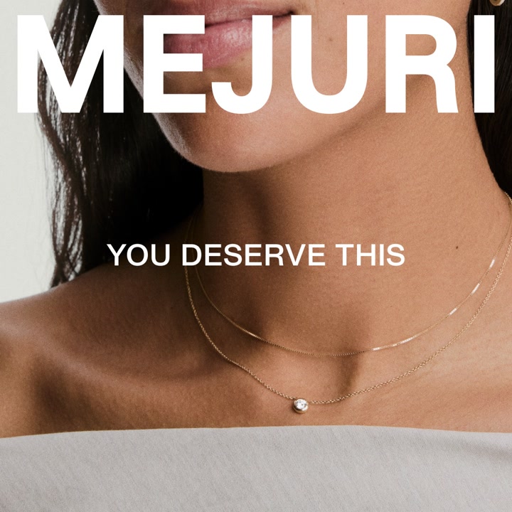
7. Mejuri: the product on a person, and two words
Mejuri's static is a close crop of a diamond necklace on a model, with the brand name huge and one line under it.

Ad data:
- Running for: 596 days (since March 2025), still active
- Impression rank: #15 of Mejuri's creatives
- Format: Image: model / try-on
- Markets: US, Canada, UK, Australia and other markets
- Ads using it: 40
- Landing page: Mejuri's Facebook page
The hook: "YOU DESERVE THIS." The copy: "Who says you have to wait for a diamond?"
Why it works: It's a brand ad, and it knows it. For jewelry, seeing the piece at true scale on a person does more than any spec. The copy reframes a diamond as an everyday treat, which is Mejuri's whole positioning in one line. It runs in 40 ads.
Steal this: For products people wear, crop tight on the product on a body and give it one emotional line.
Social proof statics: let someone else say it
These statics barely talk about the product. They borrow credibility from a magazine, a doctor or a customer. 6 of the 25 ads are tagged as review or social proof.
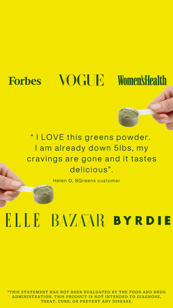
8. 8Greens: a wall of magazine logos around one quote
A loud yellow background, a scoop of greens powder, and six magazine logos framing a customer quote.

Ad data:
- Running for: 826 days (since July 2024), still active
- Impression rank: #5 of 8Greens's creatives
- Format: Image: review / social proof
- Markets: US
- Ads using it: 1
- Landing page: Super Greens Powders product page
The hook: "Have you had your greens?" as the headline, with a customer quote that opens "I LOVE this greens powder" in the middle of the image.
Why it works: The press logos do the trust work before you read a word, and the bright yellow stops the scroll in a feed of white and beige. The customer quote sits in the middle, so you get media proof and a real voice in one image.
Steal this: If you've been featured anywhere, frame your best review with those logos.
9. LYMA: a Vogue quote under a glowing device
A dark device tip glowing red, a short quote, and the Vogue wordmark under it.
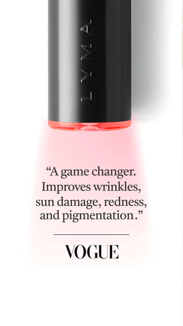

Ad data:
- Running for: 570 days (since April 2025), still active
- Impression rank: #31 of LYMA's creatives
- Format: Image: review / social proof
- Markets: US, UK, Canada, Australia and other markets
- Ads using it: 29
- Landing page: LYMA Laser Starter Kit
The hook: a one-line verdict credited to Vogue, with "Ready for bouncy, glowing skin?" as the headline.
Why it works: For a premium device, a fashion magazine's verdict carries more weight than the brand's own claims. The layout is mostly white space, which matches the price point. The copy adds "Zero damage. Zero downtime."
Steal this: For a premium product, let one respected outlet speak and give it room.
10. Jolie: "As seen in Vogue" on a lifestyle shot
A brass shower head, eucalyptus hanging from it, and a Vogue badge.
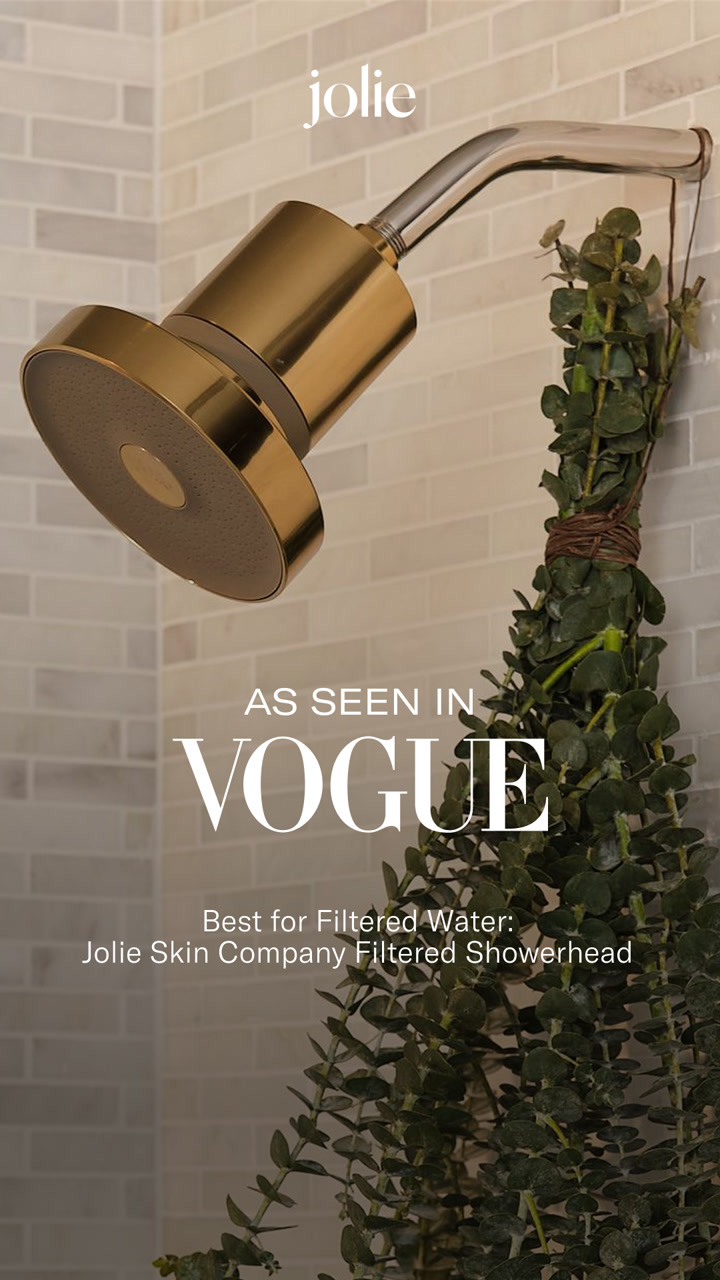

Ad data:
- Running for: 600 days (since March 2025), still active
- Impression rank: #1 of Jolie's creatives
- Format: Image: review / social proof
- Markets: US, Canada and other markets
- Ads using it: 33
- Landing page: Jolie Filtered Showerhead
The hook: "#1 Filtered Showerhead Trusted By Dermatologists" as the headline, "As seen in Vogue" on the image.
Why it works: This is Jolie's most-served creative. The photo makes a shower head look like a design object, and the badge ("Best for Filtered Water") turns press into an award. The copy does the rest: "Trusted by over 800,000 customers."
Steal this: Turn press coverage into a "Best for" badge and put it on your best-looking product photo.
11. GHIA: a customer review as the headline
Two bottles on black, and a review in quotes across the top.
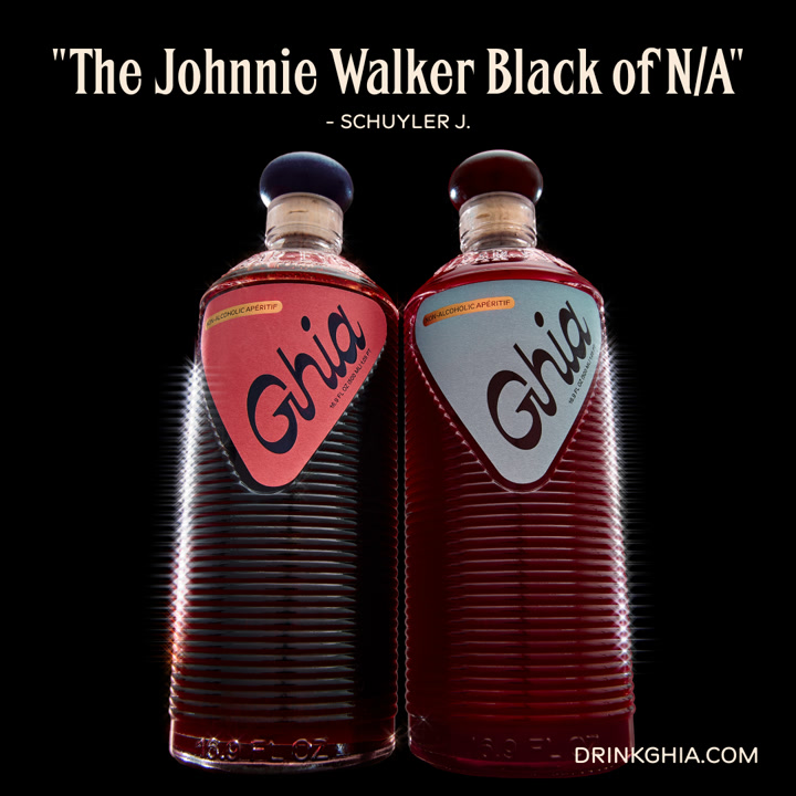

Ad data:
- Running for: 644 days (since January 2025), still active
- Impression rank: #4 of GHIA's creatives
- Format: Image: review / social proof
- Markets: US and other markets
- Ads using it: 26
- Landing page: Aperitif Duo
The hook: a customer calling it "The Johnnie Walker Black of N/A".
Why it works: A non-alcoholic drink has to prove it's a grown-up drink. A customer comparing it to a famous whisky does that in eight words, and the dark, glossy product shot backs it up. The click goes to a two-bottle bundle, not a single bottle.
Steal this: Find the review that compares you to something premium, and make it the headline.
Comparison statics: us vs them on one image
A comparison is the most "static" idea there is: two things side by side, read in a second. 2 of the 25 ads are tagged us vs them, and a third does it with before and after.
12. Liquid Death: the can next to a soda can
Liquid Death's can next to a plain white "SODA" can, with sugar and calories in a table underneath.
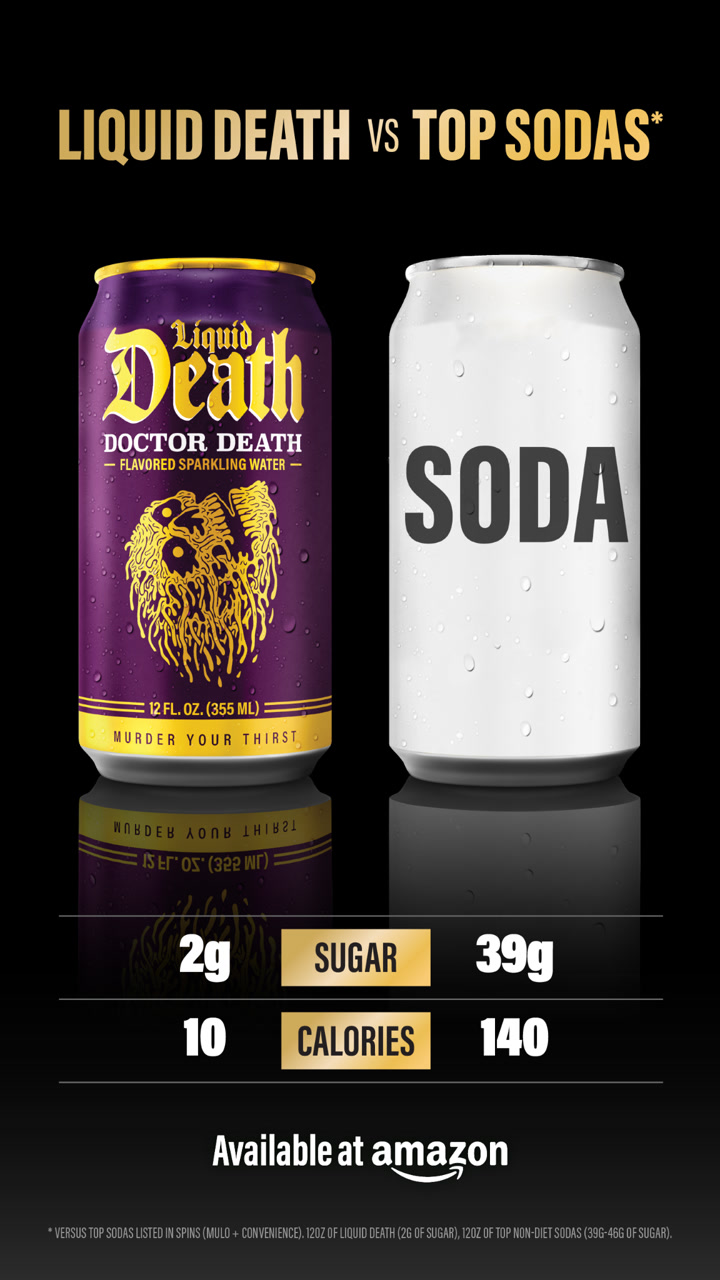

Ad data:
- Running for: 539 days (since May 2025), still active
- Impression rank: #14 of Liquid Death's creatives
- Format: Image: us vs them + product shot
- Markets: US and other markets
- Ads using it: 25
- Landing page: an Amazon short link
The hook: "LIQUID DEATH vs TOP SODAS", with "You won't believe it's not soda." as the headline.
Why it works: The numbers do all the work: 2g of sugar against 39g, 10 calories against 140. The rival is a generic "SODA" can, so no brand is named, and "Available at Amazon" tells you where to buy without leaving your cart habits.
Steal this: Put two numbers side by side against a generic rival, and say where to buy on the image.
13. Duppe Scents: a price table against designer perfume
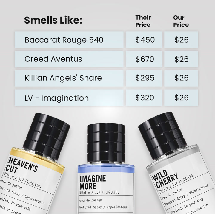
A table of designer fragrances, "their price" and "our price", above three bottles.
Ad data:
- Running for: 636 days (since February 2025), still active
- Impression rank: #21 of Duppe Scents's creatives
- Format: Image: us vs them + product shot
- Markets: US, UK, Canada, Australia and 18 more markets
- Ads using it: 1
- Landing page: 6 scents bundle
The hook: "Smells Like:" over a table where each designer scent costs $295 to $670 and Duppe's costs $26.
Why it works: The whole pitch is the gap between two columns. A table is the fastest way to show it, and naming the famous scents tells you exactly what you'll smell like. The copy adds the bundle: six scents for $79.95.
Steal this: If you win on price, show a table with the rival's price and yours, row by row.
14. Norse Organics: a hand-drawn "me before, me now"
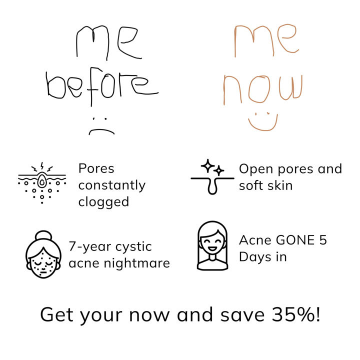
A whiteboard-style sketch: a sad face labelled "me before" and a happy one labelled "me now", with icons under each.

Ad data:
- Running for: 721 days (since November 2024), still active
- Impression rank: #40 of Norse Organics's creatives
- Format: Image: before and after + offer
- Markets: US, UK, Canada, Australia, New Zealand and other markets
- Ads using it: 17
- Landing page: Stop acne landing page
The hook: "me before / me now", then "Get yours now and save 35%!"
Why it works: It's a before and after with no photos of skin, so it reads as a story instead of a medical claim. The doodle style looks nothing like a typical skincare ad, which helps it stop the scroll, and the offer sits at the bottom.
Steal this: Draw your before and after as a simple sketch instead of a photo.
Lo-fi statics that look like a post, not an ad
These statics are built to look like something a friend posted: a text thread, a photo of a fridge, a dog with its food. They're quick to make, and they don't look like ads.
15. 8Greens: an iMessage conversation
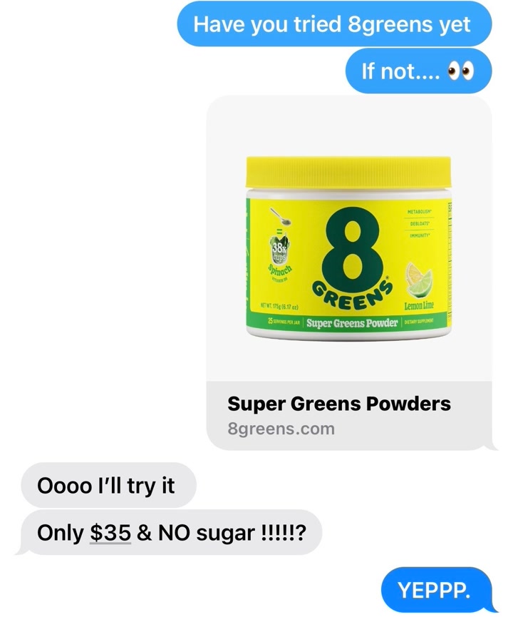
A fake text thread: one friend recommends 8Greens, the other asks about the price.
Ad data:
- Running for: 826 days (since July 2024), still active
- Impression rank: #7 of 8Greens's creatives
- Format: Image: screenshot / mockup
- Markets: US
- Ads using it: 1
- Landing page: Super Greens Powders product page
The hook: "Have you tried 8greens yet. If not.... 👀"
Why it works: Everyone reads text messages. The thread fits the whole pitch into a chat: a product card with the jar, the price ("Only $35"), the key claim ("NO sugar") and a happy "YEPPP." It has run as long as 8Greens's press static (#8), with a completely different look.
Steal this: Write your offer as a text thread between two friends, with the price in the question.
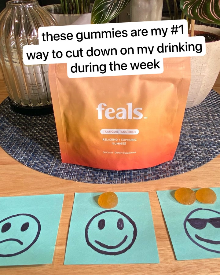
16. feals: sticky notes and a pouch on the kitchen table
A pouch of gummies, three sticky-note faces going from sad to happy, and a caption on top.

Ad data:
- Running for: 592 days (since March 2025), still active
- Impression rank: #3 of feals's creatives
- Format: Image: product shot
- Markets: US and other markets
- Ads using it: 22
- Landing page: Gummies landing page
The hook: "these gummies are my #1 way to cut down on my drinking during the week"
Why it works: The caption is written in lower case, like a story post, and names a specific use (weeknight drinking) instead of "relax". The sticky notes show the mood shift without a single claim. The click goes to a landing page built for that exact angle.
Steal this: Write the caption the way a customer would post it, lower case and specific.
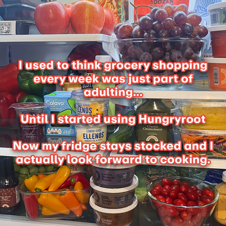
17. Hungryroot: a photo of a full fridge
A packed fridge with a three-line story over it in bold captions.

Ad data:
- Running for: 524 days (since May 2025), still active
- Impression rank: #2 of Hungryroot's creatives
- Format: Image: review / social proof
- Markets: US and other markets
- Ads using it: 27
- Landing page: Dedicated landing page
The hook: "I used to think grocery shopping every week was just part of adulting..."
Why it works: It's a before and after told in text over the "after" photo. The full fridge is the proof, and the story is relatable enough to read to the end: "Now my fridge stays stocked and I actually look forward to cooking." It's Hungryroot's second most-served creative.
Steal this: Tell a one-line before, one-line after story over a photo of the result.
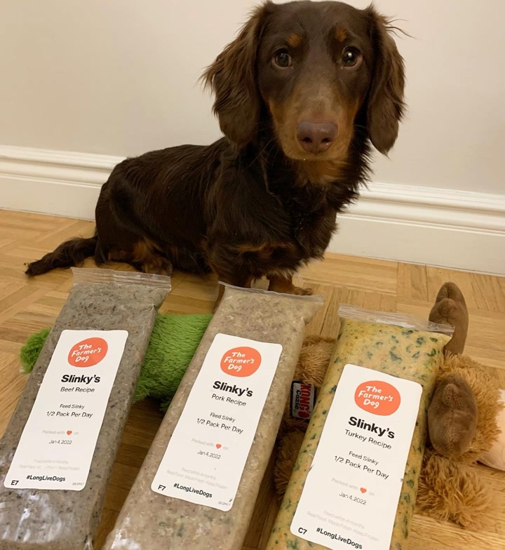
18. The Farmer's Dog: a dog sitting with its named packs
A dachshund sits behind three packs of food, each labelled with its name.

Ad data:
- Running for: 700 days (since November 2024), still active
- Impression rank: #8 of The Farmer's Dog's creatives
- Format: Image: product shot
- Markets: US, UK and other markets
- Ads using it: 15
- Landing page: 50% off sign-up page
The hook: "Sign up now for 50% off your order!" The copy opens with "Dog food should be food, not burnt brown balls."
Why it works: The personalized packs show the product's key difference (made for your dog) without a word on the image. It looks like a customer's photo, and the offer and the jab at kibble live in the copy.
Steal this: Show the personalized or custom part of your product in a real home photo.
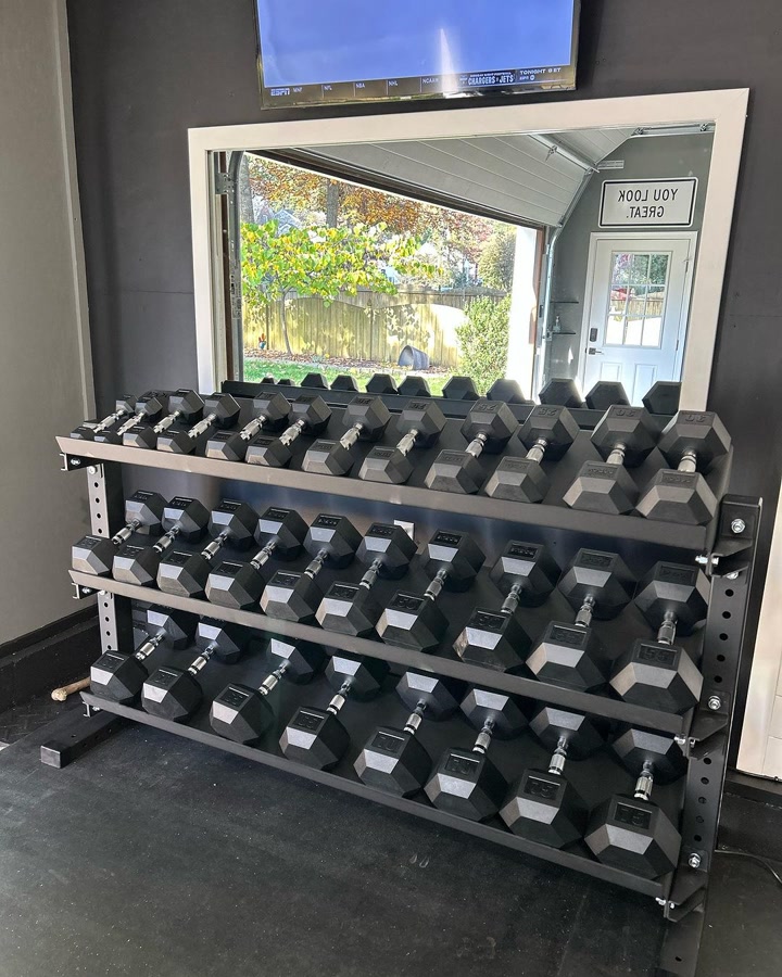
19. Rogue Fitness: a customer's garage gym
A full rack of dumbbells in a home gym, photographed by a customer.

Ad data:
- Running for: 816 days (since August 2024), still active
- Impression rank: #10 of Rogue Fitness's creatives
- Format: Image: product shot
- Markets: US and other markets
- Ads using it: 4
- Landing page: Rogue Universal Storage System 2.0
The hook: "Customize the Rogue Universal Storage System now!" The copy credits the photo to a customer.
Why it works: Home gym buyers want to see the gear in a space like theirs, not a studio. This photo shows the rack full, in a normal garage, and the copy adds the one spec that matters: "built to handle 1,000LB+ of weight."
Steal this: Ask customers for photos of your product in their space, and credit them in the copy.
20. Shakti Mat: feet on the mat
A top-down shot of bare feet standing on an acupressure mat on a wooden deck. No text.
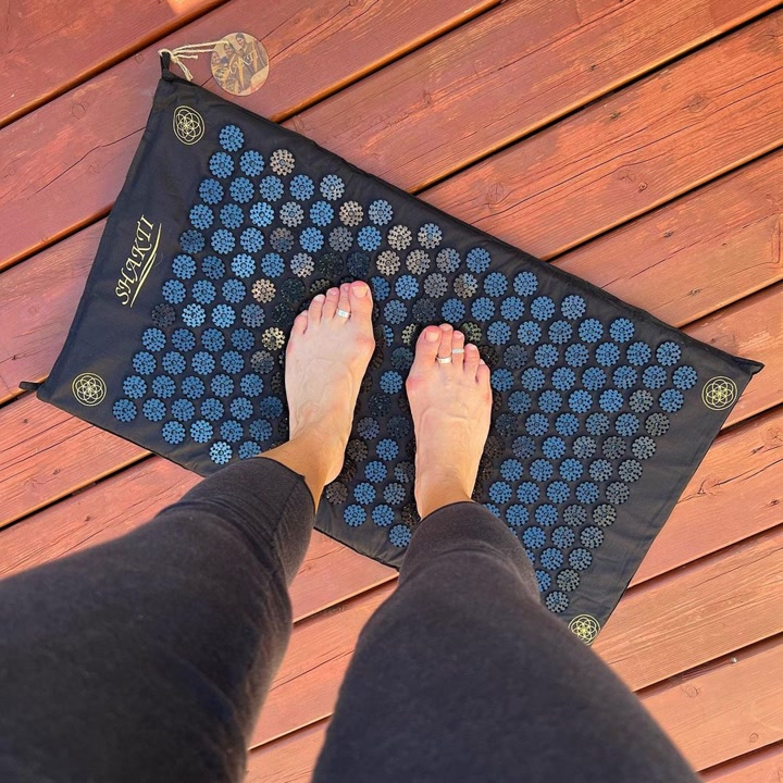

Ad data:
- Running for: 823 days (since July 2024), still active
- Impression rank: #25 of Shakti Mat's creatives
- Format: Image: lifestyle
- Markets: US, UK, Canada, Ireland and 6 more markets
- Ads using it: 64
- Landing page: Shakti Mat homepage
The hook: "One answer to everyday stress" as the headline, with a long customer review in the copy.
Why it works: The photo makes you imagine the feeling, which is the whole product. With no text on the image, the review in the copy does the persuading. It runs in 64 ads, the second most of any creative in this post.
Steal this: If your product is about a sensation, show a point-of-view shot of someone using it and let reviews carry the copy.
Offer statics: price, guarantee and scarcity
The last group puts the reason to buy now on the image itself. 8 of the 25 statics in this post show a price, discount or guarantee on the image.
21. Henson Shaving: "100 days risk free"
A metal razor on a dark gradient with the guarantee as the headline.
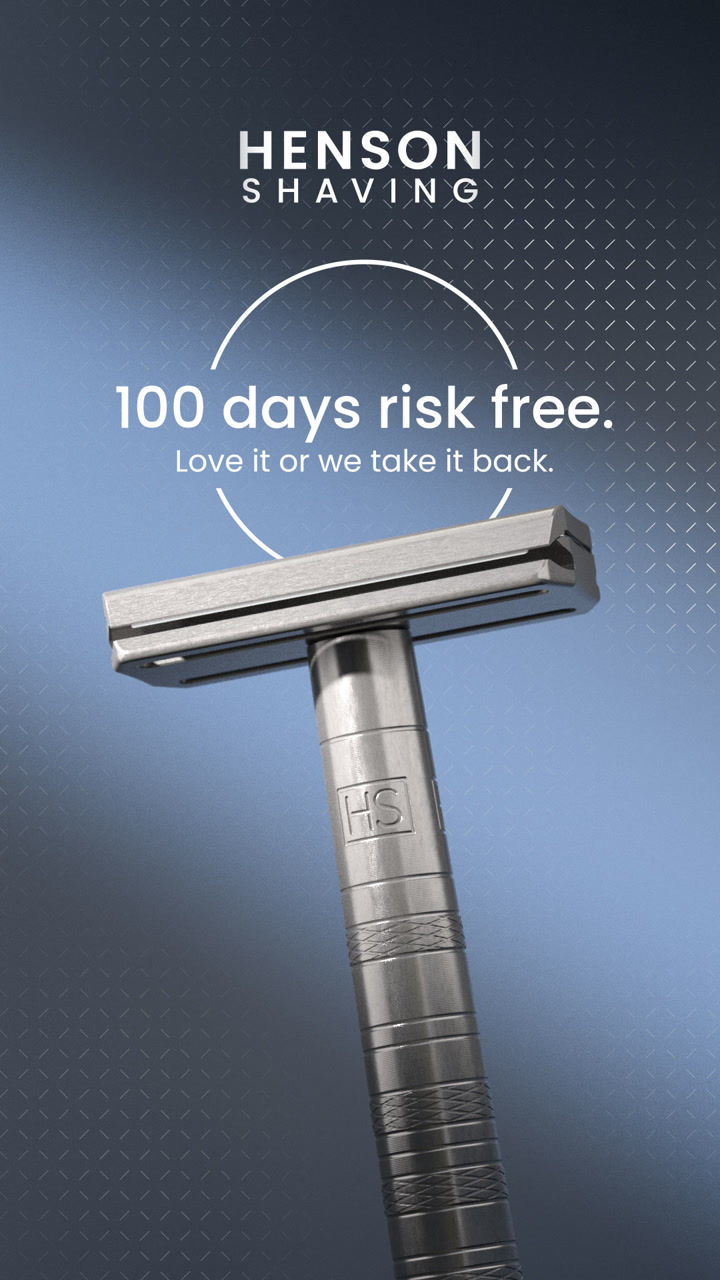

Ad data:
- Running for: 548 days (since April 2025), still active
- Impression rank: #39 of Henson Shaving's creatives
- Format: Image: product shot + offer
- Markets: US, Canada, Australia, Japan and other markets
- Ads using it: 25
- Landing page: Get Henson landing page
The hook: "100 days risk free. Love it or we take it back."
Why it works: A metal razor is a bigger upfront spend than a cartridge pack, so the risk is the objection. The ad answers it before anything else, and the clean product shot makes the razor look built to last.
Steal this: If your price is the objection, make your guarantee the headline.
22. Tempo: a crossed-out price and HSA/FSA
Tempo's home gym kit on a blue background with the old monthly price crossed out.
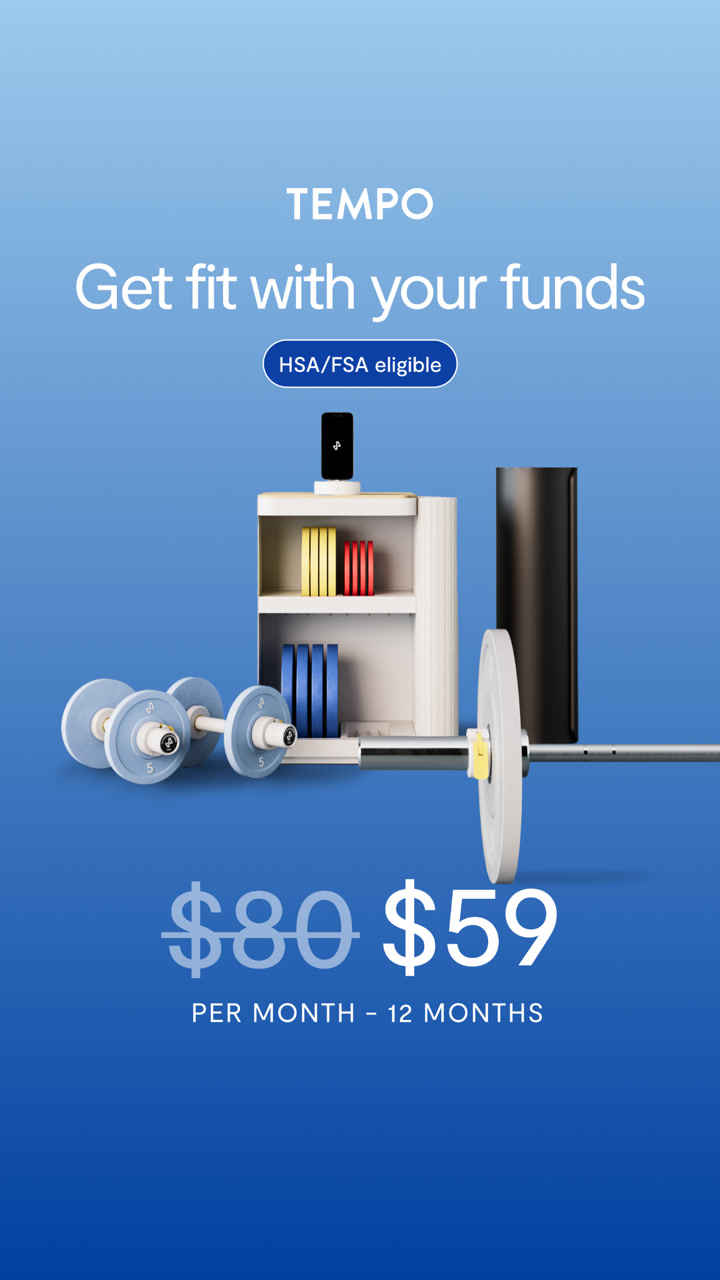
Ad data:
- Running for: 751 days (since October 2024), still active
- Impression rank: #14 of Tempo's creatives
- Format: Image: product shot + offer
- Markets: US and other markets
- Ads using it: 3
- Landing page: Tempo shop
The hook: "Get fit with your funds", with "Now HSA/FSA Eligible" as the headline.
Why it works: It removes two money objections at once: you can pay with pre-tax health funds, and the monthly price drops from $80 to $59 over 12 months. A crossed-out price is one of the clearest offer signals there is.
Steal this: Show the monthly price with the old one crossed out, and name any way to pay that buyers might not know about.
23. The Pearl Source: a line of copy, then 15% off
A pearl ring on dark stone, a short line of copy, and the offer in big type.
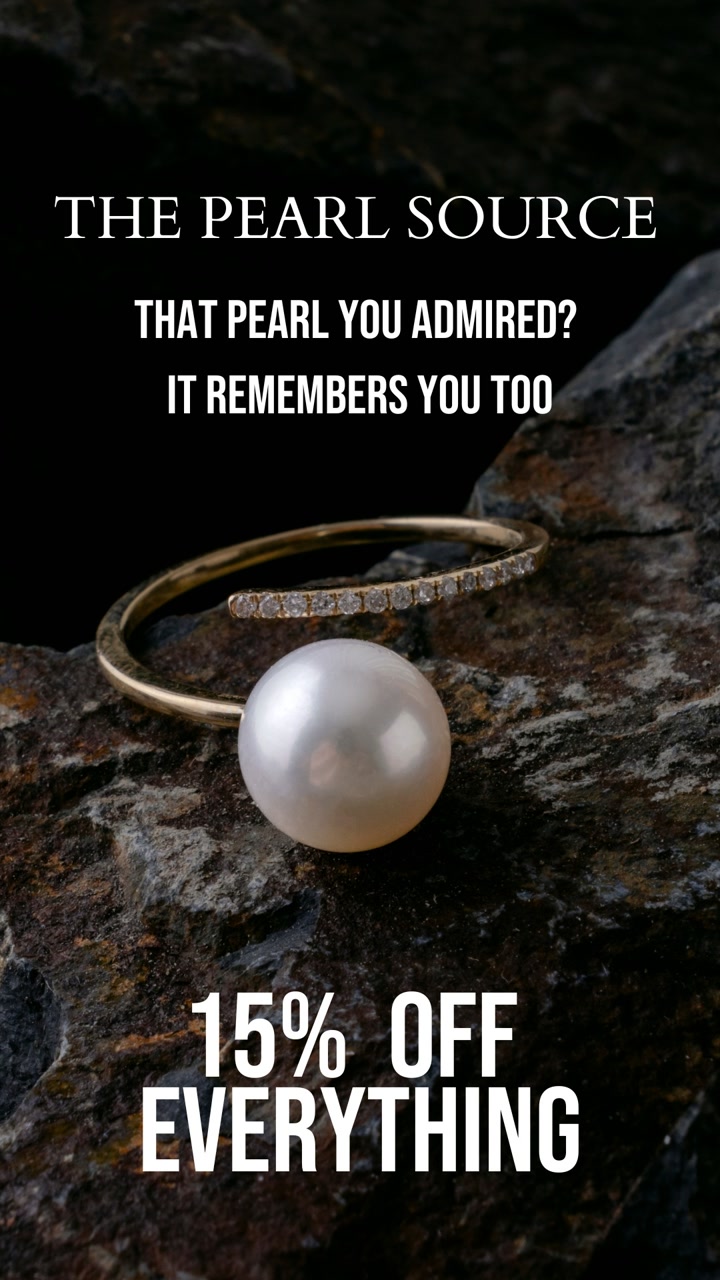

Ad data:
- Running for: 557 days (since April 2025), still active
- Impression rank: #6 of The Pearl Source's creatives
- Format: Image: product shot + offer
- Markets: US, UK, Canada, Australia and 25 more markets
- Ads using it: 7
- Landing page: The Pearl Source homepage
The hook: "That pearl you admired? It remembers you too."
Why it works: Most discount ads lead with the number. This one leads with a line that speaks to someone who already looked and left, then gives them "15% OFF EVERYTHING" as the reason to come back. It reads like a retargeting ad, built for people who already browsed.
Steal this: For retargeting, open with a line about the product they looked at, then the discount.
24. Primal Queen: a sale headline and free gifts
A bright pink "IS HERE" headline, three pouches and a price tag.
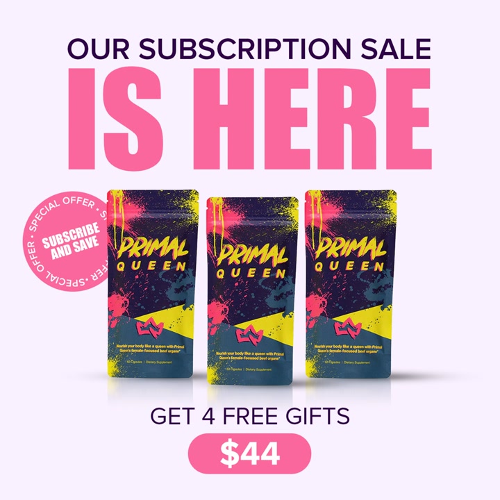

Ad data:
- Running for: 620 days (since February 2025), still active
- Impression rank: #1 of Primal Queen's creatives
- Format: Image: product shot + offer
- Markets: US
- Ads using it: 8
- Landing page: Dedicated landing page
The hook: "OUR SUBSCRIPTION SALE IS HERE. Get 4 free gifts. $44."
Why it works: It's Primal Queen's most-served creative, and it's pure offer: the sale, the bonus and the price, in that order, in type you can't miss. The copy brings the benefits back with a customer quote.
Steal this: For a subscription, stack the offer (gifts plus price) on the image and keep the benefits in the copy.
25. The Luxuriate: "only 60 made"
A stack of stone candle holders in soft light, with a scarcity line on top.
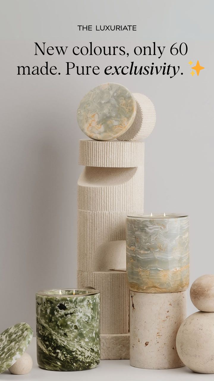

Ad data:
- Running for: 645 days (since January 2025), still active
- Impression rank: #10 of The Luxuriate's creatives
- Format: Image: product shot + low stock
- Markets: US, UK, Australia and other markets
- Ads using it: 92
- Landing page: The Luxuriate homepage
The hook: "New colours, only 60 made. Pure exclusivity." The headline: "Only 100 Pieces Made".
Why it works: Stone pieces really are one of a kind, so the scarcity is believable. The soft, editorial photo keeps it premium, and the small batch number gives a reason to buy now without a discount. It runs in 92 ads, the most of any creative in this post.
Steal this: If your batches are small, say the exact number on the image instead of discounting.
Patterns across these 25 static ads
Looking at all 25 together, a few things stand out. Every number here comes from the Adspo data behind this post.
- Winning statics run for a long time. The median ad here has run for 624 days, and the shortest for 524. 7 have run for more than 2 years, and Hero Bread's has run for 1,662 days. For more ads ranked purely by runtime, see the longest running Facebook ads.
- They sit near the top of their account. 14 of the 25 are in the top 10 most-served creatives in their brand's account, 22 are in the top 25, and 2 (Jolie and Primal Queen) are the brand's #1.
- Product shots still dominate. 15 of the 25 are tagged as product shots, and 6 lean on reviews, press or customer quotes.
- Winners get reused. 11 of the 25 creatives run in 20 or more separate ads. The Luxuriate's runs in 92, Shakti Mat's in 64.
- Offers go on the image. 8 of the 25 show a price, discount or guarantee in the image itself, not just in the copy.
- Few go to the homepage. 9 link to a product page and 9 to a dedicated landing page, quiz or offer page. Only 4 go to the homepage.
- Soft calls to action win again. Learn More appears on 15 of the 25 and Shop Now on 10. For the copy behind more long-running ads, see our Facebook ad copy examples.
Several of the lo-fi statics above (the text thread, the fridge photo) are close cousins of native ads, and the review-led ones overlap with testimonial ads. For video and image ads together, see our 50 best Facebook ad examples. For one niche at a time, see the best skincare Facebook ads and the best supplement Facebook ads.
How to find static ads like these for your brand
You can find long-running statics in your own category in a few minutes:
- Open Adspo and filter the ad library by your industry.
- Set the format to Image, filter to active ads and sort by Longest running.
- Open a creative to see its impression rank in the brand's account, how many ads use it, the copy and the landing page.
- Track the brands you want to follow, and save the statics you want to brief from to a board.
Want to start from a niche? Browse long-running ads by category, like greens powder, pet, skincare, fragrance or jewelry. If you'd rather start with the free tool, our guide on how to use the Facebook Ad Library walks through it step by step.
Frequently asked questions
What is a static ad?
A static ad is a single image with no motion: a product photo, a designed graphic, a screenshot or a photo with text on top. On Meta it runs in the same placements as video (feed, Stories, Reels) and is usually quicker and cheaper to make, which is why brands test so many of them.
What is an example of a static ad?
Hero Bread's "Cut carbs without sacrificing taste" image is a good one. It shows sliced bread, three numbers (0g net carbs, 0g sugar, 40 calories) and a Try It Now button, and it has run since April 2022. Liquid Death's can next to a generic soda can, with sugar and calories side by side, is another, running since May 2025.
Do static ads still work on Facebook and Instagram?
Brands keep paying for them. Every ad in this post is a static image that was still active on November 1, 2026, the median one has run for 624 days, and 14 of the 25 are in the top 10 most-served creatives in their own brand's account.
What makes a good static ad?
Across these 25, the good ones make one point you can read in a second: one product, one number, one quote or one offer. 15 are tagged as product shots, 6 lean on reviews or press quotes, and 8 put a price, discount or guarantee on the image itself.
Static ads vs video ads: which is better?
Neither wins everywhere. Statics are fast to make and test, and work well for offers, comparisons, reviews and simple product claims. Video wins when the product needs to be shown working. Most brands in Adspo run both. For long-running video and image ads side by side, see our 50 best Facebook ad examples.
Where can I find static ad examples from my competitors?
The free Meta Ad Library shows a brand's active ads, but you can't filter to images or sort by runtime. Adspo covers 10,000+ verified brands and lets you filter to image ads, sort by longest running and see each creative's impression rank in its brand's account, copy and landing page.
Wrapping it up
The best static ads aren't the prettiest ones. They're the ones brands keep paying for, month after month. Across these 25, the habits are simple: one product, one number, one quote or one offer, readable in a second, and a click that goes somewhere built for it.
Every ad here came from Adspo's data, and you can find the same signals for any brand in your market. Try Adspo free for 7 days.