

A good jewelry landing page continues the ad: the same piece, the same offer or the same idea. In the 12 jewelry landing page examples below, 10 of the ads skip the homepage, only 3 of the pages show a price on the first screen, and 9 show an offer. Most open with a large photo of the piece being worn.
Each example shows the Facebook ad and the page it sends traffic to, side by side, the way a shopper sees them on a phone. Every ad was still running when we pulled the data, and they've been live for 98 to 746 days. Tap any landing page to scroll the whole thing, and use the section list to jump around. Under each one, we break the page down section by section.
Dedicated landing pages
1. PupRing: a one-idea page for a pet face necklace
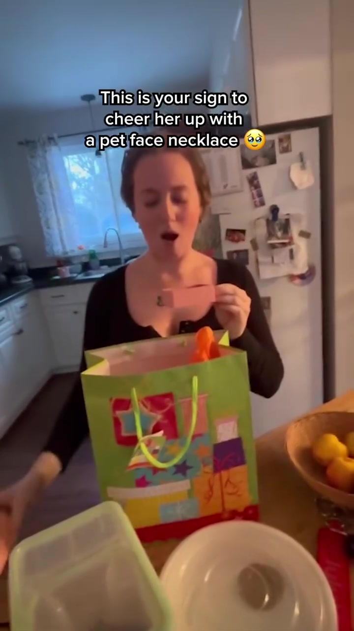
PupRing's most-served ad is a video of someone giving the gift. It goes to a page built only for ad traffic, not a store product page.

The landing page
Page data:
- Ad running for: 588 days (since March 2025), still active
- Page type: Dedicated landing page (/pages/lp12-3-2-primary-carousel)
- Above the fold: a "Buy One, Get One FREE + Up To 50% Off" bar, a photo of the gift being handed over and the headline "Craft a Gift She'll Never Forget." No price.
- Impression rank: 1st among PupRing's ads, live in 7 ads
Page sections:
- Hero: gift photos, the headline and 3 checkmarks about the bond with her pet and the photo-realistic engraving.
- Offer: "Buy One, Get One FREE" in a box, a "Create Yours Today" button and "12 Left in Stock."
- Reviews: "What Real Dog Moms Say About Their PupRing!", 4.9 out of 5 from 443 reviews, with customer photos and quotes.
- How it works: upload your pet's photo, artists illustrate it, artisans engrave the necklace.
- Guarantee: "Wear It for 30 Days" or get your money back, and one last button.
Message match: The ad shows a person getting the gift and being told to "cheer her up." The first thing on the page is a woman being handed the box. The Buy One Get One offer in the ad copy is in the page's top bar.
Why it works: A custom pet necklace raises one question: how does it get made? The page answers it in 3 steps, and repeats the same button after each section so there's always a next step.
Steal this: For a personalized product, give the how-it-works section as much room as the reviews.
2. Vincero: a Dad necklace page with a short list of reasons
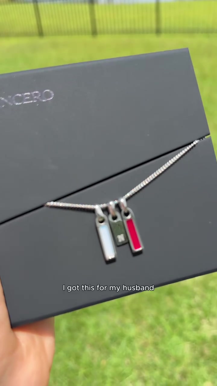
Vincero is known for watches, but this ad is about one idea: a birthstone necklace for dads. It goes to a page written for exactly that buyer.
The landing page
Page data:
- Ad running for: 98 days (since July 2026), still active
- Page type: Dedicated landing page (/pages/birthstone-lp-7)
- Above the fold: a Black Friday bar, a close-up of the necklace, the headline "Some Chains Flex. This One Speaks" and "60,000 5-Star Reviews." No price.
- Impression rank: 589th among Vincero's ads, live in 24 ads
Page sections:
- Hero: the headline and a line about "the Best Dads who don't miss a moment."
- Products: a "For the Best Dads" grid of birthstone necklaces, with the first at $104, down from $130.
- Benefits: 3 numbered reasons: Keep Them Close, Forever and Life Proof.
- More styles: "Styles You May Also Like" and a row of press quotes.
- Mission: a short brand statement over a photo of a man wearing the necklace.
- Guarantee: a lifetime guarantee with 4.7 out of 5 from 60,000+ reviews.
- Bracelets: a grid of bracelets to add on.
- Reviews: "Feeling the Love", with customer photos and quotes.
Message match: The ad opens: "I got this for my husband thinking it'd just be a thoughtful gift, but now he literally never takes it off." The page's headline and "Best Dads" line continue the same gift, and its third reason says you never have to take it off.
Why it works: The ad's headline is "Birthstone Necklace for Dads" and the page doesn't try to be anything else. It's one of the longest pages here, but the products come right after the headline.
Steal this: Give a seasonal or gift angle its own page, so the words match who the ad is talking to.
Campaign and guided pages
3. Sarah & Sebastian: a magazine-style page for a fine jewelry collection
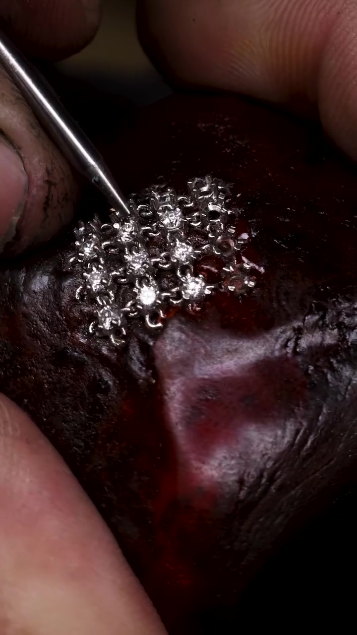
This ad is the brand's 2nd most served, and it links to a page about one collection. There's no price anywhere on it.

The landing page
Page data:
- Ad running for: 370 days (since October 2025), still active
- Page type: Campaign page (/pages/ondine)
- Above the fold: a large campaign photo, the name ONDINE and a short story. No price, offer or rating.
- Impression rank: 2nd among Sarah & Sebastian's ads, live in 18 ads
Page sections:
- Hero: the campaign photo and a story about sea creatures rising to the surface by moonlight.
- Film: a campaign video with mute controls and a "Shop the Collection" button.
- Ondine and Lume: a photo for each of the first 2 stories, then a tabbed row of pieces.
- Freedive Necklace: a single hero piece with "Shop Online" and "Shop In Store" links.
- Zenith and Rhythm: the next 2 stories, built the same way.
- Journal: "Meet Our ONDINE Muse", a link to an interview.
Message match: The ad copy talks about the ONDINE bracelet, with its 730 round white diamonds, and the page opens with the ONDINE name. The page then widens from one bracelet to the whole collection.
Why it works: For high-priced pieces, a first click isn't likely to be a purchase, and this page doesn't ask for one. It reads like a magazine feature and offers a store visit as well as an online shop.
Steal this: If your jewelry sells on considered decisions, send ads to a story about the collection and leave the price for later.
4. Jewels & Aces: a guided page for an unusual product idea
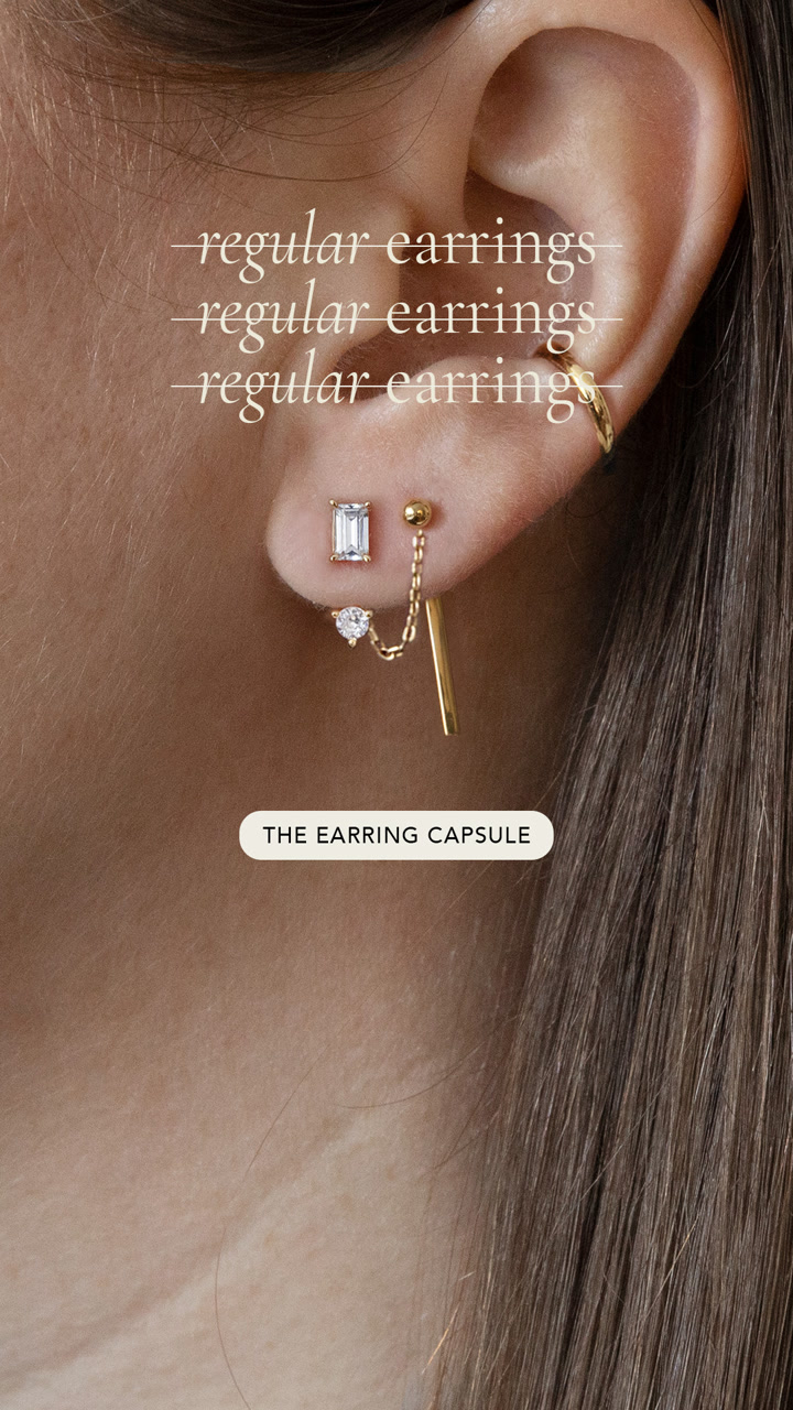
Jewels & Aces' ad crosses out "regular earrings." The page's job is to explain what its Earring Capsule is and help you pick one.

The landing page
Page data:
- Ad running for: 532 days (since May 2025), still active
- Page type: Guided shopping page with a quiz link (/pages/find-your-earring-look)
- Above the fold: a "Find Your Earring Look" bar with a "Take Quiz" link, an ear close-up and "More ways to wear your earrings." No price.
- Impression rank: 8th among Jewels & Aces' ads, live in 24 ads
Page sections:
- Hero: the ear close-up, "Shop Curated Looks" and "Build Your Bundle" buttons, and a 5-step list: pick a stud, add a jacket, add more, or less, remix.
- Explainer: "One set. So many ways to wear it", describing studs and interchangeable ear jackets.
- Curated sets: ready-made sets, with the first duo from $100 and others at $192 to $375.
- Quiz banner: "Not sure where to start?" with a link to the earring quiz.
- Bundle builder: "Build Your Earring Capsule" to mix and match pieces.
- Benefits: recycled sterling silver and 14K gold, nickel-free and hypoallergenic, and what's in the box.
- FAQ: 4 questions, including "Will it fit my own earrings?"
- Press: Elle, Today, Nylon and others, with a quote from the Today show.
Message match: The ad's label says "The Earring Capsule" and the page opens with "Meet the Earring Capsule." The ad headline "Find Your Earring Look" is in the top bar and the URL.
Why it works: A new product category needs explaining before it can be bought. This page gives shoppers 3 routes (curated sets, a bundle builder and a quiz), depending on how sure they are.
Steal this: If your product isn't a familiar one, offer a ready-made option and a build-your-own option on the same page.
Offer pages
5. Louise Carter: a "pick any 7" bundle page
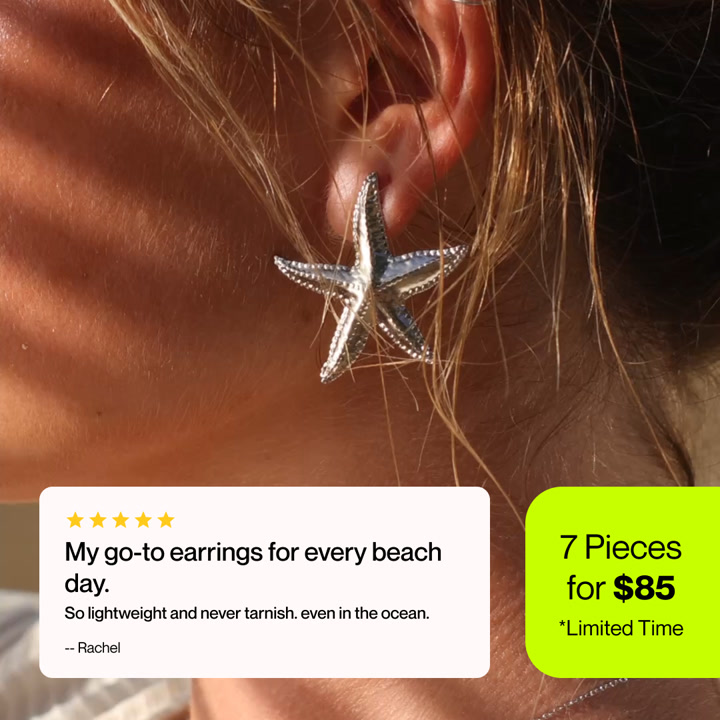
This image ad pairs a customer quote with one offer, and the whole page exists to sell that offer.

The landing page
Page data:
- Ad running for: 329 days (since December 2025), still active
- Page type: Offer page on a collection URL
- Above the fold: a lifestyle photo, 4.5 out of 5 from 70,000+ reviews, "500,000+ happy customers", a "Shop 7 for $85" button and press logos.
- Impression rank: 1,254th among Louise Carter's ads, live in 1 ad
Page sections:
- Hero: the photo, rating, button and press logos (Cosmopolitan, Elle, Tatler, Vogue, Forbes).
- The deal: "What's the deal?", any 7 pieces with real 18k gold and stainless steel, and a lifetime color warranty.
- How it works: 4 steps from "Choose My Jewelry" to enjoying the box.
- Comparison: Louise Carter vs other jewelry, in two columns.
- Guarantee: "Happiness guaranteed", with a 30-day refund.
- Reviews: "500,000+ happy customers" and customer stories.
- Why shop with us: 4 short trust points, including the color warranty.
- Product grid: "Choose any 7 jewelry pieces", 185 pieces with star ratings and filters.
Message match: The ad says "7 Pieces for $85" and the first button on the page says "Shop 7 for $85." The ad's quote about wearing earrings on the beach matches the swimsuit photo and the "Waterproof" line at the top.
Why it works: A pick-your-own bundle needs its rules explained before the shopper reaches 185 products. The page puts the deal, the steps and the guarantee first, then the grid.
Steal this: Explain your bundle in numbered steps above the product grid. And see how the two-column section works in our guide to us vs them ads.
6. Bellaucci: a restock ad to a Black Friday grid
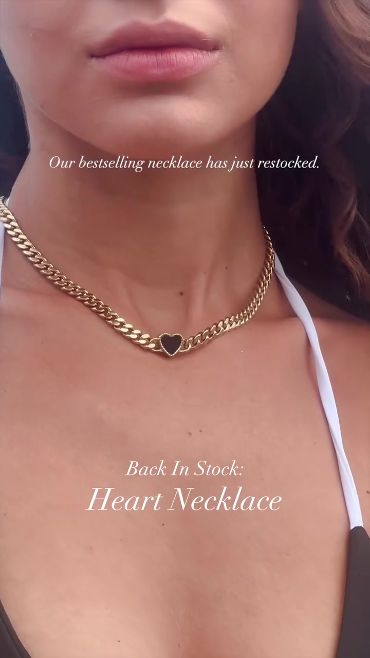
Bellaucci's ad says its bestselling necklace is back. The page keeps that urgency going with a timer and stock labels.

The landing page
Page data:
- Ad running for: 615 days (since February 2025), still active
- Page type: Collection page with an offer block on top
- Above the fold: a Black Friday countdown, a campaign photo and "Buy 1 Get 2 Free + an extra 30% off." No price or rating.
- Impression rank: 100th among Bellaucci's ads, live in 20 ads
Page sections:
- Hero: the countdown and a campaign photo.
- Offer: the deal with hand-drawn circles and arrows, a free necklace and bracelet with any piece, and "An offer this big won't return."
- Necklaces: a grid of heart necklaces at $111, tagged Low stock or Restocked.
- Moonstone promo: a tile inside the grid, with a sign-up for a Black Friday collection.
- Bracelets: a grid of 5-motif bracelets.
Message match: The ad says "Our best-selling necklace has just restocked" and offers a free bracelet. The grid shows the same heart necklaces tagged Restocked and Low stock, and the offer block includes a free bracelet.
Why it works: The offer block looks hand-marked, not like a designed banner, which makes it hard to miss. The products sit right below it, with no other content in the way.
Steal this: If your ad is about stock, carry the stock labels onto the product grid.
Product pages
7. Hearts Valley: the same locket, photographed the same way
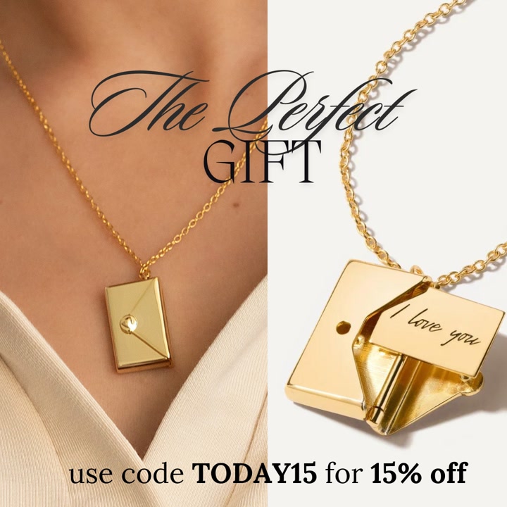
Hearts Valley's ad and page both revolve around one piece: a tiny envelope that opens to show a note.

The landing page
Page data:
- Ad running for: 683 days (since December 2024), still active
- Page type: Product page
- Above the fold: a large product photo, the name, 893 reviews, and $49 next to a crossed-out $125.
- Impression rank: 13th among Hearts Valley's ads, live in 6 ads
Page sections:
- Hero: photos, price, color choice, an Add to Cart button, shipping notes and a short description of the removable letter.
- Press: Vanity Fair, Tatler and Vogue logos.
- Bundle: "Style it with", adding a Tiny Heart Bracelet for 20% off the set.
- More products: "You May Also Like", other pieces at the same sale price.
- Reviews: a star summary and customer stories, many of them about gifts.
- Trust badges: fast and free shipping, quality and service.
Message match: The ad and the page's first photo show the same piece from a similar angle, with the "I love you" note visible. The offers don't match, though: the ad says 15% off with TODAY15, and the page's top bar says 20% off with GIFT20.
Why it works: The product is its own hook, since a locket that opens is easy to understand from a photo. The reviews then back up the gift angle with stories from real buyers.
Steal this: If a piece has a detail worth showing, use the same close-up in the ad and at the top of the page.
8. Cherish These: a gift box first, a necklace second
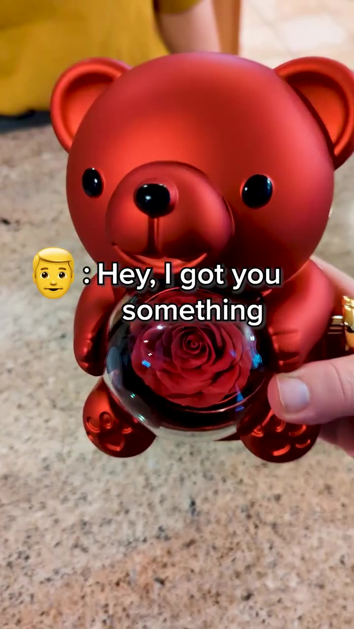
This ad shows a rose bear being opened. The product page keeps the gift box in the name, the photos and the options.
The landing page
Page data:
- Ad running for: 746 days (since October 2024), still active
- Page type: Product page
- Above the fold: an "Up to 55% Off + Free Shipping" bar, a photo of the bear and the necklace, and the product name. The price comes just below it.
- Impression rank: 78th among Cherish These' ads, live in 2 ads
Page sections:
- Hero: photos, 4.5 stars from 404 reviews, "1000+ bought in past month" and $69.89, down from $139.98.
- Options: metal, bear color, 2 optional engraved names, quantity and Add to Cart.
- Details: expandable sections for description, specs, shipping, guarantee and gift packing.
- More products: "Customers Loved These Products", at 50% off.
- Founder story: a short note on the founder and a portrait.
- Reviews: 4.51 out of 5, a star breakdown and customer photos.
Message match: The ad copy promises "a gift with a hidden twist" and the video centers on the bear. The first photo on the page is that same red bear, and the product name mentions the giftbox.
Why it works: The buyer here is shopping for a reaction, so the box matters as much as the necklace. The page turns the gift into a choice: pick the bear color and engrave 2 names.
Steal this: For gift products, put the packaging in the ad and the first photo, and let buyers personalize it.
9. Quince: a side-by-side price table on a product page
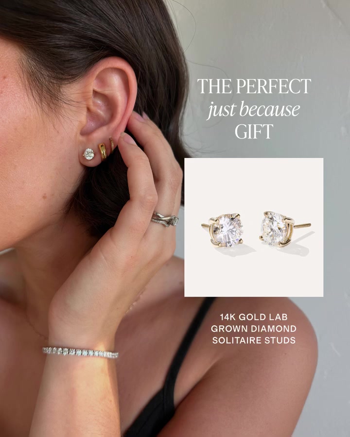
Quince's ad shows a simple pair of studs as a gift. The page backs up its low price with named competitors and a cost breakdown.

The landing page
Page data:
- Ad running for: 391 days (since October 2025), still active
- Page type: Product page
- Above the fold: a large model photo and a pinned "Add to Bag - $998.00" button with "You save 38%." No rating until you scroll.
- Impression rank: 5,331st among Quince's ads, live in 10 ads
Page sections:
- Hero: model photos and the pinned button.
- Buy box: 189 reviews, the price against traditional retail, color and carat choices, and shipping and return notes.
- Review highlights: 4.9 out of 5, with 3 short reviews.
- Comparison: "Beyond Compare", Quince at $998 against Ring Concierge at $1,618 and Blue Nile at $1,730.
- More products: "Shop the Look" and "More to Explore."
- Transparent pricing: the materials, crafting, packaging and other costs itemized to a total cost of $459.88.
- FAQ: "All Your Questions, Answered."
- Reviews: an AI review summary, filters, a gallery and full reviews.
Message match: The ad shows the same 14K gold lab grown diamond solitaire studs. Its copy about jewelry "at a fraction of the cost" is what the comparison table and pricing section then prove.
Why it works: $998 is a big purchase to make from a phone, so the page does the price argument for you. It names the competitors and shows the cost of making the studs.
Steal this: If you win on price, put a named comparison and your cost breakdown on the product page, as long as you can prove them.
Collections
10. Adornmonde: an explainer ad to a filterable piercing collection
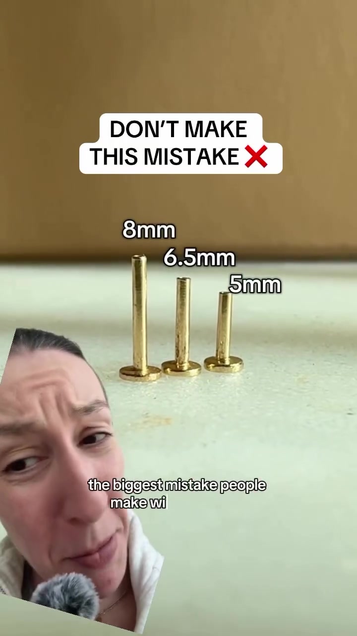
Adornmonde's ad teaches one thing about flat back piercings. The click goes to the full collection so you can find the right one.
The landing page
Page data:
- Ad running for: 381 days (since October 2025), still active
- Page type: Collection
- Above the fold: a free gift banner, the title "Flat back piercings", a short description, filter chips and the first products.
- Impression rank: 28th among Adornmonde's ads, live in 17 ads
Page sections:
- Hero: the banner, the title, "Sits flush and out of mind" and filters by piercing type.
- Product grid: single earrings, mostly from US$130 to US$342, in solid 14k gold.
- Promo: a free Wish Anklet on orders of $240 or more.
- Load more: "You have viewed 26 of 196 items" with a Show Me More button.
- Explainer: a short note on internally threaded flat backs.
- Benefits: "Made to stay in" and "Solid gold, no shortcuts."
Message match: The ad opens: "The biggest mistake people make with flatbacks, picking the wrong post length." The page has the same flat backs with filters by placement, so a shopper can act on what they just learned.
Why it works: The ad is a useful lesson more than a pitch, so a collection makes sense. The viewer doesn't yet know which piece they want, and they can browse by where it goes.
Steal this: After an educational ad, send people to a filterable collection, not one product.
Homepages
11. BabyGold: a creator code ad to a homepage full of categories
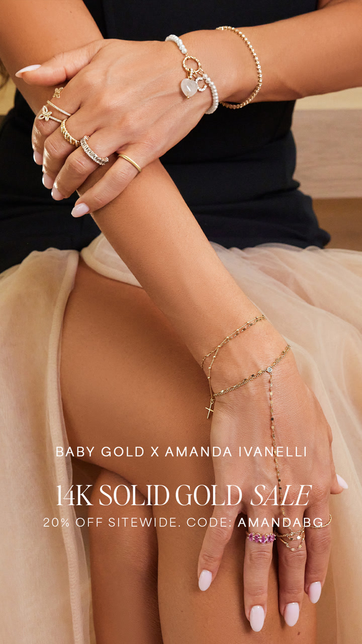
This image ad is a creator partnership with a discount code, and it sends people to the homepage to browse.
The landing page
Page data:
- Ad running for: 540 days (since May 2025), still active
- Page type: Homepage
- Above the fold: a large necklace photo, "Black Friday Sale, Happening Now", 25% off sitewide with code EARLY26 and a Shop Now button.
- Impression rank: 76th among BabyGold's ads, live in 10 ads
Page sections:
- Hero: the sale photo and code.
- Categories: a tile for each jewelry type.
- Banners: "Personalized, just for you" and "Bring on the Charm."
- The Line Up: best sellers, new arrivals and personalized tabs, with prices from $230 on the first chain.
- BG Babes edit: a feature on model Nicole Williams English and her favorite pieces.
- Reviews: "Loved by over 600,000+ customers."
- Press: a quote and a link to more coverage.
- Our story: "always 14K solid gold", made in a family-owned factory in Los Angeles.
Message match: The ad and page both sell 14K solid gold jewelry with a sitewide code. The specific offers differ: the ad has 20% off with AMANDABG, and the homepage has 25% off with EARLY26, so the creator's code isn't on the page.
Why it works: The ad is about the brand and a sitewide sale, not one piece, so a homepage gives the shopper the whole range to use the code on.
Steal this: If you run an always-on creator code, make sure the homepage offer doesn't undercut it when a sale starts.
12. RW Fine Jewelry: "as seen in" to a high-end homepage
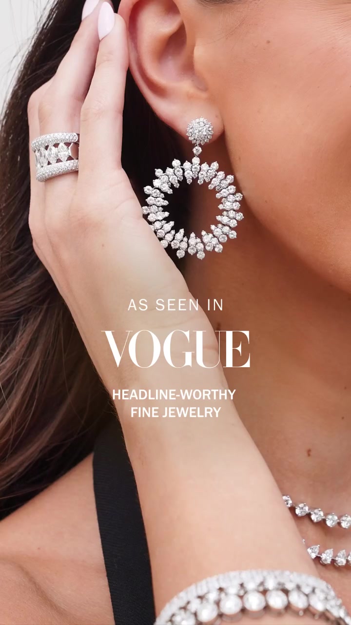
RW Fine's ad leads with press. Its homepage then does what a showroom would.
The landing page
Page data:
- Ad running for: 330 days (since December 2025), still active
- Page type: Homepage
- Above the fold: a "Free Shipping On Orders Over $500" bar, a model photo, "Make It Personal" and a Shop Now link. No price or rating.
- Impression rank: 3rd among RW Fine's ads, live in 1 ad
Page sections:
- Hero: the model photo and a line about planning holiday gifts ahead.
- Categories: new arrivals, bracelets, earrings, necklaces and rings.
- New and now: a product grid, starting at $2,110.
- Collections: Founder's Favorites, Classic Collective, engagement rings and wedding bands.
- Press: Bazaar, Vogue and USA Today logos.
- Reviews: "Rave Reviews" from verified buyers.
- Loyalty: "The Fine Society", a free points program.
- Personalized: custom gifts.
- Services: bespoke appointments and a gifting suite.
- Our story: the founder and the team in the store.
Message match: The ad says "As seen in Bazaar", and its copy mentions Vogue. Both logos are on the page, but halfway down. The hero is about holiday gifting instead, so the match is more about the look than the message.
Why it works: At these prices, buyers want to see a real business before they spend. The homepage gives them a store, a founder, appointments and financing to look through, not a single checkout path.
Steal this: For high-ticket jewelry, make booking an appointment as easy to find as the shop.
Patterns across these 12 landing pages
Counted from the captures and the Adspo data:
- Few go to the homepage. 3 of the 12 ads go to a product page, 2 to a dedicated landing page, 2 to a campaign or guided page, 2 to an offer page on a collection URL, 1 to a plain collection and 2 to a homepage.
- Offers come before prices. 9 of the 12 pages show some kind of offer on the first screen, but only 3 show a price (Louise Carter, Hearts Valley and Quince).
- Ratings usually wait too. Only 3 show a star rating or review count on the first screen (Vincero, Louise Carter and Hearts Valley).
- Offers often don't carry over. 6 of the 12 ads mention a specific deal. 3 of them have that deal on the page (PupRing, Louise Carter and Bellaucci). The other 3 (Hearts Valley, BabyGold and Jewels & Aces) show a different one, or none that matches.
- The piece usually does. Hearts Valley, Cherish These, Quince and Jewels & Aces all carry the exact product or product name from the ad onto the first screen.
- Photos do most of the work. Most first screens lead with a large close-up or model photo, usually worn on the body.
- Sticky buttons are in the minority. 5 of the 12 pages use one (Hearts Valley, Cherish These, Quince, Jewels & Aces and Sarah & Sebastian).
- Popups are common. 5 of the 12 pages (Quince, Jewels & Aces, Adornmonde, RW Fine and Louise Carter) showed a popup we had to close before seeing the page.
- Page length varies a lot. The median page here has 7 sections, from 5 on PupRing and Bellaucci to 10 on RW Fine.
- These ads last. The median ad runtime in this set is 462 days, and 9 of the 12 have run for more than a year.
How to build a landing page for your Facebook ads
These steps come from what the pages above have in common. They don't prove a page converts, but brands keep paying to send traffic to them.
Step 1: Decide if the ad is about a piece, a deal or the brand
An ad about one piece goes to its product page (Hearts Valley). An ad about a bundle goes to an offer page (Louise Carter). An ad about the brand can go to a homepage or campaign page (RW Fine, Sarah & Sebastian).
Step 2: Show the same piece, photographed the same way
Jewelry is small, and a shopper needs to recognize it instantly. Use the same close-up in the ad and at the top of the page, worn on the body if the ad shows it that way.
Step 3: Repeat the offer exactly
If your ad gives a deal or code, make sure the page shows it. 3 of the 6 ads here with a deal don't have it on the page. Check this again whenever a sale starts.
Step 4: Answer the jewelry questions
What's it made of? Will it tarnish? Is it safe for sensitive skin? Will it fit? Jewels & Aces puts these in benefits and an FAQ, and Louise Carter puts "waterproof" and a color warranty near the top.
Step 5: Match the page to the price
At lower prices, a clear offer and a grid may be enough (Bellaucci). As the price rises, add proof: a price comparison (Quince), press and appointments (RW Fine), or a whole story (Sarah & Sebastian).
Step 6: Check it on your phone
Close the popups, look at what fits on the first screen, and scroll the whole page. If it has a popup, make sure it isn't covering the piece the shopper came to see.
Find the landing pages behind any ad with Adspo
The Facebook Ad Library shows a brand's ads, but not which landing pages it keeps sending traffic to. Adspo shows the landing page on every creative, and each brand page lists its top landing pages with how many of the brand's creatives point to each one.
 Jambys brand page in the Adspo app showing 99 creatives and 201 ads, 40 new creatives in the last 30 days, 98% US targeting and its top landing pages, led by the black-black product page with 38 creatives
Here's that view on a brand from our clothing brand landing page examples. To find jewelry landing pages, filter to the Jewelry & Accessories category, keep active ads only and sort by longest running, then open any brand to see where its traffic goes. For more niches, see our supplement landing page examples and skincare landing page examples, or start from the ads with 50 Facebook ad examples.
Adspo costs $29 a month, or $19 a month billed yearly, with a 7-day free trial.
Frequently asked questions
What makes a good jewelry landing page?
In the 12 pages here, the ones brands keep paying to send traffic to continue the ad: the same piece, the same offer or the same idea. Hearts Valley's ad and page both lead with the envelope necklace, Louise Carter's button repeats the ad's 7 for $85, and Bellaucci's restock ad lands on a grid tagged Restocked and Low stock.
Should jewelry ads go to a product page or a collection?
Both show up. 3 of the 12 ads go to a single product page, and those ads show one piece: an envelope necklace, a rose bear giftbox and a pair of diamond studs. 3 go to a collection or a collection built around an offer, which suits ads about a range or a pick-your-own bundle.
Do jewelry ads ever go to the homepage?
Yes, but rarely in this set. 2 of the 12 go to a homepage (BabyGold and RW Fine Jewelry), and both ads sell the brand and its range rather than one piece. The other 10 go to a page closer to what the ad shows.
What should be above the fold on a jewelry landing page?
In this set, the first screen usually leads with a large photo of the piece being worn. Only 3 of the 12 show a price on the first screen and 3 show a star rating, while 9 of the 12 show some kind of offer. A big worn photo plus one clear offer is the most common opening.
What is a dedicated jewelry landing page?
It's a page built for ad traffic, with no standard store layout. PupRing's page has one product idea, a Buy One, Get One Free offer, a 3-step explanation of how the personalized necklace is made and a 30-day guarantee, with the same button repeated between sections.
How do I see a competitor's jewelry landing pages?
Click through their ads in the free Facebook Ad Library, or use Adspo, which lists the landing page on every creative and shows each brand's top landing pages and how many of its creatives point to each one. Sorting by longest running shows the pages a brand has kept sending traffic to for months.
Wrapping it up
The jewelry pages brands keep paying for match the ad's piece, explain what the buyer needs to know for that price, and rarely send people to the homepage. Start by checking whether your own page repeats your ad's offer.
Try Adspo free for 7 days and see where the long-running ads in your niche send their traffic.