

An us vs them ad is an ad that puts your product next to the alternative and makes the difference obvious at a glance. The us vs them ad examples you've seen are likely a two-column checklist with ticks and crosses, a pile of competitor boxes next to one small one, or a side-by-side video test. The "them" is a rival, a product type or an old habit.
Brands use it because it answers the question every shopper is already asking: why this and not what I use now? Below are 10 us vs them ad examples that brands have kept running for 286 to 1,232 days, plus how to make one and a template you can copy.
What is an us vs them ad?
An us vs them ad is a comparison with a point of view. It sets up two options, then makes one look like the obvious choice. It has one job: to give someone who already buys something else a reason to switch.
Here's what you'll usually see:
- Two sides. Two columns, a split image, or a video that shows one and then the other.
- A clear "them". A competitor, a product type (microfibre quilts, crystal litter) or a habit (manual notes).
- The same measure on both sides. Price, lifespan, drying time, washes per pack.
- A visual verdict. Ticks and crosses, a green and red color split, or one result that plainly looks better.
- Very little copy on the creative. The layout does most of the talking.
It comes in three common forms. The table lists features in rows (Bonny, Paire, Heidi). The visual stack shows the difference with objects and hardly any words (smol, Tooletries). The side-by-side demo runs both products through the same test on video (Henson Shaving).
Us vs them ads vs before and after ads
These two get mixed up because both often use a split screen. They make different arguments.
| Us vs them ad | Before and after ad | |
|---|---|---|
| What it compares | Two products or options | One person or thing at two points in time |
| The message | Choose this instead | This is what changes |
| Best for | Crowded categories where buyers already use something | Products with a visible result |
| Main risk | An unfair or unprovable comparison | Result claims, which Meta's ad policies restrict in some categories |
A neighbor worth knowing is the testimonial ad, where a customer makes the comparison in their own words. It's softer and easier to believe, but less scannable. If you're ranking five or six options instead of two, that's a tier list, one form of the listicle ad. For more on how formats fit together, start with our guide to UGC ads.
Why brands use us vs them ads
They speak to people who already buy the category. Most shoppers aren't starting from zero. They have a razor, a doona, a brand of laundry capsules. A comparison starts from what they own today.
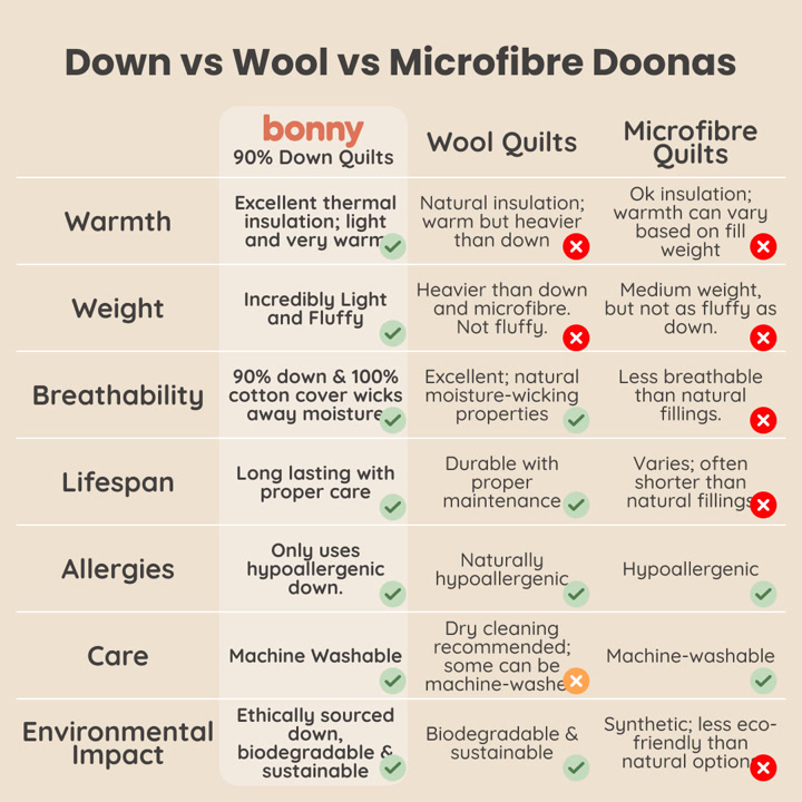
They make the reasons to switch scannable. Bonny's table fits 7 comparison points into one image. A viewer takes in the pattern of ticks and crosses before reading a single row.
They work without a big production. A table needs a designer, not a shoot. 15 of the 35 active creatives we reviewed with this tag were images.
They last. Among the 10 examples below, the median has been running for 664 days, and smol's has been live for 1,232. That doesn't prove they convert, since Adspo can't see a brand's results. It does show brands keep paying to run them.
On video, the format often leans on a live test: 13 of the 20 videos we reviewed were also tagged Demo.
10 us vs them ad examples from real brands
We pulled active ads tagged Us vs Them in Adspo on November 6, 2026, filtered to English ads running for 60+ days, and reviewed 35 creatives from 27 brands. We looked at each one, then kept one per brand and aimed for a mix of forms and categories. We left out ads built around health results. Impression rank is where the ad sits among that brand's own ads, by impressions, not across Meta.
1. smol: a wall of boxes for the same number of washes
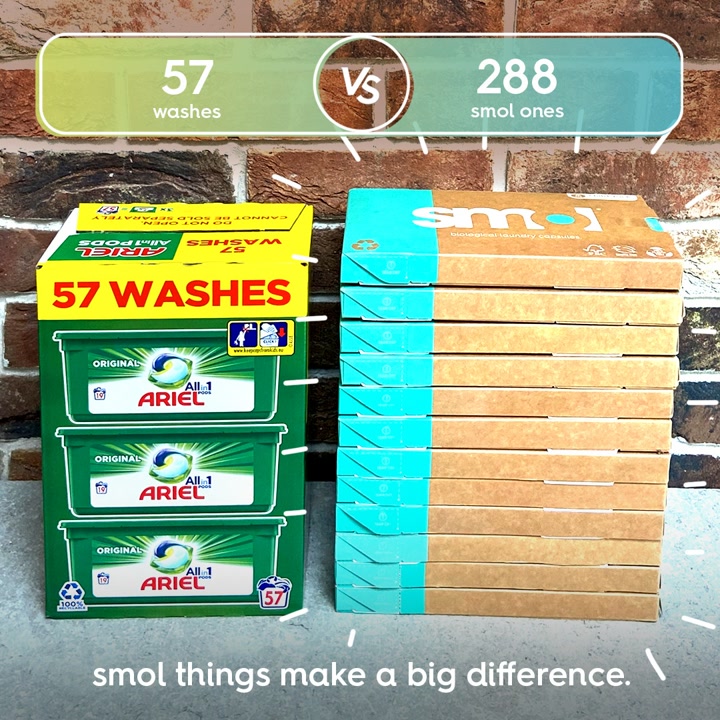
smol's image stacks 3 boxes of Ariel next to a tall column of its own flat packs, so you see the difference before you read anything.

Ad data:
- Running for: 1,232 days (since June 2023), still active
- Impression rank: #1 of smol's creatives
- Format: Image: us vs them, product shot
The hook: "57 washes vs 288 smol ones."
What makes it a good us vs them ad: It uses one number, the number of washes, and the objects themselves carry the argument. It names the rival outright and links to a page built for the comparison (/pages/smol-vs-ariel), so the ad and the page make the same case.
Steal this: Stack your product and the alternative in the same photo, and let one number on top explain what you're looking at.
2. Bonny: a 3-way table with 7 rows
Bonny compares its down quilts with the two materials shoppers might buy instead, across everything they might care about.

Ad data:
- Running for: 1,051 days (since December 2023), still active
- Impression rank: #2 of Bonny's creatives
- Format: Image: us vs them, illustration, features and benefits
The hook: "Down vs Wool vs Microfibre Doonas."
What makes it a good us vs them ad: The title sounds like a search someone would run, so it reads as a useful guide rather than a pitch. It also gives the rivals some credit in places, like wool's natural insulation, which makes the table easier to trust.
Steal this: Compare against product types, and write the headline like the question a shopper is already asking.
3. Tooletries: 5 years of loofahs vs 1 scrubber
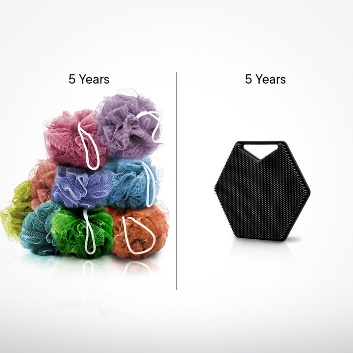
This one has almost no words. The left side shows a heap of colorful loofahs, the right side one black silicone scrubber, and both are labeled "5 Years."

Ad data:
- Running for: 717 days (since November 2024), still active
- Impression rank: #9 of Tooletries' creatives
- Format: Image: us vs them, product shot
The hook: "5 Years" on both sides of the split.
What makes it a good us vs them ad: It turns a dull benefit (lasts longer) into something you can see. The viewer works out the argument themselves, and the copy handles the details: 100% silicone, dishwasher safe.
Steal this: If your edge is durability, show how many of the other product someone would go through in the same time.
4. Nook Saunas: a thumbs down for "free delivery"
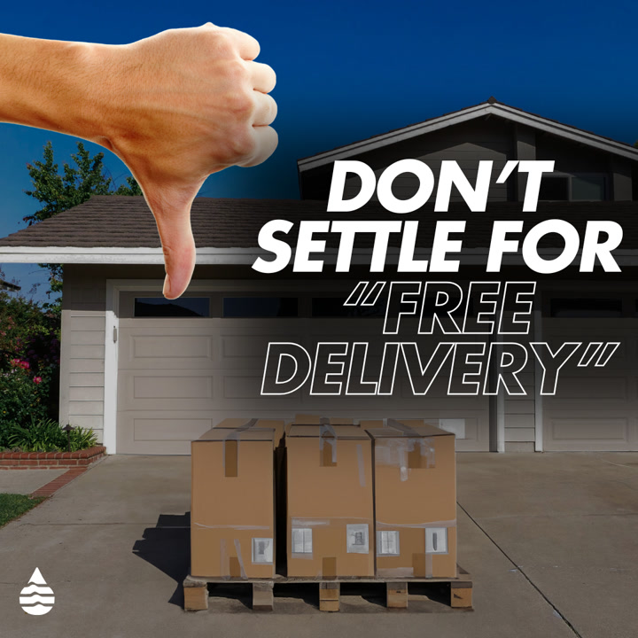
Nook's "them" isn't a product, it's a promise other sellers make. The image shows a pallet of boxes dumped on a driveway.

Ad data:
- Running for: 689 days (since December 2024), still active
- Impression rank: #7 of Nook Saunas' creatives
- Format: Image: us vs them
The hook: "Don't settle for 'free delivery'."
What makes it a good us vs them ad: It only shows the "them" side and leaves "us" to the viewer's imagination. The image makes a common selling point look like a problem, because a sauna on a pallet is now your job to deal with. The headline carries the same stance: "We Don't Do Ice Baths."
Steal this: Find the perk every competitor advertises and show what it really looks like for the buyer.
5. Paire: Us, Them and one pair of undies down the middle
Paire takes the format literally. One pair of underwear sits across a split background with "Us" on one side and "Them" on the other.
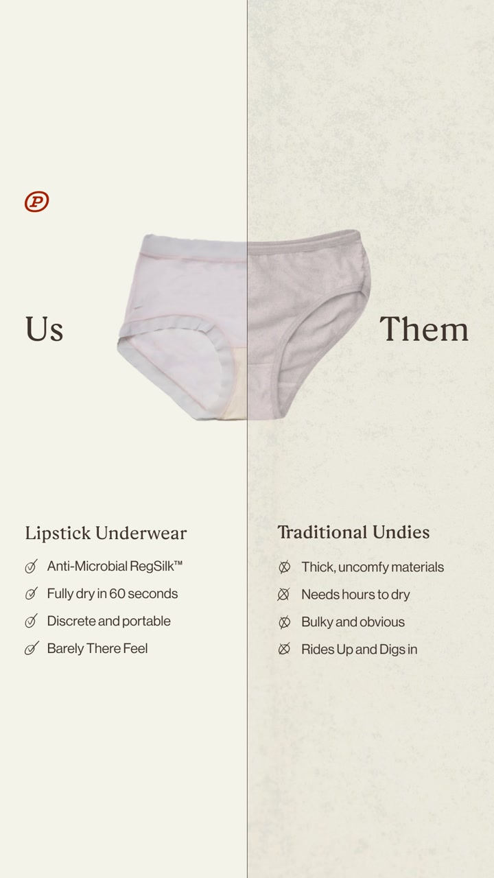

Ad data:
- Running for: 688 days (since December 2024), still active
- Impression rank: #50 of Paire's creatives
- Format: Image: us vs them, features and benefits
The hook: "Us" and "Them", with the headline "Undies in the Size of Lipstick."
What makes it a good us vs them ad: Each row is a direct pair: "fully dry in 60 seconds" against "needs hours to dry", "discreet and portable" against "bulky and obvious." Because the rows match, you can compare them line by line.
Steal this: Write the two columns as matched pairs, so every claim on your side has an opposite on theirs.
6. Duppe Scents: their price, our price
Duppe's table has only 2 number columns: what the designer bottle costs and what its version costs.
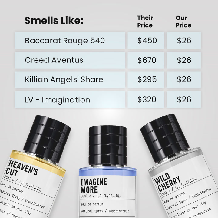
Ad data:
- Running for: 641 days (since February 2025), still active
- Impression rank: #19 of Duppe Scents' creatives
- Format: Image: us vs them, product shot
The hook: "Smells Like:" with $670 next to $26 on the same row.
What makes it a good us vs them ad: When price is the entire argument, it drops everything else. The column header "Smells Like" does the explaining, and the same $26 on every row makes the point again and again.
Steal this: If you win on price, cut the features and show their number next to yours, row after row.
7. Henson Shaving: the same test on two razors
Henson runs a razor along a material on camera, then does the same with its own, with the shot split to show both.
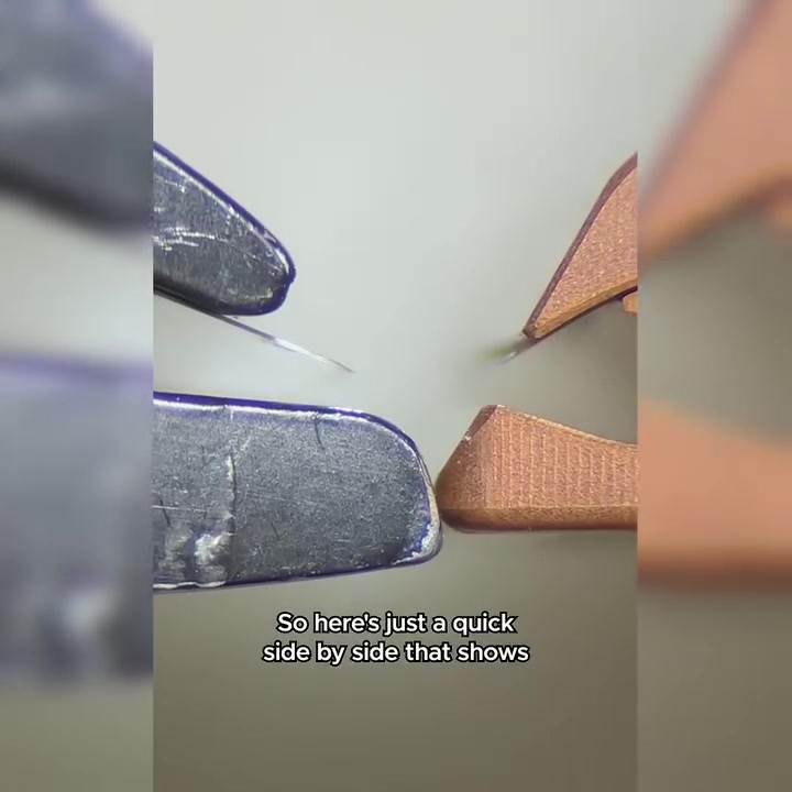

Ad data:
- Running for: 474 days (since July 2025), still active
- Impression rank: #17 of Henson Shaving's creatives
- Format: Video: demo, us vs them
The hook: "So here's just a quick side-by-side that shows the Henson versus your typical safety razor."
What makes it a good us vs them ad: The opening line says exactly what's coming, and the "them" is a "typical safety razor", not a named rival. At 29 seconds, the voiceover just narrates what you're watching: one razor "digs and it bites", the other "glides."
Steal this: Run the same test on both products in one continuous close-up, and have the voiceover describe only what's on screen.
8. Tuft & Paw: an attack on a whole product type
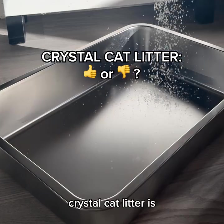
Tuft & Paw picks a fight with crystal litter, with one blunt opening line and an on-screen question.

Ad data:
- Running for: 456 days (since August 2025), still active
- Impression rank: #28 of Tuft & Paw's creatives
- Format: Video: demo, us vs them
The hook: "If you think about it, crystal cat litter is basically a sandbox filled with your cat's old pee."
What makes it a good us vs them ad: It spends most of its 36 seconds on "them" and explains the one thing that makes the alternative worse: crystal doesn't clump, so it can't be scooped out. Its own litter only needs a line or two after that. It goes to a dedicated page for the litter, not the homepage.
Steal this: Pick the one fact about the alternative that your buyer doesn't know yet, and open with it.
9. Heidi: a software comparison that shows the paper
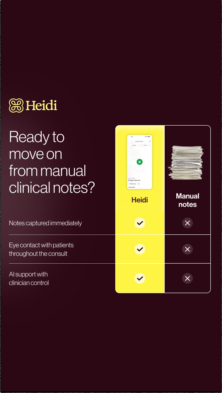
Us vs them isn't only for physical products. Heidi, an AI tool for clinical notes, compares itself with the habit it replaces.

Ad data:
- Running for: 298 days (since January 2026), still active
- Impression rank: #6 of Heidi's creatives
- Format: Image: us vs them, features and benefits
The hook: "Ready to move on from manual clinical notes?"
What makes it a good us vs them ad: The rival isn't another app, it's a stack of paper, and that photo says more than the rows do. Keeping it to 3 rows and highlighting Heidi's column in yellow means your eye lands on the right side first.
Steal this: For software, compare against the manual process, and use a photo of the mess instead of a competitor's logo.
10. Pact: US and THEM as two plain lists
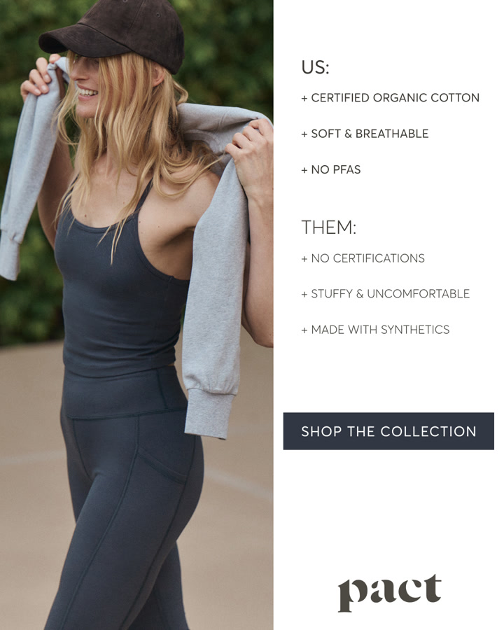
Pact keeps its lifestyle photo and adds the shortest comparison possible beside it, with no table or icons.

Ad data:
- Running for: 286 days (since January 2026), still active
- Impression rank: #12 of Pact's creatives
- Format: Image: lifestyle, us vs them, features and benefits
The hook: "US: certified organic cotton. THEM: no certifications."
What makes it a good us vs them ad: It shows that a comparison can sit inside a normal brand ad. The photo still reads as a normal lifestyle ad, and the 3 points on each side line up: certified against no certifications, breathable against stuffy, no PFAS against synthetics.
Steal this: Add a 3-line US and THEM list to a lifestyle photo you already have, before you commission anything new.
How to make an us vs them ad: step by step
Step 1: Pick one "them"
Choose the thing your buyer is most likely using today. A product type works best for most brands, since only 2 of the 10 examples here name other companies. If people have to work out who "them" is, the ad has lost them.
Step 2: Find the difference that matters
Ask your reviews and support tickets why people switched. You want the reason a real customer gave, not the feature your team is proudest of. Tuft & Paw's whole ad is one fact about clumping.
Step 3: Choose your form
Use a table if you win on several points, a visual stack if you can photograph the difference, a price column if you win on cost, and a side-by-side demo if the product can be tested on camera.
Step 4: Write matched pairs
Keep each row short, and make both sides talk about the same thing. Paire's "fully dry in 60 seconds" against "needs hours to dry" works because you're comparing like with like. 3 to 4 rows is plenty for a phone screen, though Bonny's 7 work because it's a guide.
Step 5: Be fair, and check your claims
Include only things you can prove. Give the other side credit where it's true, as Bonny does. If you name a competitor or quote a price, make sure it's accurate and current, and check the rules for comparative advertising in your market.
Step 6: Send it to a page that continues the argument
smol sends its ad to a page called smol-vs-ariel. Tuft & Paw sends its video to a dedicated litter page. A comparison ad that lands on a generic homepage drops the argument it just made. See our landing page examples for how brands carry an ad's message onto the page.
Step 7: Test the "them", not just the design
Run the same layout against different alternatives, such as the product type, the old habit and the cheaper option. Find out which rival your audience actually cares about, then change the visuals. Our guide on how many ads to test per week covers how to fit this in.
Us vs them ad template
Copy these and fill in the brackets.
STATIC: TABLE (4:5)

Headline:    [Your product type] vs [them]: [question the buyer has]

             [YOUR BRAND]              [THEM]
Row 1        [Benefit, 2 to 5 words]   [Matching downside]
Row 2        [Benefit, 2 to 5 words]   [Matching downside]
Row 3        [Benefit, 2 to 5 words]   [Matching downside]

Button:      [Try it / Shop now]
Proof:       [Review count or guarantee you can back up]


VIDEO: SIDE-BY-SIDE DEMO (9:16, 30 to 40 seconds)

0-3s    Hook: "Here's a quick side by side of [us] and your typical [them]."
3-12s   Show them: run the test, and say what's going wrong.
12-22s  Show us: the exact same test, same angle, same light.
22-30s  Why: the one design reason for the difference.
30-35s  CTA: "If you're still using [them], try [us]." + offer or guarantee.

Rules: same test on both, one continuous shot if you can,
captions on, no claims you can't prove.
Common mistakes
- A straw man "them". If the other column is a cartoonishly bad product, no one believes the ad. Compare against what people really use.
- Too many rows. A table that reads fine on your monitor can be tiny on a phone. Check it at phone size first.
- Rows that don't match. If one side talks about price and the other about comfort, the comparison falls apart.
- Claims you can't back up. Comparisons invite scrutiny, and they're especially risky around health or results. Stick to what you can prove.
- Comparing on what buyers don't care about. A win on something no one was worried about doesn't give anyone a reason to switch.
- Forgetting the ask. A clear comparison still needs a next step. Say what to do, and give a reason to do it now.
Find us vs them ad examples with Adspo
The Meta Ad Library can't filter by format, so finding comparison ads means guessing at brands and scrolling (here's how to use the Facebook Ad Library if you're starting there). Adspo tags creatives by visual format, so you can pull up only this one.
 Adspo's Discover feed with a Visual format filter applied, here set to Talking Head with active ads sorted by longest running, showing runtime badges of 735, 623, 586, 559 and 552 days
In the Adspo Discover feed, add a Visual format filter and pick Us vs Them. The screenshot above shows the same filter set to another format. Sort by longest running to find comparisons brands have kept live, or add a category to see only your niche. Every ad shows its runtime, its impression rank in the brand's account and where it sends traffic.
Adspo costs $29 a month, or $19 a month billed yearly, with a 7-day free trial.
Frequently asked questions
What is an us vs them ad?
An us vs them ad puts your product next to the alternative and shows the difference. The "them" can be a named competitor, a product type like crystal cat litter, or the old way of doing something, like paper clinical notes. It's usually a two-column image, a checklist table or a side-by-side video.
What are the best us vs them ad examples?
The 10 examples in this post are all still running, for between 286 and 1,232 days. They include smol's stack of Ariel boxes next to its own, Duppe Scents' price table, Pact's plain US and THEM lists, Tooletries' 5 years of loofahs next to one scrubber, and Henson Shaving's side-by-side razor test.
Should an us vs them ad name the competitor?
Usually not. Only 2 of the 10 examples here name other brands: smol shows Ariel boxes and Duppe lists the designer perfumes it's inspired by. The other 8 compare against a category or a habit, like wool quilts, traditional undies or manual notes. That still reads clearly, and it avoids making claims about a specific company that you'd have to back up.
Do us vs them ads work as static ads?
Yes, and the format suits statics because a two-column layout reads in a second. 8 of the 10 examples here are images. Of the 35 active us vs them creatives we reviewed for this post, 15 were images and 20 were videos.
What is the difference between an us vs them ad and a before and after ad?
An us vs them ad compares two products or options. A before and after ad shows the same person or thing in two states over time. Us vs them says "choose this one instead." Before and after says "this is what changes."
Where can I find us vs them ad templates and examples?
This post has a copyable template for a static and for a video. For more examples, Adspo's Discover feed has a Us vs Them visual format filter, and you can sort the results by longest running to see the ones brands have kept live.
Wrapping it up
An us vs them ad gives someone who already buys something else one clear reason to switch. The 10 examples above have run for a median of 664 days, and 8 of them never name a rival brand. Pick the alternative your buyer uses today, compare on what they care about, and keep it fair.
Try Adspo free for 7 days and filter to Us vs Them to see what your category is running.