

A good clothing brand landing page picks up exactly where the ad left off: the same product, the same offer or even the same person. In the 11 pages below, the two ads with a simple discount show that discount word for word on the page, 4 of 11 go to a single product page, and 3 go to a collection, more than in most niches. None go to the homepage.
Each example shows the Facebook ad and the page it sends traffic to, side by side, the way a shopper sees them on a phone. Every ad was still running when we pulled the data, and they've been live for 199 to 1,120 days. Tap any landing page to scroll the whole thing, and use the section list to jump around. Under each one, we break the page down section by section.
Advertorials
1. Comfrt: a first-person travel story for one hoodie
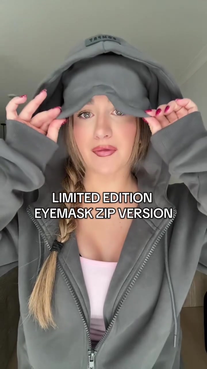
Comfrt's creator video about the zip-up version of its eye mask hoodie goes to an article on a separate subdomain, written as one frequent flyer's story.

The landing page
Page data:
- Ad running for: 321 days (since December 2025), still active
- Page type: Advertorial on its own subdomain (try.comfrt.com), labeled "Trending in the USA | Advertorial"
- Above the fold: a red Trending badge, "3 Min Read", the headline about sleeping through flights and a note that "most travel sleep hacks are a waste of money". No price.
- Impression rank: 11th among Comfrt's ads, live in 78 ads
Page sections:
- Hero: headline, a photo of three people in Comfrt hoodies on an airport bench, and an "As seen on" row of media logos.
- Problem: the writer's long-haul flights, the cabin light and every sleep hack that didn't work.
- Discovery: a comment on a layover photo that pointed them to the Comfrt Airplane Mode Travel Hoodie.
- Comparison: a checklist (built-in contoured eye mask, oversized double-lined hood, heavyweight fleece, zip sleeve pockets and 8 pockets total) against crossed-out alternatives like a bulky travel pillow.
- Reviews: "What Other Travelers Are Saying", a stack of 5-star quotes from verified buyers.
- Final CTA: "This Is the Part Where I Tell You to Hurry", with the hoodie at up to 50% off.
Message match: The ad shows the eye mask being pulled down over the creator's face. The page is the long version of that one feature: a hoodie you can sleep in on a plane.
Why it works: A feature like a built-in eye mask is easier to believe after a story. The page sells the problem (no sleep on flights) for most of its length and only mentions the discount at the end.
Steal this: For a product with one unusual feature, write a first-person story page that earns the feature before the price.
Offer and bundle pages
2. MeUndies: "20% off matching pairs" to a matching page
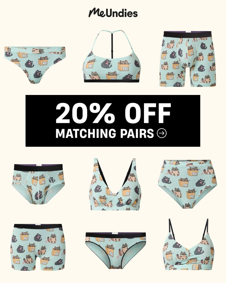
MeUndies' print-heavy image ad is all about couples' matching underwear, and it sends people to a page built around the same idea.

The landing page
Page data:
- Ad running for: 563 days (since April 2025), still active
- Page type: Offer page for one idea (matching pairs)
- Above the fold: "Get 20% off" with the code WELCOMEFAM on a photo of a matching pair, the headline "Couples Matching Underwear" and a Start Matching button.
- Impression rank: 48th among MeUndies' ads, live in 23 ads
Page sections:
- Hero: the 20% off banner, "MatchMe", the headline and Start Matching.
- Trust bar: 4 icons: "3X softer than cotton", "90K+ 5 star reviews", "50 million+ sold" and "Love it or it's on us".
- Customer videos: "MatchMe IRL", a carousel of couples' videos, each with a shoppable product card (a boxer brief at $29).
- Bundles: "Matching Bundles", like the Yours and Mine Bundle at $48 (was $63).
- Reviews: a carousel of short quotes, starting with "Super Comfortable!"
Message match: The ad says "20% off matching pairs" and the first screen says "Get 20% off" over a matching pair. Same discount, same product idea.
Why it works: The page is short (5 sections) because the offer is simple. It proves the idea with real couples on video, then gets straight to bundles.
Steal this: If your ad sells a use case ("matching"), send it to a page about that use case, not to a general underwear collection.
3. Knix: "Buy 3+ for 15% off" to a Buy More, Save More page
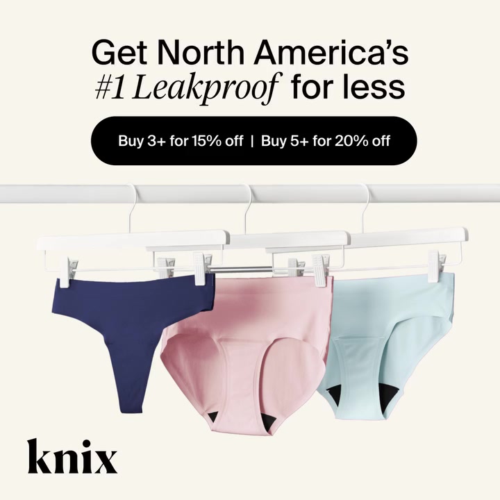
Knix's offer video repeats its tiered discount on screen, and the page it sends traffic to has the same tiers as its headline.

The landing page
Page data:
- Ad running for: 199 days (since April 2026), still active
- Page type: Offer page with a product grid
- Above the fold: "Buy More, Save More", "Buy 3, save 15%. Buy 5, save 20%.", "Mix and match colors, absorbencies, and styles. Discount applied at checkout.", absorbency filter chips and "100 items".
- Impression rank: 140th among Knix's ads, live in 10 ads
Page sections:
- Hero: the offer headline, the two tiers, the mix-and-match line and filter chips.
- Best sellers: a grid led by the Super Leakproof Dream Boxer at $48, under a black bar that repeats "Buy 3+ get 15% off | Buy 5+ get 20% off".
- Ultra absorbency: the highest absorbency styles, with promo tiles mixed into the grid.
- Heavy absorbency: the next tier of styles. The page runs past our 28,000 pixel capture limit.
Message match: Word for word. The ad says "Buy 3+ for 15% off | Buy 5+ for 20% off" and the page says "Buy 3, save 15%. Buy 5, save 20%."
Why it works: A tiered discount only works if the shopper can build an order fast. Grouping 100 items by absorbency lets someone fill a cart of 3 or 5 without leaving the page.
Steal this: For a quantity discount, land on a filtered grid of everything that qualifies, with the tiers repeated as you scroll.
4. BRUNT Workwear: a starter kit ad to a 3-step bundle builder
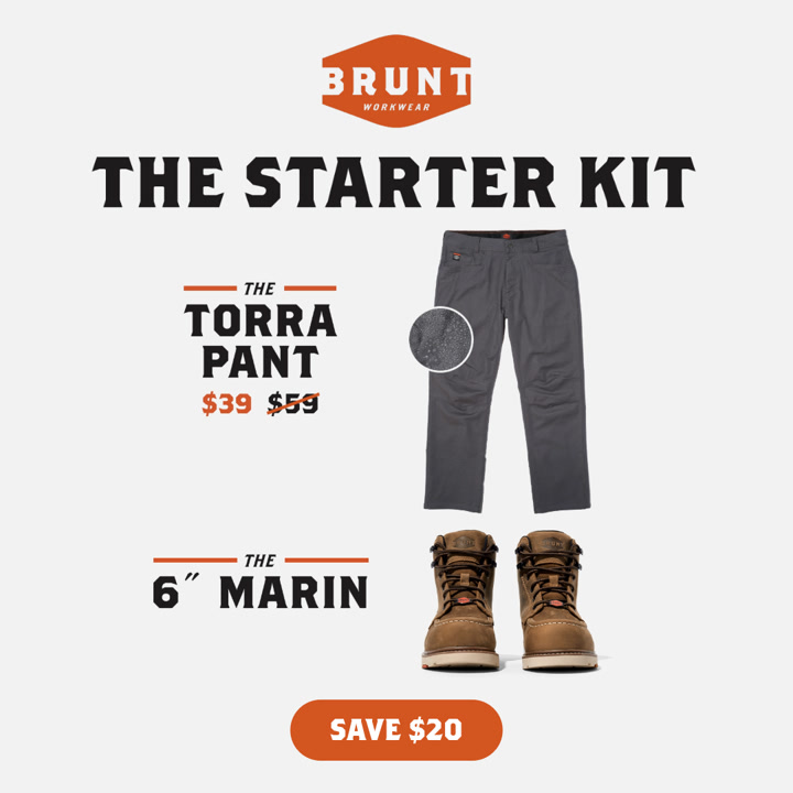
BRUNT's static ad sells a boots and pants "Starter Kit". The page lets you build that kit yourself.

The landing page
Page data:
- Ad running for: 724 days (since October 2024), still active
- Page type: Bundle builder
- Above the fold: "Gear Up & Save", "Save an extra 10% on your favorite pair of boots and pants or shorts", 3 step icons, "Bundles starting at: $184.48" (was $204.98) and a sticky Add Bundle to Cart bar at $193.48.
- Impression rank: 483rd among BRUNT's ads, live in 12 ads
Page sections:
- Hero: the offer, the 3 steps (select your boots, select your pants, save 10%) and the starting bundle price.
- Pick boots: step 1, the Marin Waterproof (Soft Toe) at $154.99 with 4.5 stars from 10,061 reviews, style, color, width and size pickers.
- Pick pants: step 2, the Torra Pant at $59.99 with 4.6 stars from 3,099 reviews, plus color, waist and length.
- Bundle total: the Add Bundle to Cart button with the bundle price, "Free Shipping & Exchanges" and "Try Risk-Free On The Job".
Message match: The ad and the page sell the same pair: the Marin boot and the Torra pant. The numbers don't match, though. The ad shows the pant at $39 and "Save $20", while the page shows the pant at $59.99 and a 10% bundle discount.
Why it works: Turning a two-product ad into two numbered steps makes a $190 order feel like a simple checklist. The sticky bar keeps the running total in view the whole time.
Steal this: For a kit ad, build the kit as steps on one page, and make sure the ad's price and discount are the ones the page shows.
Product pages
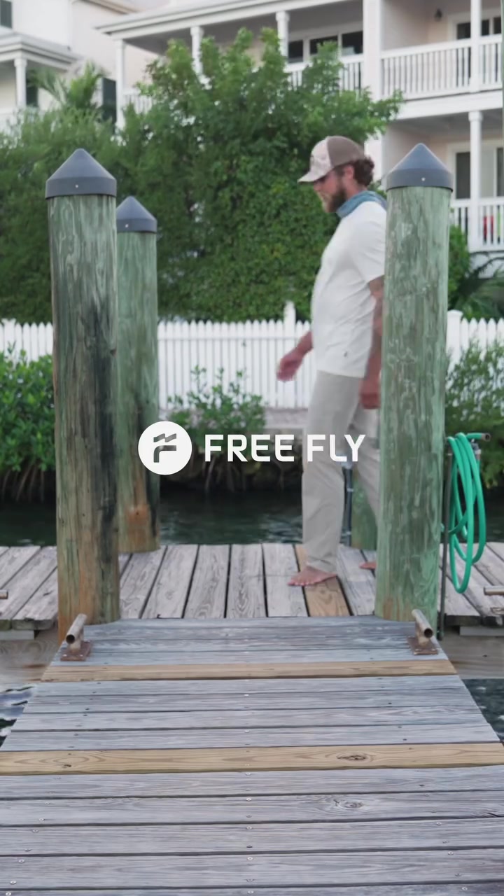
5. Free Fly: "I'm Alec Lucas" to a page with Alec Lucas on it
Free Fly's testimonial video opens with a fishing guide introducing himself. The product page it sends traffic to plays a video of the same guide.

The landing page
Page data:
- Ad running for: 254 days (since February 2026), still active
- Page type: Product page
- Above the fold: a large photo of the khaki pant with a "2025 Gear of the Year" badge and a fit note ("Model has 32" waist wearing size 32x32"). No price until you scroll.
- Impression rank: 146th among Free Fly's ads, live in 38 ads
Page sections:
- Hero: the product photo carousel, a Bestseller tag, "Men's Topogrid Pant", $108 and 164 reviews.
- Buy box: color and style options, size grid, Select a Size and "Why You'll Love It".
- Key features: UPF 50+ protection, quick-dry, water resistant and 2-way stretch.
- Video: "See It In Action", with "Free Fly Ambassador and fishing guide, Alec Lucas" walking through the pant.
- Fabric: "Topogrid Fabric", a stretch nylon ripstop with a DWR finish.
- Reviews: 4.8 out of 5 from 164 reviews, a fit slider, an AI summary and customer photos.
- More products: "You may also like" and recently viewed.
Message match: The ad's hook is "I'm Alec Lucas, and I like these pants." A third of the way down the page, Alec Lucas is back, in a video about the same pants.
Why it works: Someone who clicked because they trusted the guide gets more of the guide, not a stranger in a studio. It carries the ad's credibility onto the page.
Steal this: If a creator or expert carries your ad, put a clip of them on the page they send people to.
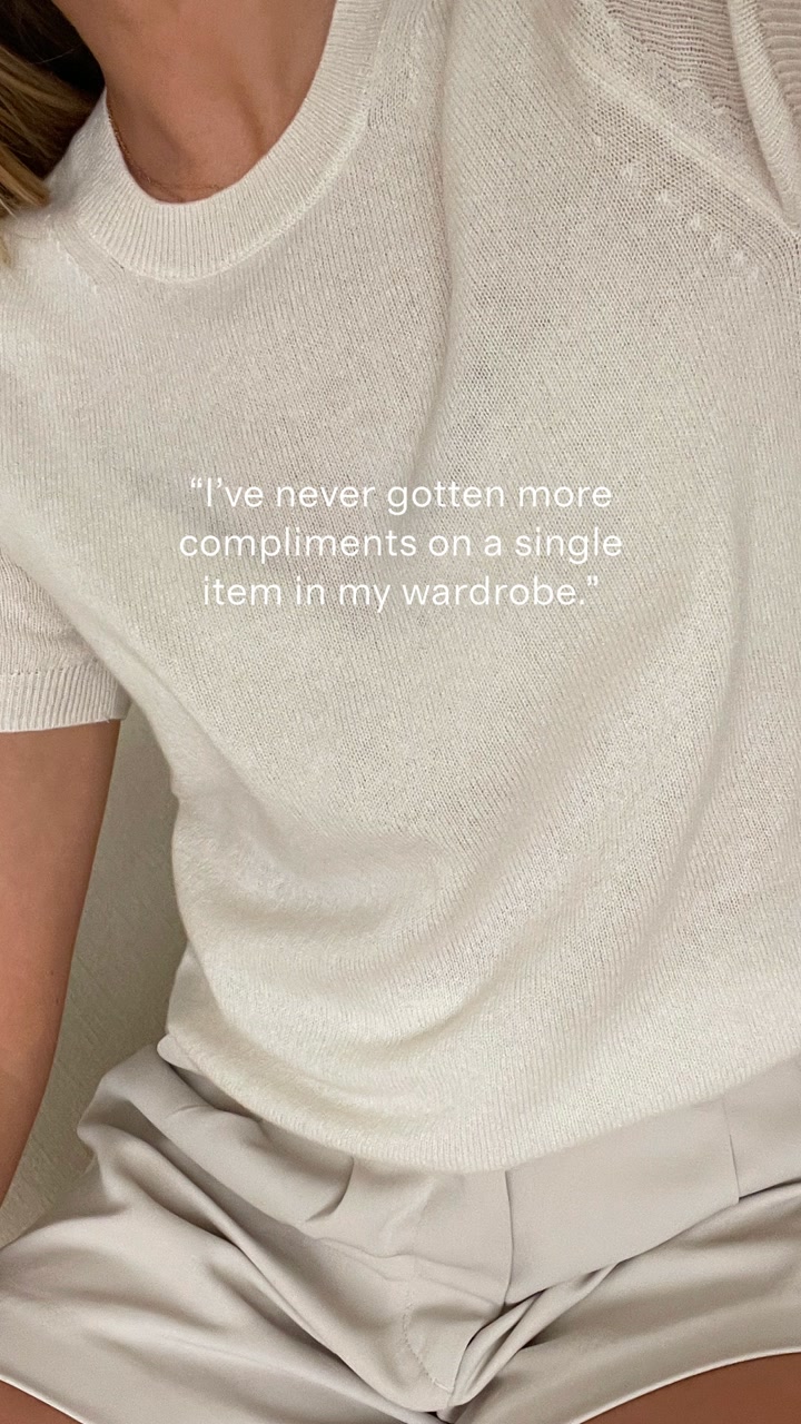
6. Quince: a compliments ad to a page that compares prices
Quince's static ad for its cashmere tee leans on one customer line. The product page leans on price.

The landing page
Page data:
- Ad running for: 411 days (since September 2025), still active
- Page type: Product page
- Above the fold: a model photo, an orange "Add to Bag - $44.90" button, "You save 60%" and "Shop happy with free shipping and easy returns for 365 days".
- Impression rank: 155th among Quince's ads, live in 14 ads
Page sections:
- Hero: photo, "Mongolian Cashmere Tee", 16,483 reviews, $44.90 against an original $115.00 "traditional retail", colors and sizes.
- Review highlights: 4.8 stars and 3 short reviews, like "Perfect fall cashmere sweater".
- Comparison: "Beyond Compare", Quince at $44.90 against State Cashmere at $115.00 and J.Crew at $158.00.
- Fabric: "Take a closer look", close-ups of the knit with notes like "Cozy weight".
- Pricing breakdown: "Transparent pricing", the cost of materials, crafting, packaging, freight and duties, adding up to $27.97.
- Customer photos: "Quince IRL", shoppers' photos with Buy It Now links.
- FAQ: "All your questions, answered", questions about feel, fit and care.
- Reviews: the full 4.8 rating with fit and length sliders and a review gallery. The page runs past our 28,000 pixel capture limit.
Message match: Partial. The ad sells the tee with a compliment, and the page backs it with 16,483 reviews, but the page's main argument is price, which the ad never mentions.
Why it works: "How is cashmere $44.90?" is the first question a shopper asks. The comparison table and the cost breakdown answer it before anyone has to wonder.
Steal this: If your price is the surprise, show your math: a competitor comparison and a cost breakdown.
7. Vuori: an organic try-on video to a clean product page
Vuori's ad looks like a phone video of someone trying on the pants at home. It goes straight to the product page for those pants.

The landing page
Page data:
- Ad running for: 510 days (since May 2025), still active
- Page type: Product page
- Above the fold: "Halo Essential Wideleg Pant", $118, a star rating with 4,823 reviews, a Best Seller badge on the model photo and a Select Size bar at the bottom.
- Impression rank: 529th among Vuori's ads, live in 22 ads
Page sections:
- Hero: name, price, rating, review count and the model photo.
- Buy box: length options (short, regular, long), sizes, Afterpay at 4 payments of $29.50 and free shipping over $75.
- Fabric: product details, fit notes and "Get To Know Our Fabrics" on DreamKnit.
- Collection story: "About The Halo Collection" with lifestyle photos.
- More products: "More From The Halo Collection" and "You May Also Like".
- Reviews: suggested questions, a 4.6 rating from 4,823 reviews, an AI review summary and individual reviews with height and size.
Message match: The ad shows the pants on a real person at home, and the page opens on the same black wide leg pant. The ad doesn't push an offer, so the page doesn't need one.
Why it works: Price, rating and review count all sit on the first screen, the only page in this set to show a rating before you scroll. For a $118 pant, 4,823 reviews does a lot of the selling.
Steal this: On a product page for a pricier basic, put the review count next to the price.
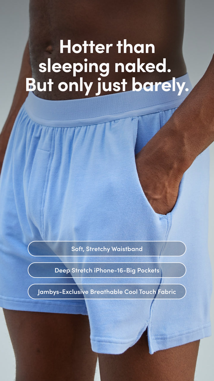
8. Jambys: a pockets ad to a page that leads with pockets
Jambys' static ad calls out the pockets on its house shorts. The page it sends traffic to says so in its top bar.

The landing page
Page data:
- Ad running for: 343 days (since November 2025), still active
- Page type: Product page
- Above the fold: a top bar reading "We put pockets on your boxers. Please remain calm.", a large photo of the black shorts and the title "Black Jambys". The price sits just below.
- Impression rank: 7th among Jambys' ads, live in 17 ads
- Share of the brand's ads: 38% of Jambys' creatives (38 of them) point to this page, its top landing page in Adspo
Page sections:
- Hero: photo carousel, "Black Jambys", $68.00, 4,686 reviews and "Officially the Best Sleep Shorts Ever Made. Source: Us."
- Buy box: sizes, Add to Cart and "Basics" bullets (comfort, house shorts, 95% Modal and 5% Spandex), plus a fabric chart rating softness, breathability and more.
- Shipping and returns: wear them for 77 days and return them free if they aren't your softest clothing.
- Pair it with: other colors at $68.00.
- Press: logos from Women's Health, The Cut and others.
- FAQ: where they're made, shipping, returns and care.
Message match: The ad labels "Deep Stretch iPhone-16-Big Pockets", and the first thing on the page is a joke about pockets on boxers. Same product, same angle, same tone.
Why it works: It's a short page (6 sections) for a $68 impulse buy, and the jokes in the ad carry straight through to the copy, so the brand feels the same on both.
Steal this: Keep your ad's voice on the page. If the ad is funny, the first line of the page should be too.
Collection pages
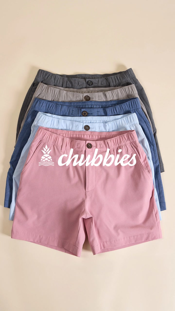
9. Chubbies: a stack of Everywear shorts to the Everywear collection
Chubbies' static ad stacks five colors of one short. The page shows every color of that short.

The landing page
Page data:
- Ad running for: 550 days (since April 2025), still active
- Page type: Collection page for one style
- Above the fold: "The Everywear Short" with 4 checkmarks (water resistant, anti-rip, ultra stretchy fabric, perfect for any activity) over an autoplaying close-up video. No price.
- Impression rank: 6th among Chubbies' ads, live in 29 ads
Page sections:
- Hero: the benefit checklist and the video.
- Popular styles: "With classic and breezetech fabric, The Everywear Short", 4.9 stars from 2.57K reviews, then "Our most popular Everywear styles".
- All colors: "Shop All Colors", a long grid of named colorways at $64.50 and $74.50, each with color dots and inseam options.
- Recommended: "Recommended For You" at the bottom.
Message match: The ad is five colors of one short, and the page is every color of that short. No hunting through other styles.
Why it works: When the product is one style in dozens of colors, a product page shows one color at a time. A collection for that single style lets the shopper browse all of them at once.
Steal this: If your ad shows color range, land on a collection filtered to that one product.
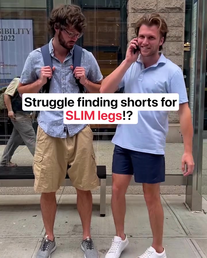
10. Birddogs: a slim-legs skit to the 3 in 1 khaki shorts
Birddogs' video opens with a problem ("Struggle finding shorts for SLIM legs!?") and sends people to the collection for the shorts that solve it.

The landing page
Page data:
- Ad running for: 597 days (since March 2025), still active
- Page type: Collection page
- Above the fold: "free shipping orders $150+", a photo banner reading "3 in 1 Khaki Shorts. One Short. For Everything.", the collection intro and the first row of shorts. No prices on the first screen.
- Impression rank: 349th among Birddogs' ads, live in 19 ads
- Share of the brand's ads: 14% of Birddogs' creatives (59 of them) point to this collection, its top landing page in Adspo
Page sections:
- Hero: the free shipping bar and the photo banner.
- Collection intro: "3 in 1s: look like khakis, stretch for activity, and dry like a bathing suit" and a "What do product names mean?" link.
- Product grid: shorts at $78 with joke names like The Marty McFridays and The Nightcaps, tagged Best Seller, New or Limited Edition.
- More styles: "Explore more styles" tiles for all shorts and golf.
Message match: Loose. The ad is about fit for slim legs, but the page talks about 3-in-1 versatility and never mentions fit. The shorts are the same; the reason to buy changes.
Why it works: Birddogs points more of its creatives at this collection than at any other page, so it's built to catch traffic from many different hooks, not just this one.
Steal this: If many ads share one landing page, make its intro broad, then test a version that repeats your best hook.
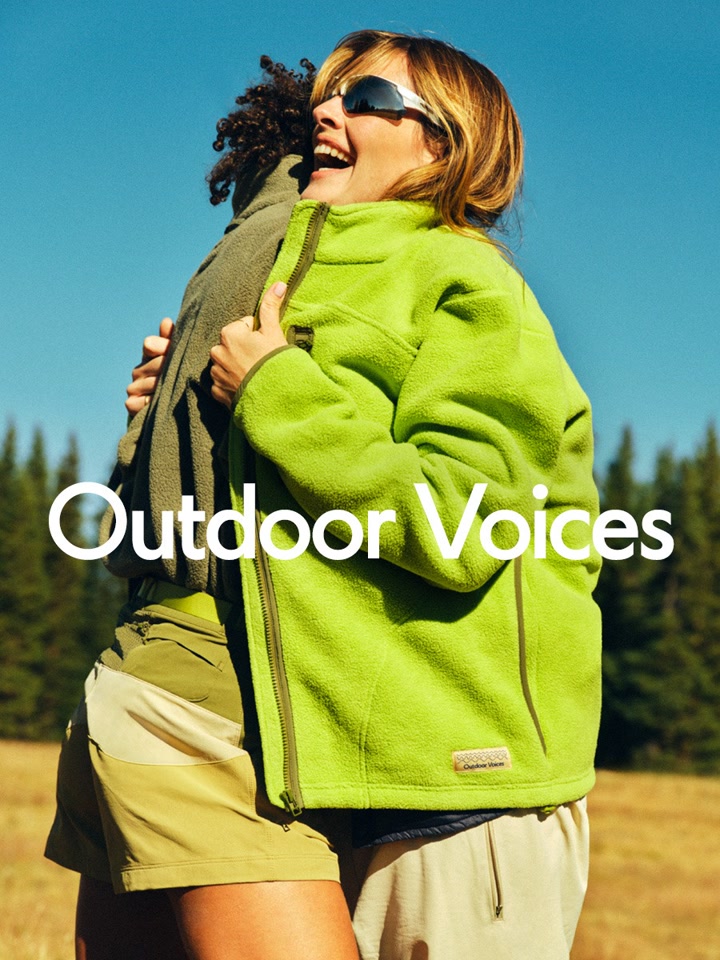
11. Outdoor Voices: a fleece ad running since 2023
Outdoor Voices' "Find Your Fleece" image ad has run for over 3 years, the longest in this set. It sends people to the new arrivals collection.

The landing page
Page data:
- Ad running for: 1,120 days (since September 2023), still active
- Page type: Collection page (women's new arrivals)
- Above the fold: "Free Shipping on orders $100+", the heading "New Arrivals", filter and sort, and the first row of RecTrek Zip Pants at $148.
- Impression rank: 1st among Outdoor Voices' ads, live in 1 ad
Page sections:
- Hero: the shipping bar, the "New Arrivals" heading and filter and sort.
- Pants: RecTrek zip, cargo and zip-off pants from $118 to $148.
- Tops: shortsleeve tees, baby tees and a club polo.
- Activewear: bras, leggings and shorts from the TechSweat, CloudKnit and Doing Things lines.
Message match: Weak today. The ad's headline is "Find Your Fleece", and the first screen of the page is pants. A new arrivals link stays live as the season turns, but the fleece from the ad isn't the first thing a shopper sees.
Why it works: It's the brand's top ad by impressions, and pointing an evergreen ad at "new arrivals" means it never lands on a sold-out product page.
Steal this: If you send an evergreen ad to a changing collection, check every season that the first row still matches the ad.
Patterns across these 11 landing pages
Counted from the captures and the Adspo data:
- No homepages. 4 of the 11 ads go to a product page, 3 to a collection, 3 to an offer or bundle page and 1 to an advertorial. None go to the homepage.
- Collections are common in clothing. 3 of the 11 land on a collection, usually for one style in many colors (Chubbies) or one product line (Birddogs).
- Simple offers carry over. 3 of the 11 ads show a discount in the creative. Knix and MeUndies repeat it word for word on the first screen. BRUNT's page has a bundle discount too, but a different one from the ad.
- The best matches go beyond the offer. Free Fly repeats the same person, Jambys the same joke and Chubbies the same product range.
- Prices often wait. Only 4 of the 11 show a price on the first screen (Quince, Vuori, BRUNT, Outdoor Voices). Most lead with a big product or model photo.
- Ratings wait even longer. Only Vuori shows a star rating on the first screen.
- Pages are shorter than in other niches. The median page has 5 sections, against 7 in our skincare landing page examples. Offer pages and collections are mostly product grids.
- These ads last. The median ad runtime in this set is 510 days, and 7 of the 11 have run for more than a year.
How to build a landing page for your Facebook ads
Step 1: Pick the page type from the ad
One product in the ad, one product page (Free Fly, Quince, Vuori). One style in many colors, a collection for that style (Chubbies). A discount, an offer page with everything that qualifies (Knix). A kit, a bundle builder (BRUNT). A story, an advertorial (Comfrt).
Step 2: Repeat the ad's offer exactly
Knix and MeUndies show the same discount, in nearly the same words, as their ads. BRUNT shows a different discount from its ad, which is the kind of gap that makes a shopper wonder if they're in the right place.
Step 3: Carry over the person and the voice
Free Fly brings back the guide from its ad. Jambys keeps its jokes. If someone clicked because of who was talking or how, give them more of it.
Step 4: Answer the obvious question
Quince answers "how is this so cheap?" with a comparison and a cost breakdown. Comfrt answers "does a hoodie really help me sleep?" with a story. Find your product's first objection and put the answer above the reviews.
Step 5: Keep an eye on evergreen ads
Outdoor Voices' ad has run for 1,120 days. When an ad lasts that long, the page behind it changes under it, so check that the first screen still matches the creative.
Find the landing pages behind any ad with Adspo
The Facebook Ad Library shows a brand's ads, but not which landing pages it keeps sending traffic to. Adspo shows the landing page on every creative, and each brand page lists its top landing pages with how many of the brand's creatives point to each one.
 Jambys brand page in the Adspo app showing 99 creatives and 201 ads, 40 new creatives in the last 30 days, 98% US targeting and its top landing pages, led by the black-black product page with 38 creatives
Jambys' brand page shows why this matters. Its top landing page is the black-black product page in this post, with 38 creatives (38% of the brand's creatives), then two more product pages with 18 and 12. That's one page carrying more than a third of a brand's ads. To find clothing landing pages worth studying:
- Search a brand, like Vuori or Chubbies.
- Filter to active ads and sort by longest running.
- Open an ad to see its landing page, runtime and impression rank in the brand's account.
- Check the brand's Landing Pages panel to see which pages get the most creatives.
Adspo covers 10,000+ verified brands and costs $29 a month, or $19 a month billed yearly, with a 7-day free trial. Several of these brands also appear in our top DTC brands breakdown. For other niches, see our supplement landing page examples, and for the free route, our guide to using the Facebook Ad Library.
Frequently asked questions
What makes a good clothing brand landing page?
Across the 11 clothing pages here, the ones brands keep paying to send traffic to match the ad closely: the same product, the same offer or the same person. Knix and MeUndies repeat their ad's discount word for word, Free Fly's product page plays a video of the same fishing guide who stars in its ad, and Jambys sends a pocket-focused ad to a page whose top bar says "We put pockets on your boxers."
Should clothing ads go to a product page or a collection page?
Both work, and clothing uses collections more than most niches. 4 of the 11 ads here go to a single product page and 3 go to a collection (Chubbies, Birddogs, Outdoor Voices). Product pages suit an ad about one item, like Free Fly's pant or Quince's cashmere tee. Collections suit an ad about a style that comes in many colors or prints, like Chubbies' Everywear shorts.
What is a bundle builder page for clothing?
A bundle builder lets the shopper pick several items and get a discount on the set. BRUNT Workwear's Gear Up & Save page walks you through 3 steps: pick your boots, pick your pants, save 10%. A sticky bar at the bottom shows the running bundle price.
What is an advertorial landing page for clothing?
An advertorial is a page written like an article that sells one product through a story. Comfrt sends its travel hoodie ad to a first-person story headlined "I Used To Dread Flights. Then I Found The Hoodie That Finally Let Me Consistently Sleep Through Them." It walks through the problem, the discovery, a feature checklist and reviews before the offer.
What should be above the fold on a clothing landing page?
In this set, the first screen usually leads with a big product or model photo and the product or collection name. Only 4 of 11 show a price before you scroll and only 1 shows a star rating. The offer pages are the exception: MeUndies, Knix and BRUNT all put their discount in the first screen.
How do I see a competitor's clothing landing pages?
Click through their ads in the free Facebook Ad Library, or use Adspo, which lists the landing page on every creative and shows each brand's top landing pages and how many of its creatives point to each one. Sorting by longest running shows the pages a brand has kept sending traffic to for months.
Wrapping it up
The clothing pages brands keep paying for don't reinvent anything. They take the ad's product, offer, person or joke and put it on the first screen, then pick the page type that fits: a product page for one item, a collection for a range, a bundle builder for a kit.