

A good supplement landing page picks up the exact promise of the ad that sent the visitor, proves it fast and makes the next step obvious. In the 12 pages below, 8 skip the standard product page for a quiz, an advertorial or a page built for the campaign, 9 keep a buy button stuck to the screen, and the headline almost always repeats the ad.
Each example shows the Facebook ad and the page it sends traffic to, side by side, the way a buyer sees them on a phone. Every ad was still running when we pulled the data, and the shortest has been live for 98 days. Tap any landing page to scroll through the whole thing, and use the section list to jump to its reviews, offer or FAQ. Under each one, we break the page down section by section, top to bottom.
Quiz funnels
1. Obvi: a weight loss quiz that opens on one tap
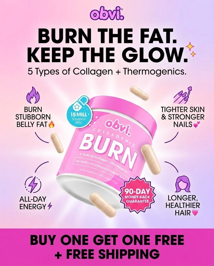
Obvi's 3rd most-served ad doesn't go to a product page. It drops people into a quiz that asks one easy question before anything else.

The landing page
Page data:
- Ad running for: 109 days (since June 2026), still active
- Page type: Quiz funnel
- Above the fold: the headline "Get your weight loss formula for your body and goals!", a "Choose your gender" prompt with 3 photo buttons, and a lifestyle photo of the product. No price, no menu.
- Impression rank: 3rd among Obvi's ads
Page sections:
- Logo and progress bar: just the Obvi logo and an empty progress bar. No menu, no links out.
- Question 1: "Get your weight loss formula for your body and goals!" and 3 photo buttons: Male, Female, Other. One tap moves you on.
- Lifestyle photo: a woman in a kitchen holding the Collagenic Burn tub. The rest of the quiz, and the offer, only appear after you answer.
Message match: The ad ends on "Buy one get one free + free shipping" and a 90-day money-back guarantee. The quiz holds that offer back and asks for a first answer instead, so the offer lands after the buyer has invested a few taps.
Why it works: The first question takes no thought, so almost anyone who clicks takes the first step. With no menu or links on the page, the only way forward is through the quiz.
Steal this: Make the first quiz question one tap and impossible to get wrong.
Advertorials
2. Seed: a "Seed vs. other probiotics" comparison article
Seed sends its top-ranked ad to an article on its own blog that compares its probiotic with the rest of the category.

The landing page
Page data:
- Ad running for: 717 days (since October 2024), still active
- Page type: Advertorial (comparison article)
- Above the fold: a banner asking "Is DS-01 Daily Synbiotic Right For You?", the headline "Seed vs. Other Probiotics for Gut Health: Why Science and Quality Matter", a date and byline, and the product jar starting below.
- Impression rank: 1st among Seed's ads
Page sections:
- Hero: a "Is DS-01 Daily Synbiotic Right For You?" banner, the headline, the date, a byline and the DS-01 jar.
- Contents: a table of contents with 8 chapters, from "Not All Probiotics Are Equal" to "Start Your Subscription Today".
- Science: the first comparison. Every chapter has the same shape: an "Other Probiotics" paragraph, a "Seed" paragraph, "The takeaway?" and a "Start DS-01 today" link.
- Strains: why strain names matter, with Seed's 24 strains and where they're deposited.
- Beyond gut health: the 6 areas DS-01 is studied for, shown as a numbered list and icons.
- Survives digestion: the capsule-in-capsule design and heat testing, with product photos and a lab diagram.
- Potency: why Seed counts live bacteria with AFU instead of the usual CFU, with a flow cytometry photo.
- Testing: a list of Seed's tests (potency, survival, contaminants, allergens) and a link to all of them.
- Final CTA: a checklist of what to look for in a probiotic, then "Start Your Subscription Today".
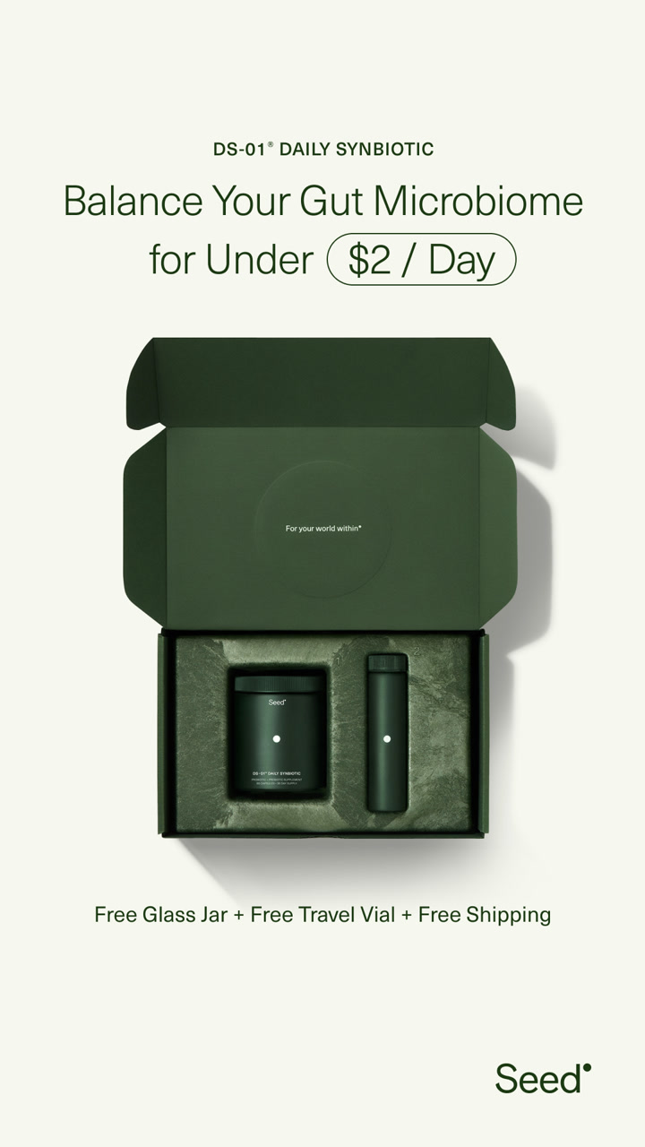
Message match: The ad promises easy gut health "for less than your daily cup of coffee". The page answers the obvious next question, "why this probiotic and not a cheaper one?", before it asks for money.
Why it works: Supplement buyers compare before they buy. A comparison article on the brand's own blog does that research for them, and the top banner keeps a route to the product one tap away.
Steal this: Write the comparison your buyers would search for, and send ad traffic straight to it.
3. Cymbiotika: "5 reasons your skin's not improving"
Cymbiotika runs this creative in 122 separate ads, and sends its skin-focused angle to a listicle advertorial about the same problem.

The landing page
Page data:
- Ad running for: 301 days (since December 2025), still active
- Page type: Advertorial (listicle)
- Above the fold: a "Subscribe & save 30% off your first order" bar, topic tags (skin, hair, nails, cellular aging), the headline "5 Reasons Your Skin's Not Improving (Even Though You've Tried it All)", a short intro and 4 proof points, including "200+ Million Packets Sold".
- Impression rank: 27th among Cymbiotika's ads, and the creative runs in 122 separate ads
Page sections:
- Hero: the "5 Reasons Your Skin's Not Improving" headline over a model with the product, 4 proof points and a 30% off subscribe bar.
- Problem: "Healthy-Looking Skin Starts Below The Surface": the gap between creams and what your body absorbs.
- Reasons 1 to 3: numbered reasons (01/05 to 03/05). Each names a cause, then the Cymbiotika ingredient it pitches for it (Vitamin C, Glutathione), with a "Shop the Protocol, Save 30%" button after the first.
- Expert: "Backed by Experts Who Understand Absorption": a quote card from Gary Brecka, in a swipeable carousel.
- Reasons 4 and 5: NAD+ with a "NAD+ levels over time" chart, then "You Don't Have a Complete Skincare Protocol" and a second Shop the Protocol button.
- Timeline: "Here's What Real Progress Looks Like, Week by Week": what to expect in weeks 1 to 2, month 2 and month 3+.
- Protocol pricing: "Build. Protect. Power." The 3 products as layers, each with Subscribe & Save 30% and Buy Once & Save 20% prices, a 30-day guarantee and free shipping.
- Reviews: "4.9 out of 54,324 reviews", "200+ Million Packets Sold" and a carousel of creator videos with shoppable products.
- Comparison: "How we stack up to the competition": a checklist table of Cymbiotika vs pills and powders.
- FAQ: "Got questions? We have answers!" (topical skincare, why NAD+, how long until results) and a final risk-free offer.
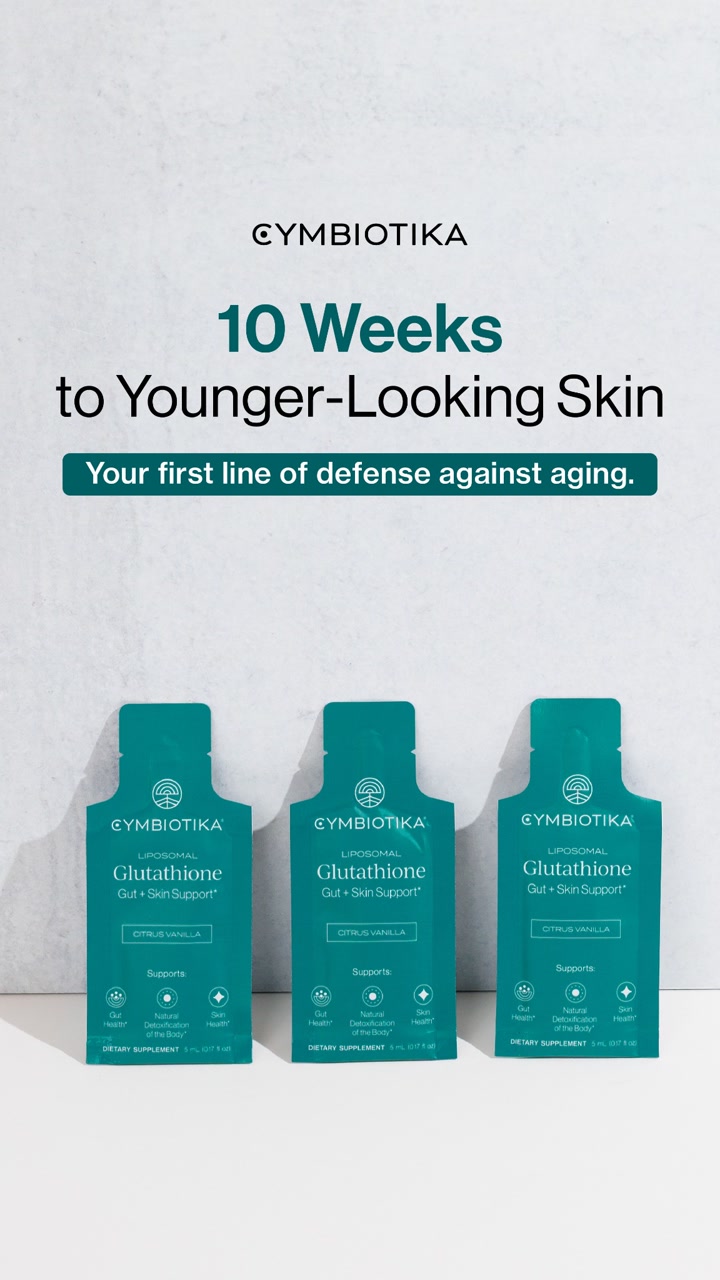
Message match: The ad says "Radiant skin starts from within". The page headline names the frustration behind it (you've tried everything) and the intro repeats the "from within" idea: the reason may be "at the cellular level".
Why it works: The headline calls out a reader who has already tried creams and SPF, which is the person most likely to try a supplement. The proof points and the 30% offer sit in view before the article starts.
Steal this: Open the advertorial with the reader's failed attempts, then present your product as the thing they haven't tried.
4. NuStrips: "5 reasons why millions are ditching their sleeping pills"
NuStrips sends its sleep strip video to a classic listicle advertorial, led by a big review number.

The landing page
Page data:
- Ad running for: 721 days (since October 2024), still active
- Page type: Advertorial (listicle)
- Above the fold: a large product shot of the Sleep in a Strip box, "4.8 Stars from 250,000+ Members", the headline "5 Reasons Why Millions Are Ditching Their Sleeping Pills for these little Strips!" and the start of a customer quote.
- Impression rank: 47th among NuStrips' ads
Page sections:
- Hero: the product box, "4.8 Stars from 250,000+ Members", the headline, a customer quote and a "Get 54% Off Sleep Strips" button over a 60-day money back guarantee.
- As seen on: NBC, Forbes, USA Today and CBS logos.
- The 5 reasons: each reason is a short heading ("You'll fall asleep within 15 minutes", "They're made with 100% natural, vegan ingredients"), a photo of a real person using the strips and a customer quote in italics.
- Reviews: a long stack of 5-star review cards with headlines like "Out in 15 minutes" and "No more 3AM wake-ups".
- Bundle builder: "Add all 3, Save 54%": sleep, energy and essentials strips with quantity buttons, a free mystery gift, an auto-refill toggle and a Complete Checkout button.
- About NuStrips: a founder-style note ("Did you know pills were invented in 1600 BC?"), a second guarantee and a Learn More button.
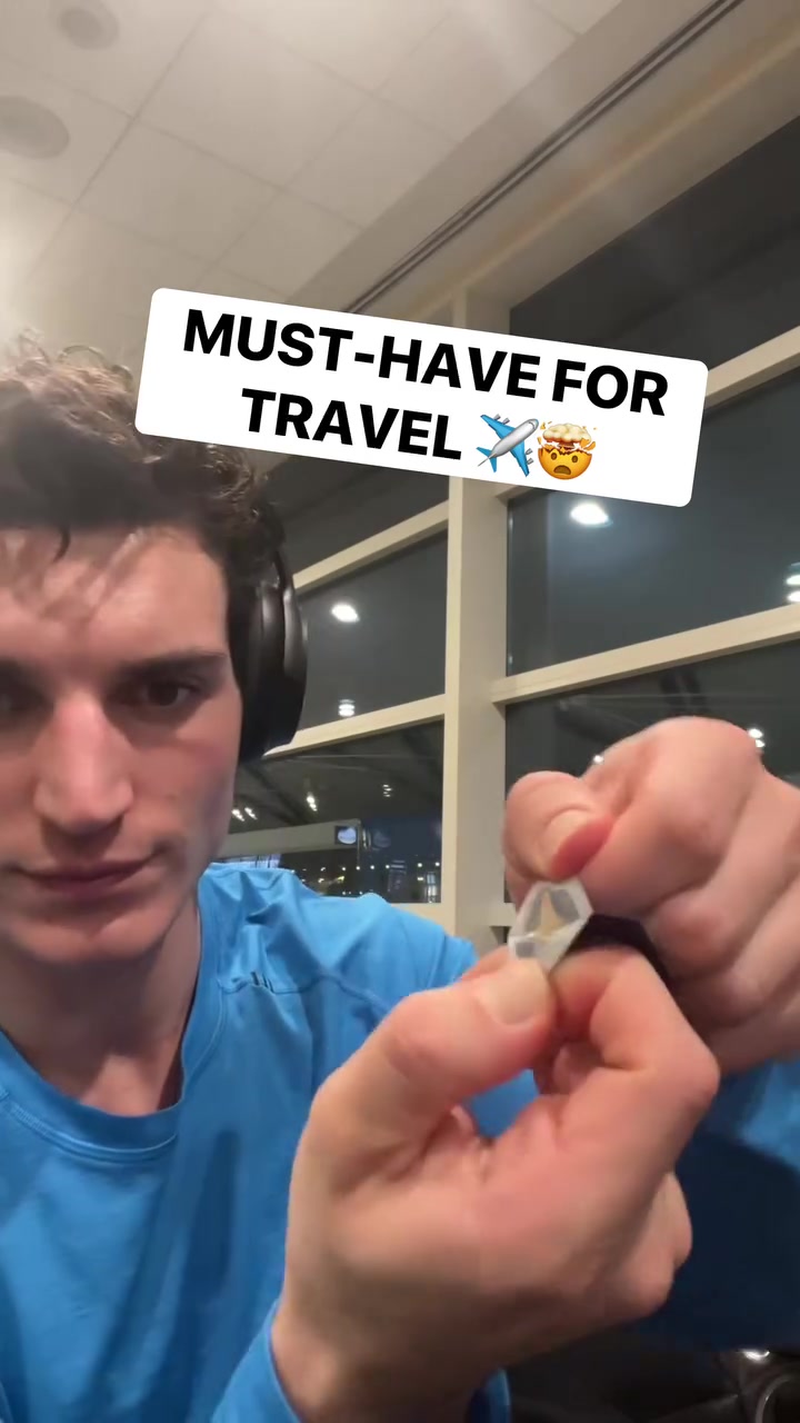
Message match: The ad's hook is a personal discovery ("this insane new invention has changed my travel game") and its copy quotes a 5 star review. The page keeps both: a "millions are switching" headline and another customer quote right under it.
Why it works: The page sells the switch, not the ingredients. The review count and the quote do the convincing before the reader reaches reason 1.
Steal this: Put your review count and a real customer quote directly above and below the advertorial headline.
Custom landing pages
5. MUD\WTR: a "rise" page that sells the morning swap
MUD\WTR's longest-running ad in this set points to a page built to introduce the product to people who drink coffee.

The landing page
Page data:
- Ad running for: 983 days (since January 2024), still active
- Page type: Custom landing page (offer)
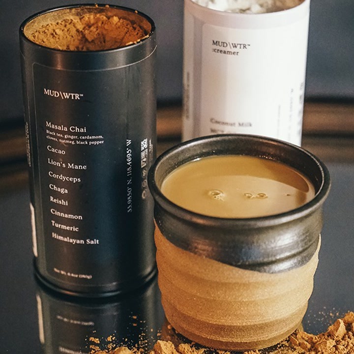
- Above the fold: a bright offer bar (a free Pumpkin Spice Latte bag with a starter kit), a large photo of the tin listing its ingredients, and the headline "Energy & focus without the jitters" with a one-line explanation. The "Try It" button with $20 off sits just below.
- Impression rank: 14th among MUD\WTR's ads
Page sections:
- Hero: the free gift bar, a hand holding the tin, "Energy & focus without the jitters" and the ingredient list.
- Offer and proof: a big "Try It, Save $20" button, a 30-day money back guarantee, free US shipping, "50k 5-Star Reviews" and a quote from fitness creator Thomas DeLauer.
- What is it: "What is MUD\WTR?", how to drink it, the full nutrition facts panel, the ingredient list and 6 certification badges.
- Ingredients: a full-screen photo panel for each of 9 ingredients (lion's mane, chaga, cordyceps, cacao, masala chai, turmeric and more), each with a short story. This is over 40% of the page.
- FAQ: "Ask us anything.": caffeine (about 35mg against coffee's 90 to 100mg), sugar, sourcing, pregnancy and more.
- Starter kits: 4 blends with their caffeine amounts, then "Shop all starter kits" at $40 with $60 struck through and what's in the box.
- Best sellers: a product carousel with discounted starter kits.
- Founder story: "I wasn't mad at coffee, just disappointed": the founder's note signed by Shane Heath, a Watch Video button, then a newsletter signup.
Message match: The ad copy says you get energy and focus "with a fraction of the caffeine", so "you don't feel jittery". The page headline is that sentence, shortened to 5 words.
Why it works: One product, one benefit, one button. The page doesn't ask a coffee drinker to browse a store; it explains the swap and makes the first order cheaper.
Steal this: Turn the strongest line in your ad copy into the page headline, word for word.
6. Grüns: a first-order offer page with a countdown
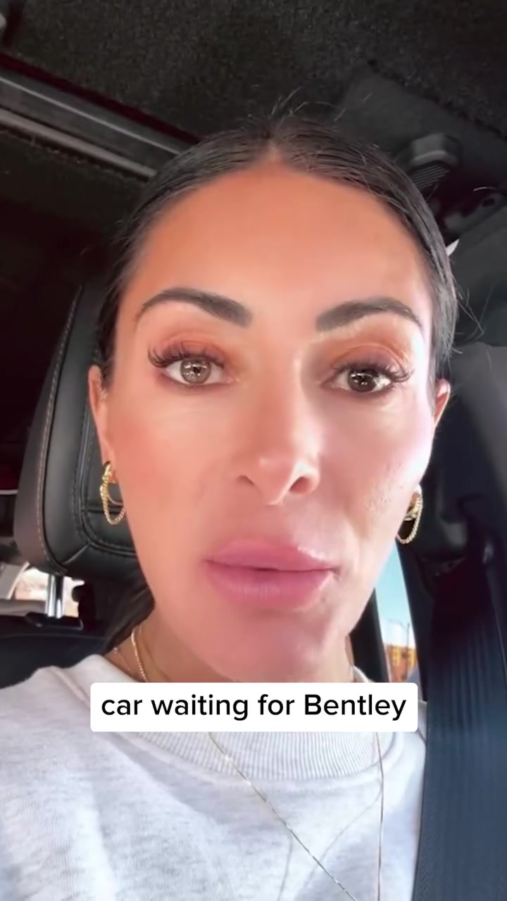
Grüns sends a testimonial video to a page made for first-time buyers, stacked with proof and a timed sale.

The landing page
Page data:
- Ad running for: 490 days (since June 2025), still active
- Page type: Custom landing page (offer)
- Above the fold: an "End of Summer Sale, up to 61% off with free gifts" bar with a live countdown, a "We lowered our price" badge, a clinicians' choice line, "4.8 stars, 100,000 reviews, 1M+ members", the headline "You Have Nutrition Gaps. Grüns Fills Them." and 3 checkmarked benefits.
- Impression rank: 34th among Grüns' ads
- Share of the brand's ads: 50 of Grüns' creatives (5%) point to this page, and 3 other first-order pages are in its top 4
Page sections:
- Hero: a sale bar with a live countdown, the pack, "4.8 stars, 100,000 reviews", the headline, 3 benefits and a "Save 61% + Free Gifts" button with a 30-day risk-free line.
- Testimonials: a swipeable customer quote carousel, then press logos (Yahoo Life, theSkimm).
- Benefits: "Transform Your Health": 4 icon blocks (gut health, immunity, energy, brain health) and a 35,000 research publications claim.
- Problem and proof: "Modern Living Leaves Our Bodies Deficient": big stats (90% of U.S. adults miss nutrient targets), customer survey results, then contaminant testing.
- Offer and buy box: "It's Our Birthday! We Lowered Our Prices": product photos, flavor, sugar level and number of adults, subscribe at $29.99 against $66.65 one time, 4 free gifts and a Start Now button. A "Going fast, no restocks planned" banner follows.
- Reviews: "Join 1,000,000+ Others Filling Nutrition Gaps" with tabs (taste, value, vs powders) and review cards, then a video testimonial carousel.
- Comparison: "Us vs. Them": a table of Grüns against multivitamins and greens powders on cost per serving ($1.47 vs $3.60), taste and nutrients.
- Price drop: "Same Grüns. New Lower Price. Subs Now Start at $29.99." and a Shop Now button.
- Athlete: a quote from Shaun White, labeled as a paid spokesperson and investor.
- Final offer and FAQ: the guarantee, testing and HSA/FSA points with one more Shop Now, then "Any last questions?".
Message match: The ad is tagged as an offer and a customer testimonial, and its copy promises "your daily nutrients". The page repeats both: a big discount up top, then a nutrition gap headline backed by a review count.
Why it works: Every common objection gets an answer on the first screen: price (the sale), trust (reviews and clinicians), and "what's in it" (the 3 benefits). The countdown gives a reason to buy today.
Steal this: Build one page just for first orders, and put the offer, the review count and the core benefit on the first screen.
7. Momentous: an expert partnership page
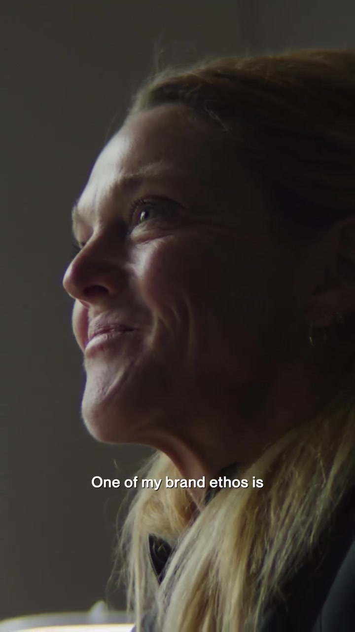
Momentous sends a founder-story style video featuring Dr. Stacy Sims to a page about her partnership with the brand.

The landing page
Page data:
- Ad running for: 375 days (since September 2025), still active
- Page type: Custom landing page (expert endorsement)
- Above the fold: a large portrait of Dr. Stacy Sims, "Momentous x Dr. Stacy Sims", and her quote that she doesn't usually partner with brands but made an exception for Momentous.
- Impression rank: 11th among Momentous' ads
Page sections:
- Hero: the black and white portrait, "Momentous x Dr. Stacy Sims", her quote and "Save up to 35% off your first order with code SIMS".
- Featured product: Creatine with 4.8 stars from 3,953 reviews, $47.25 against $63.00 and an Add to Bag button.
- Stacy's Edit: a 2-column grid of the products she picked, each discounted with its own Add to Bag button.
- Bundle: "The Women's Three": iron, calcium and vitamin D developed with Dr. Sims, at $62.25 against $83.00.
- Free guide: "Get Your Free Copy": what's inside her training and fueling guide, and a form for name, email and phone.
- Women in Performance: a YouTube video and a short story about the partnership.
- Momentous Standard: sourcing, science and certification, each with a photo.
Message match: The ad opens with her saying she made an exception to partner with Momentous. The page opens with the same face and the same line, so the visitor knows instantly they are in the right place.
Why it works: For a premium supplement, the expert is the reason to buy. The page keeps her front and center instead of handing the visitor to a generic product grid.
Steal this: If the ad's hook is a person, make that person and their exact words the first thing on the page.
8. David Protein: a "Meet David" brand page
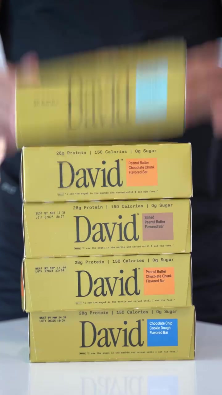
David Protein sends a product demo to a page that introduces the brand to people who have never heard of it.

The landing page
Page data:
- Ad running for: 288 days (since December 2025), still active
- Page type: Custom landing page (brand intro)
- Above the fold: a "3rd party tested" bar, product category links, a "4.8/5, 20K+ 5 Star Reviews" badge, the headline "Meet David.", "Free shipping on your first order", a "Shop all" button and a scrolling strip with "19,000+ positive reviews" and "Satisfaction Guarantee".
- Impression rank: 11th among David Protein's ads
Page sections:
- Hero: the reviews badge, "Meet David.", free shipping on the first order, a Shop all button and a ticker (19,000+ reviews, satisfaction guarantee).
- Comparison chart: "Designed for protein efficiency. Nothing else.": a bar chart of calories from protein, David at 75% against 3 other bars at 40% to 49%, then 3 benefits.
- Buy box: the Blueberry Pie bar with a photo gallery, $35.10 against $39 and an Add to cart button.
- Reviews: "What customers are saying.": a carousel of big quote cards from verified buyers.
- Best sellers: a carousel of flavors with calories, protein and sugar chips.
- Email signup: "Don't miss out on David updates" with email or SMS, then the footer.
Message match: The ad sells the numbers (28g protein, 150 calories, 0g sugar). The page opens on the brand instead, then follows with "Designed for protein efficiency" right under the first screen.
Why it works: A cold viewer of a demo ad needs to trust a new brand before they pick a flavor. Reviews, testing and free shipping all sit on the first screen.
Steal this: For cold traffic, lead with who you are and why to trust you, then let the product range follow.
Product pages
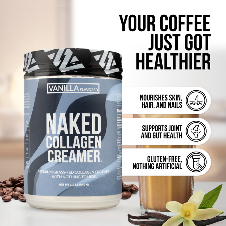
9. Naked Nutrition: a product page that leads with the ingredient count
Naked's long-running ad for its collagen creamer goes straight to the product page for that exact product.

The landing page
Page data:
- Ad running for: 664 days (since December 2024), still active
- Page type: Product page
- Above the fold: a "Trusted by 1M+ Customers" bar, a product image that says "Only 4 Ingredients" with 9g protein, 50 calories, 0g sugar and 1g carbs, a "No additives, no fillers" line, and 4.8 stars from 216 reviews.
- Impression rank: 73rd among Naked Nutrition's ads
Page sections:
- Hero: the "Only 4 Ingredients" infographic, an image strip, 4.8 stars from 216 reviews and the product name.
- Buy box: type, flavor and frequency pickers, Autoship at $39.99 (save 20%) against $49.99 one time, and a Buy with Shop button.
- Comparison: "The Naked Difference": a side-by-side table against regular collagen creamers (sourcing, ingredients, solubility, production).
- Benefits: what collagen does, then 3 expandable benefits (skin, hair and nails, joints).
- How to use: when and how to add it to coffee, with lifestyle photos.
- Cross-sell: "People Also Bought": a carousel of other creamer flavors.
- FAQ: 5 questions, from "What is collagen creamer?" to who it's for.
- Reviews: 4.8 from 216 reviews, a written reviews summary, topic filters and review cards. This is over a third of the page.
Message match: The ad sells a collagen creamer with "no artificial additives". The first product image says "Only 4 Ingredients" and lists what's left out.
Why it works: The first product image does the job a landing page headline would. A buyer who clicked for "clean" collagen sees the proof before they scroll.
Steal this: Make the first image on your product page an infographic that answers the ad's promise.
10. LMNT: the product page with 93,365 reviews
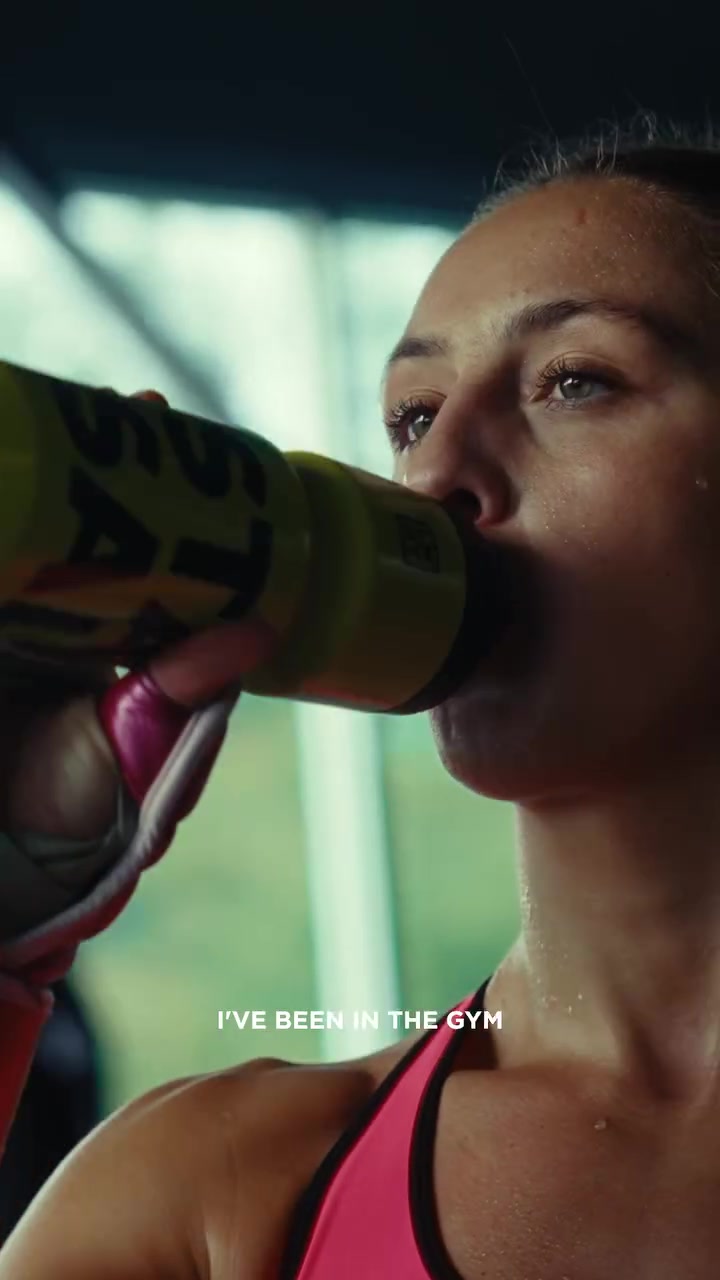
LMNT sends a combat sports testimonial video to its main electrolyte product page.

The landing page
Page data:
- Ad running for: 271 days (since January 2026), still active
- Page type: Product page
- Above the fold: a new flavor announcement bar, the 30 stick pack box showing 1000mg sodium, 200mg potassium and 60mg magnesium, 6 thumbnail images, 93,365 reviews and the title "LMNT Zero-Sugar Electrolytes".
- Impression rank: 17th among LMNT's ads
Page sections:
- Hero: the product gallery, 93,365 reviews, the title and a short flavor description.
- Buy box: box size (one box or a 120-stick bundle marked Best Value), a flavor grid, $45 one time or $39 on subscription, Add to cart, a no-questions refund policy and free US shipping.
- What's inside: "A truly meaningful dose of electrolytes": sodium 1,000mg, magnesium 60mg and potassium 200mg, then no sugar, no gluten and vegan badges.
- Reviews: 93,374 reviews at 4.7/5 with the star breakdown and paged review cards. Almost 30% of the page.
- FAQ: questions about the formula, the INSIDER bundle, DIY mixes, shipping and how much to drink.
Message match: The ad's message is "zero sugar LMNT" for athletes. The page title repeats "Zero-Sugar", but the page is the same one every LMNT buyer sees, with nothing specific to combat sports.
Why it works: With a review count this large, the product page is its own proof. The sodium number on the box is the detail an athlete checks first.
Steal this: Once you have thousands of reviews, put the count next to the product title, above everything else.
11. Myprotein: a discounted product page for one flavor
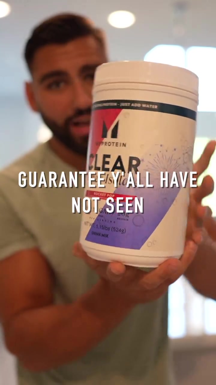
Myprotein sends a creator video about Clear Whey Isolate to that product's page, with the discount on screen.

The landing page
Page data:
- Ad running for: 98 days (since June 2026), still active
- Page type: Product page
- Above the fold: an "Up to 50% off site-wide" bar, the Clear Whey Isolate tub in an image carousel, and a sticky bar with the flavor, size, $33.71 and "Add To Basket". The was-price ($44.95, save $11.24) sits just below.
- Impression rank: 33rd among Myprotein's ads
Page sections:
- Hero: a site-wide sale bar, the product image carousel and a sticky bar with flavor, size, $33.71 and Add To Basket.
- Buy box: 940 reviews, the product name, $33.71 against $44.95 (save $11.24), flavor and size pickers, free shipping, 30-day returns and pay-later options.
- Bundle: "Frequently bought with": creatine and a second protein, each discounted, with one Add these to your routine button.
- Reviews: a 4.34 overall rating from 940 reviews with the star breakdown and a review carousel.
- Product details: nutrition, ingredients and suggested use, then the brand promise ("20 years of relentless refinement").
- Recommendations: "Other users are looking at": a carousel of other protein products, then a newsletter offer for 5% off.
Message match: The ad pitches Clear Whey as "protein water" with 20g of protein. The page shows the same tub, the same 20g, and a price cut, so there's nothing left to explain.
Why it works: A familiar brand selling a simple product doesn't need a story page. The price and the buy button are on the first screen, and the saving is one scroll down.
Steal this: For a known product with a sale on, send the ad straight to a product page with the discounted price in view.
Collection pages
12. Ritual: a "Daily Health" collection with first-order pricing
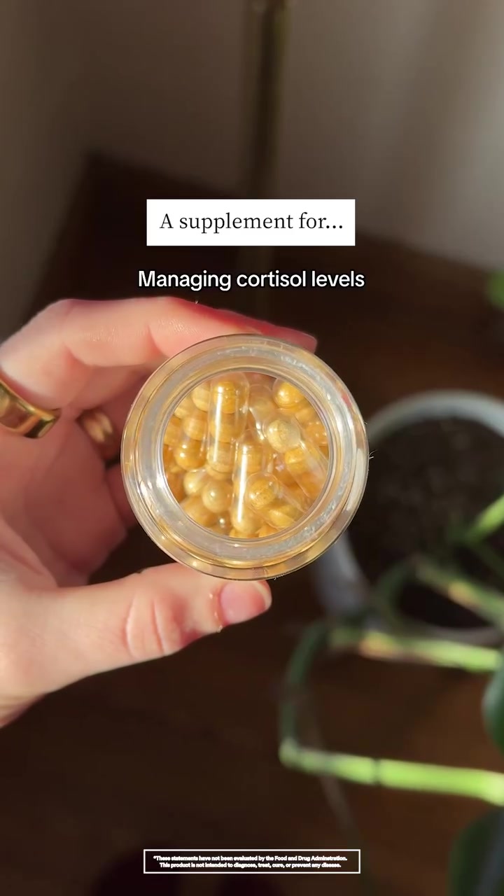
Ritual sends an organic-style video to a collection page, so the viewer can pick the product that fits them.

The landing page
Page data:
- Ad running for: 207 days (since March 2026), still active
- Page type: Collection page
- Above the fold: the title "Daily Health", the line "The perfect diet doesn't exist, but hit your bases anyway", filter chips, and 2 products (Synbiotic+ and HyaCera) each "From $43.20" with $54.00 struck through and an "Add" button.
- Impression rank: 2nd among Ritual's ads
Page sections:
- Hero: breadcrumbs, the "Daily Health" title, a one-line pitch and filter chips (Daily Health, Shop For, Shop by Need).
- Product grid: every product in the range in a 2-column grid. Each shows its benefit (Gut Health, Wrinkle Support), "From" a discounted price with the full price struck through, and an Add button.
- Shop by need: round photos linking to Daily Health, Pregnancy and Bestsellers, then a scrolling "third-party tested" ticker.
- Quality standards: "Daily supplements designed for high standards" and a short explanation of Ritual's traceable ingredients.
- Email signup: "We have high standards for emails too" with an email field, then the footer.
Message match: The ad promises "up to 30% off your first order" across "foundational health, skin, gut and more". The page shows reduced prices on every product and covers the same range of needs.
Why it works: The ad is broad, so the page is broad. Showing the discounted price on each product proves the offer from the ad is real.
Steal this: When an ad covers several needs, send it to a short collection with the discount already applied to every price.
Patterns across these 12 landing pages
We counted these from the 12 phone captures and the Adspo data.
| Pattern | Count |
|---|---|
| Go to a quiz, advertorial or campaign page instead of a store page | 8 of 12 |
| Sticky buy button or sticky bar | 9 of 12 |
| Discount or free gift on the first screen | 6 of 12 |
| Star rating or review count on the first screen | 5 of 12 |
| Price on the first screen | 2 of 12 |
| Showed a popup or email capture during load | 6 of 12 |
| Video ads | 7 of 12 |
- Purpose-built pages ran longer. The 8 ads sent to quizzes, advertorials and campaign pages have a median runtime of 433 days. The 4 sent to product or collection pages have a median of 239 days. It's a small set, but 3 of the 4 longest-running ads (MUD\WTR, NuStrips and Seed) go to a page built for the ad.
- Proof beats price up top. More pages show a rating, review count, expert or "tested" claim on the first screen than show a price.
- The headline repeats the ad. MUD\WTR, Momentous, Cymbiotika and Naked all restate the ad's main line in the page headline or first image.
- Runtime: the median ad here has run for 338 days, from 98 days (Myprotein) to 983 days (MUD\WTR).
From the section breakdowns:
- Purpose-built pages are long. Seed, Cymbiotika, Grüns and MUD\WTR all run past 21 phone screens (where our capture stops). The 4 product and collection pages run 7 to 13 screens.
- The median page has 6 or 7 sections. Grüns and Cymbiotika have 10 each; Obvi's quiz has 3, because the rest only appears as you answer.
- Reviews get their own section on 7 of the 12 pages, and on product pages they take the most room: over a third of Naked's page and almost 30% of LMNT's.
- 5 of the 12 compare themselves to the alternative in a table, chart or side-by-side copy (Seed, Cymbiotika, Grüns, Naked and David Protein).
- 5 of the 12 have an FAQ, and on all 5 it sits past the halfway point, after the offer, to answer the last objections before the buy button.
- The offer repeats. Grüns shows its discount 4 times (hero, buy box, price-drop banner and final offer); Cymbiotika puts a "Shop the Protocol, Save 30%" button after its 1st and 5th reasons and again in the pricing section.
How to build a landing page for your Facebook ads
Step 1: Match the page type to how much the buyer needs to learn
New idea or new brand (a sleep strip, a coffee swap, a new protein bar)? Use an advertorial or a custom page that explains it. Known product with a sale on? A product page is enough.
Step 2: Put the ad's main line in the headline
Copy the strongest sentence from your ad and shorten it. If the hook is a person, show that person first.
Step 3: Add one proof point to the first screen
A star rating and review count, an expert, "third party tested" or units sold. 5 of these 12 pages show reviews before any scrolling.
Step 4: Show the offer, and keep the button close
If the ad mentions a discount, show it on the page in the first screen, and add a sticky buy button so the next step is always one tap away.
Step 5: Build one page per angle and let the ads decide
Seed, Cymbiotika and NuStrips each run long-lived ads to pages written for one angle. Make a page per angle, send ads to each, and keep the ones that stay live.
Find the landing pages behind any ad with Adspo
The Facebook Ad Library shows a brand's ads, but not which landing pages it keeps sending traffic to. Adspo shows the landing page on every creative, and each brand page lists its top landing pages with how many of its creatives point to each one.
 Grüns brand page in the Adspo app showing 901 creatives and 1,161 ads, creative velocity, media mix, brand creators and its top landing pages led by gruns.co/pages/first-order-gwp with 130 creatives
Grüns is a good example of why this matters. Its brand page shows 4 different first-order pages near the top of its landing pages: /pages/first-order-gwp with 130 creatives (13% of the brand's creatives), /pages/flip-to-win with 53, and /pages/first-order-gut-health and /pages/first-order with 50 each. That's a brand testing landing pages as hard as it tests ads.
To find supplement landing pages worth studying:
- Search a brand, or browse the Health & Wellness category.
- Sort by longest running and filter to active ads.
- Open an ad to see its landing page, runtime and impression rank in the brand's account.
- Check the brand's Landing Pages panel to see which pages get the most creatives.
Adspo covers 10,000+ verified brands and costs $29 a month, or $19 a month billed yearly, with a 7-day free trial. For more examples, see our 50 best Facebook ad examples, and for the free route, our guide to using the Facebook Ad Library. Several of these brands also appear in our top DTC brands breakdown, and for beauty, see our skincare landing page examples.
Frequently asked questions
What makes a good supplement landing page?
Across the 12 pages here, the ones brands keep paying to send traffic to pick up the ad's exact promise in the headline, show proof early (5 of the 12 put a star rating or review count on the first screen) and keep a buy button close (9 of the 12 have a sticky button). Most skip the standard product page: 8 of the 12 go to a quiz, an advertorial or a page built for the campaign.
Should supplement ads go to a product page or a landing page?
Both work, but in this set the purpose-built pages ran longer. The 8 ads that point to quizzes, advertorials and campaign pages have a median runtime of 433 days. The 4 that point to standard product or collection pages have a median of 239 days. Product pages suit ads for a single, simple product where the buyer already knows what they want, like Myprotein's Clear Whey.
What is a supplement advertorial?
An advertorial is a landing page written like an article: a headline such as "5 Reasons Why Millions Are Ditching Their Sleeping Pills", a few sections of story or education, then the product and an offer. Seed, Cymbiotika and NuStrips all send long-running ads to one. It suits supplements because buyers often need the problem explained before the product makes sense.
What is a quiz funnel?
A quiz funnel asks a few questions before showing a product, so the recommendation feels personal. Obvi's 3rd most-served ad, live for 109 days, sends people to a quiz that opens with "Get your weight loss formula for your body and goals" and a gender choice.
How do I see a competitor's supplement landing pages?
Click through their ads in the free Facebook Ad Library, or use Adspo, which lists the landing page on every creative and shows each brand's top landing pages and how many of its creatives point to each one. Sorting by longest running shows you the pages a brand has backed for months.
What should be above the fold on a supplement landing page?
In this set, the first screen usually carries a headline that repeats the ad, one proof point (a star rating, review count, expert or "third party tested" claim) and either an offer or a clear next step. Only 2 of the 12 show a price on the first screen, so a price is less common up top than proof or an offer.
Wrapping it up
The supplement brands that keep their ads running the longest rarely send people to a plain product page. They build a page that repeats the ad, proves it on the first screen and keeps the buy button close.
Try Adspo free for 7 days and see the landing pages behind any brand's longest-running ads.