

A good fitness landing page answers the question the ad raises, whether that's "is this cheaper than a studio?" or "which rower do I need?" In the 11 fitness landing page examples below, none of the ads go to a homepage, 8 of the first screens show an offer, and only 2 show a price.
Each example shows the Facebook ad and the page it sends traffic to, side by side, the way a shopper sees them on a phone. These are fitness product brands, not gyms or coaches: equipment, apparel, wearable tech and a workout app. Every ad was still running when we pulled the data, and they've been live for 105 to 757 days. Tap any landing page to scroll the whole thing, and use the section list to jump around.
Article-style pages
1. Flo Pilates: 10 reasons to quit your studio
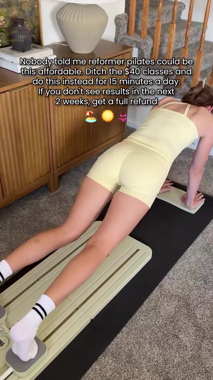
Flo's most-served ad says to skip studio classes, and it goes to a long list that makes the case one reason at a time.
The landing page
Page data:
- Ad running for: 111 days (since July 2026), still active
- Page type: Listicle advertorial (/pages/lp-006-4)
- Above the fold: a "67% off + 4 free gifts" bar with a countdown, the "10 Reasons" headline and one customer quote. No price or star rating.
- Impression rank: 1st among Flo Pilates' ads, live in 8 ads
Page sections:
- Hero: the sale bar, the headline and a verified customer quote.
- Comparison: Flo against studio classes on workout time, coaching, guarantee and long-term cost.
- 10 reasons: numbered reasons, starting with "Skip the $7,680 studio bill" and ending with a 99-day guarantee.
- Offer: "67% off + 4 free gifts," with the kit laid out.
- Reviews: 4.8 out of 5 from 11,784 reviews, with customer quotes.
- Final CTA: an "87% sold" bar, a low-stock warning and one last button.
Message match: The ad's caption says to "ditch the $40 classes" and do this for 15 minutes a day. The page's first argument is the cost of those classes, and its second is the 15-minute session.
Why it works: The ad starts an argument and the page finishes it. Putting a dollar figure on the studio habit gives a big purchase something to be compared against.
Steal this: Compare your price with what the buyer pays for the old way each year, not with a competitor's product.
2. Tonal: a sponsored article on another site
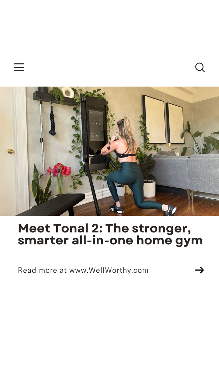
Tonal's ad doesn't go to Tonal. It's built to look like a link to an article, and that's what you get.

The landing page
Page data:
- Ad running for: 634 days (since February 2025), still active
- Page type: Sponsored article on a third-party site (wellworthy.com)
- Above the fold: a "Sponsored" tag, the headline, a one-line summary, a byline and a contents box. No price, offer or star rating.
- Impression rank: 34th among Tonal's ads, live in 16 ads
Page sections:
- Hero: the headline and contents list.
- Intro: the case for strength training at home, then the $4,295 price, with a product card and a "Shop Now" button.
- Brand story: 175,000+ members, 25% more power and the form coaching camera.
- Goals: a CEO quote and the personalized training, followed by another product card.
- Final CTA: the price again, shipping to all 50 states and a 30-day trial.
Message match: The ad's headline is the article's headline, word for word, and the ad says "Read more at WellWorthy." The strength stats in the ad copy appear again in the article.
Why it works: A $4,295 machine needs more explanation than a product page's first screen. An article has room to get through the reasons, and it brings up the price once it has made a case.
Steal this: If your product needs convincing, test a sponsored article, and use the same headline in the ad.
3. Hume Health: a page about what your scale misses
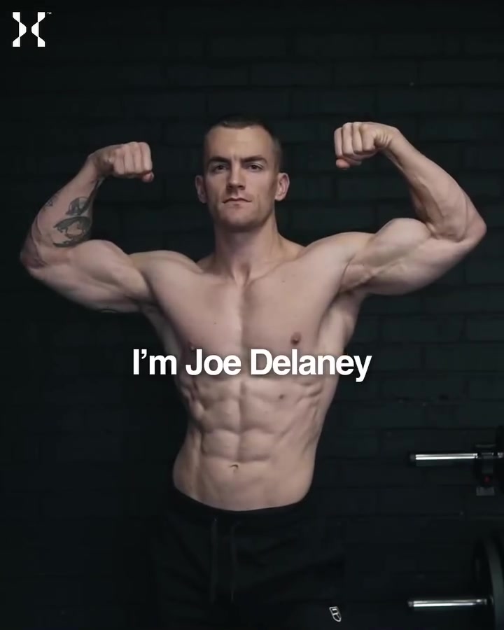
The ad introduces the product through a person. The page then argues against the thing you already own: a regular scale.

The landing page
Page data:
- Ad running for: 487 days (since June 2025), still active
- Page type: Comparison advertorial (/pages/hume-pod-vs-regular-smart-scales)
- Above the fold: the headline, a short explanation, "4.6, 48K+ reviews," a "50% off with SS20" code and a button. No price.
- Impression rank: 21st among Hume Health's ads, live in 2 ads
Page sections:
- Hero: the headline, the code and the "See What Scales Miss" button.
- Problem: numbered points on what a regular scale can't show you.
- Results: 4 percentages from the brand's own user numbers.
- How it works: what one scan measures, and who it's for.
- Comparison: a table of Hume Pod against regular smart scales.
- Offer: $238, down from $366, with a 10-year warranty add-on and a 45-day refund.
- Reviews: "over 1.2 million users" and a 4.6 rating.
Message match: The ad's headline calls it the "world's first body scan" and its copy lists muscle mass, body fat and hydration. The page explains why those numbers matter. The hook is about the founder, and the page doesn't pick that up.
Why it works: Nobody is shopping for a "body scan." The page starts from something the reader already owns and explains what it can't do, which creates the need before the product appears.
Steal this: Write your page's headline about the limits of what your buyer uses today.
Quiz funnels
4. BetterMe: one question and nothing else
BetterMe's ad copy asks you to take a 1-minute quiz, and the page starts it immediately.

The landing page
Page data:
- Ad running for: 255 days (since February 2026), still active
- Page type: Quiz funnel
- Above the fold: the whole page: a title, one line of copy and 2 photos to tap. No price, offer or rating.
- Impression rank: 1st among BetterMe's ads, live in 14 ads
Page sections:
- Hero: "BetterMe Plan" and one line on the goal.
- Choice: 2 large photos, Male and Female, each with an arrow.
- Consent: a line saying that continuing means you agree to the terms.
Message match: The ad says "Take 1-minute quiz to start now," and the first screen is the first question. The ad talks about the gym while the page says "at home," which is a small gap.
Why it works: There's nothing to read and nothing to decide except one easy question. Tapping once starts the funnel. We captured the first step only, since going further means answering as a user.
Steal this: If your ad promises a quick quiz, make the first screen the first question, with no intro.
Pages that help you choose
5. Pvolve: a bundle page with a sale on top
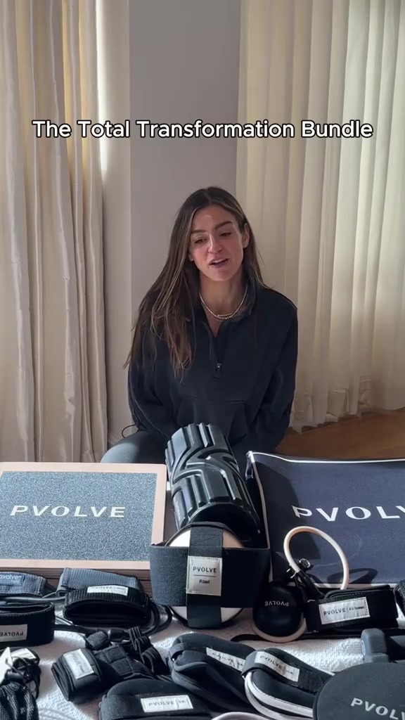
Pvolve's ad shows the whole kit laid out on the floor, and it goes to a page for exactly that bundle.

The landing page
Page data:
- Ad running for: 598 days (since March 2025), still active
- Page type: Bundle offer page (/pages/total-transformation-bundle-lp)
- Above the fold: a sale bar with a countdown, a "15% off + free gift" badge, a photo and "250K+ women have already made the switch to PVOLVE." No price or star rating.
- Impression rank: 70th among Pvolve's ads, live in 10 ads
Page sections:
- Hero: the sale, the photo, 3 checkmarks and a button.
- Method: strength, mobility and stability explained, with 3 class types.
- Bundle: a 13-piece set at $620, down from $728.97, with 4.6 stars from 11,472 reviews.
- What's included: a swipeable row of the equipment.
- Results: customer photos and quotes, then study figures with footnotes.
- Celebrity fans: a named celebrity quote under "Iconic women train with PVOLVE."
- Classes: "Over 10 Million Workouts Streamed" and sample classes.
- FAQ: beginner, timing and equipment questions.
- Reviews: the full review list, including negative ones.
Message match: The ad's on-screen line is "The Total Transformation Bundle," and that's the product on the page. The offers differ, though: the ad's headline has a code for an extra 10% off, and the page runs a 15% birthday code.
Why it works: The page sells the method before it sells the kit, so the 13 pieces make sense by the time you reach the price.
Steal this: When a bundle looks like a lot, explain the system first, then show the pieces.
6. Tempo: bundles with monthly prices and an HSA/FSA line
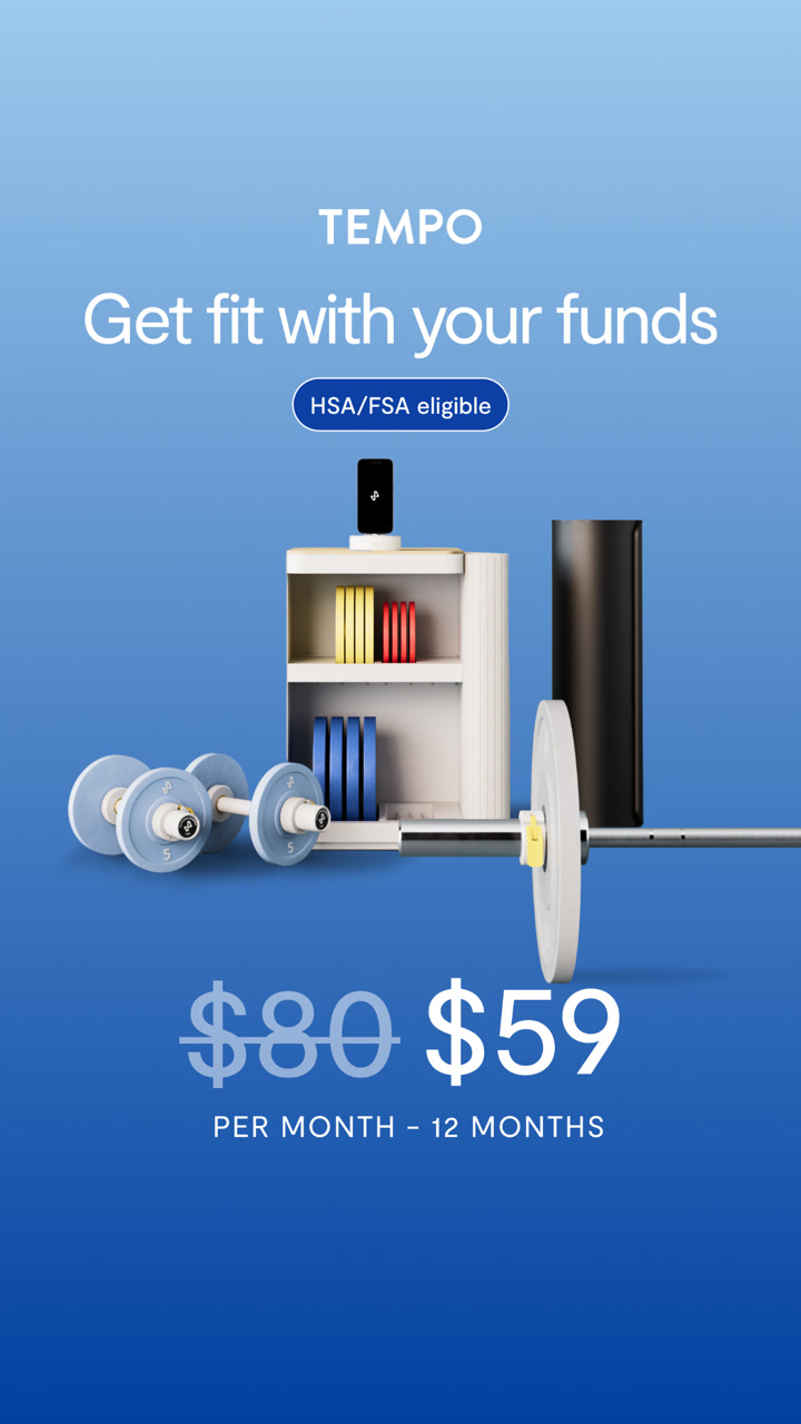
This ad is about how to pay, and the page carries that through every product on it.

The landing page
Page data:
- Ad running for: 757 days (since October 2024), still active
- Page type: Shop page with bundles (/shop)
- Above the fold: a ticker reading "Black Friday Sale" and "HSA/FSA Eligible," the headline "Black Friday Deals Start Now," "Save up to 40%" and a "Shop now" button. No price or star rating.
- Impression rank: 9th among Tempo's ads, live in 3 ads
Page sections:
- Hero: the holiday photo, the offer and one button.
- Move bundles: starting with the Move Starter Bundle at $49 a month, down from $80.25.
- Core bundles: starting with the Core Starter Bundle at $36 a month, down from $59.42.
- Memberships: prepaid 12 and 24 month plans for existing members.
- Training app: on-demand training for $39 a month.
- Email signup: "Never done moving" with a signup box.
Message match: The ad says "Get fit with your funds," with an HSA/FSA badge and a monthly price. The page has HSA/FSA in its top ticker and on each bundle, and its bundle prices are monthly too.
Why it works: Home gym bundles are a big one-off cost, so the page leads with the monthly number. The ad has run for 757 days, and the page around it still carries the current sale.
Steal this: Keep one evergreen ad pointed at a page you can reskin for each sale.
7. Hydrow: 2 rowers and a straight answer
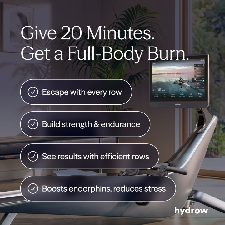
Hydrow's ad sells the workout. The page assumes you're sold on rowing and helps you pick a machine.

The landing page
Page data:
- Ad running for: 184 days (since May 2026), still active
- Page type: Product chooser (/rowing-machines)
- Above the fold: a Black Friday bar, the headline "Which Rower Is Right For You?" and 2 machines with prices and "Save $775+" and "Save $425+" badges. No star rating.
- Impression rank: 15th among Hydrow's ads, live in 10 ads
Page sections:
- Hero: the question, both rowers, prices, monthly payments and "best for those who" lists.
- Design: colors, frame and finish, side by side.
- Size and weight: dimensions, and 145 lbs against 102 lbs.
- Display: a 22" against a 16" touchscreen.
- Technology: which rower includes HydroMetrics.
- Setup: assembly time and shipping.
- Sound: speakers and operating noise.
- What's included: shared features, including a 30-day home trial.
Message match: The ad's message is a short, full-body workout, and the page doesn't repeat it. It picks up the next question, which is which machine to buy, and the sale bar adds the offer.
Why it works: A 2-column layout turns "should I buy a rower?" into "which of these 2?" Every row of the table is another reason to compare, and each machine has a "best for those who" list.
Steal this: If you sell 2 or 3 models, send ad traffic to a chooser page, with the prices on the first screen.
Product pages
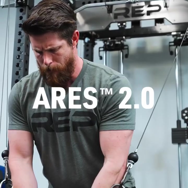
8. REP Fitness: a builder page for a named product
REP's ad is about one product with its name across the screen, and it goes straight to that product's builder.

The landing page
Page data:
- Ad running for: 506 days (since June 2025), still active
- Page type: Product page with a builder (/products/ares-2-0-builder)
- Above the fold: a "Free shipping on all orders" bar, a Black November link and a large product photo. No price or star rating until you scroll.
- Impression rank: 8th among REP Fitness' ads, live in 22 ads
Page sections:
- Hero: product photos, "Starting at $2,999.99," "Ships within 24 to 48 hours" and a "Start Building" button.
- Overview: what the attachment is, plus FAQs, videos and tech specs.
- Features: swipeable cards on the design and pulleys.
- Reviews: 4.9 from 171 reviews, 99% would recommend, with customer photos.
- More info: articles on what makes the Ares 2.0 different.
- Athletes: "REP Athlete Approved" with their gym setups to shop.
Message match: The ad's title is "Ares 2.0, In Stock and Ready to Ship." The page shows the same name and says it ships in 24 to 48 hours. The free shipping in the ad copy is in the top bar.
Why it works: Someone who's clicked an ad for a named attachment on a rack already knows the category. They need specs, shipping and proof, and the page has little else.
Steal this: If your ad names one product, send people to that product's page, and repeat the shipping promise.
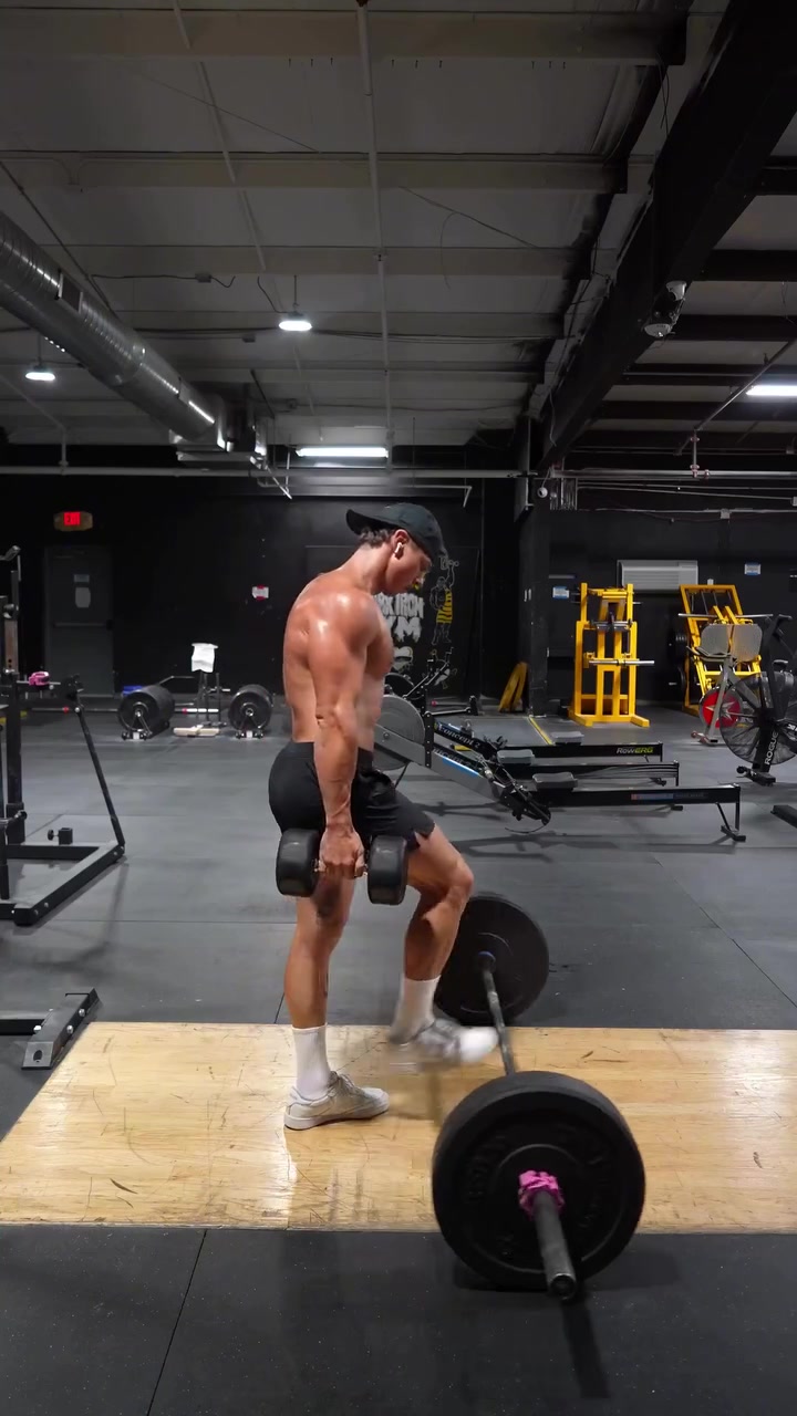
9. Ten Thousand: a standard product page that answers questions
The ad is someone saying these shorts handle all of their training. The product page is plain and very complete.

The landing page
Page data:
- Ad running for: 105 days (since July 2026), still active
- Page type: Product page (/products/interval-short)
- Above the fold: the name, $88 to $98, "Next-Level Versatility," a star rating from 16,508 reviews and a large product photo.
- Impression rank: 5th among Ten Thousand's ads, live in 5 ads
Page sections:
- Hero: the photo, then colors, liner, inseam, size and a "Select size" button, with quick question buttons like "Are these shorts good for lifting?"
- Overview: a one-paragraph summary with training, lifting and running tags.
- Features: "Next-Level Versatility" and "Built for any workout."
- Athlete story: "Athlete-led design" with a training video.
- Reviews: 4.6 from 16,508 reviews, each with the reviewer's activity.
- Cross-sell: "Pairs well with" and recommended products.
Message match: The ad's first line is "I finally found workout shorts that can keep up with every type of training I do." The page's main idea is the same: versatility. Its tags and its "Perfect for" list name lifting, running and everyday training.
Why it works: Price and proof are both on the first screen, and the question buttons pick up the doubts a shopper has about shorts. Tagging reviews by activity lets you check what a lifter or runner thinks.
Steal this: Tag your reviews by use case, so buyers can find someone who trains like they do.
Collections
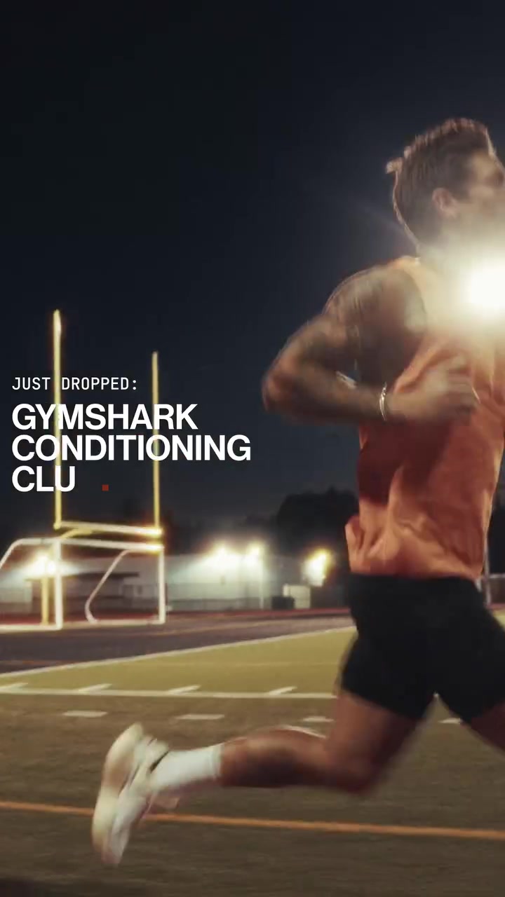
10. Gymshark: a collection named for the ad's idea
Gymshark's most-served ad sells an idea, the hybrid athlete, and it goes to a collection with that name.

The landing page
Page data:
- Ad running for: 218 days (since April 2026), still active
- Page type: Collection (/collections/functional-fitness/mens)
- Above the fold: a free shipping bar, the "Hybrid Training" title, a short description and category tiles. No price or star rating.
- Impression rank: 1st among Gymshark's ads, live in 45 ads
Page sections:
- Hero: the title and a line on the hybrid lifestyle: "by the squat rack" or "on the track."
- Categories: swipeable tiles for tanks, T-shirts and shorts.
- Products: a 2-column grid, led by the Conditioning Club pieces.
- Running banner: a new running kit, with a button.
- Campaign banner: a full-width training photo, with more products below.
Message match: The ad's headline is "The hybrid athlete's uniform" and its video shows the Conditioning Club range. The page's title is "Hybrid Training" and its first products are from that range.
Why it works: A brand-level ad about a type of athlete has no single product to link to. A named collection keeps the idea going and lets a shopper browse right away.
Steal this: Build a collection around your campaign's idea, and name it the way the ad talks.
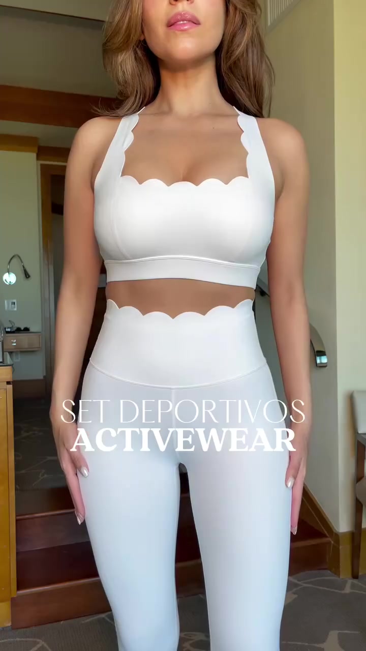
11. WISKII Active: the exact style from the ad, and nothing else
WISKII's video is a try-on of its scalloped sets, and the link goes to a collection of only those.

The landing page
Page data:
- Ad running for: 689 days (since December 2024), still active
- Page type: Collection (/collections/elegant-scallop-edit)
- Above the fold: a "20% off sitewide, code BF20" bar, the "Elegant Scallop Edit" title, an "As Seen In Vogue, Forbes" line and 2 lifestyle photos. No price or rating until you scroll.
- Impression rank: 121st among WISKII Active's ads, live in 4 ads
Page sections:
- Hero: the sale bar, the title, one line of copy and the press mention.
- Products: a 2-column grid across 5 pages of results, led by the 7/8 High-Waist Energy Legging at $89 with 479 reviews.
- Style guide: a paragraph on the leggings, tops, skirts and swimwear in the edit.
Message match: The ad shows a scalloped set up close, and every product on the page has that scalloped edge. There's no need to hunt for what you just saw.
Why it works: For apparel, the style is often why someone clicks. A tight edit shows the look in many colors and shapes, using lifestyle photos more than product shots.
Steal this: If one design detail drives your ads, build a small collection around that detail and link to it.
Patterns across these 11 landing pages
- Page types: 3 article-style pages, 3 pages that help you choose, 2 product pages, 2 collections and 1 quiz.
- Homepages: 0 of the 11. Every ad goes somewhere closer to what it shows.
- Offer on the first screen: 8 of 11. 6 show a sale, code or discount, and REP and Gymshark show free shipping.
- Price on the first screen: 2 of 11 (Hydrow and Ten Thousand).
- Star rating on the first screen: 2 of 11 (Hume and Ten Thousand).
- Third-party pages: 1 of 11. Tonal's goes to a sponsored article on Wellworthy.
- Sections: a median of 6 per page, from 3 on the BetterMe quiz step and WISKII collection to 9 on Pvolve's bundle page.
- Ad runtime: a median of 487 days, from 105 to 757.
The pricier the item, the more explaining the page does. Tonal, Flo and Hume all use a long argument before the buy button matters. Apparel pages stay simple: Ten Thousand, Gymshark and WISKII let you shop right away.
How to build a landing page for your Facebook ads
Step 1: Start with the question your ad raises
Write down what someone wants to know after seeing your ad. "Is it cheaper than my studio?" leads to a page like Flo's. "Which model do I need?" leads to Hydrow's.
Step 2: Match the page type to the price
For a low-cost item people already understand, a product page or a collection can be enough. For a large purchase, give yourself room with a chooser or an article-style page.
Step 3: Repeat one specific thing from the ad
Use the same headline (Tonal), the same product name (REP), the same payment angle (Tempo) or the same style detail (WISKII). The shopper should know right away they're in the right place.
Step 4: Put your offer on the first screen
8 of the 11 pages here do this, usually in a bar at the very top, so you can change it for each sale without rebuilding the page.
Step 5: Add proof where the doubt comes up
Hume shows user numbers after its argument. Ten Thousand tags reviews by activity. Flo puts one customer quote above everything else. Decide what a skeptic would ask, then answer it at that point on the page.
Find the landing pages behind any ad with Adspo
The Facebook Ad Library shows a brand's ads, but not which landing pages it keeps sending traffic to. Adspo shows the landing page on every creative, and each brand page lists its top landing pages with how many of the brand's creatives point to each one.
 Jambys brand page in the Adspo app showing 99 creatives and 201 ads, 40 new creatives in the last 30 days, 98% US targeting and its top landing pages, led by the black-black product page with 38 creatives
Here's that view on a brand from our clothing brand landing page examples. To find fitness landing pages, filter to the Active & Sports category, keep active ads only and sort by longest running, then open any brand to see where its traffic goes. For more niches, see our supplement landing page examples and skincare landing page examples, or start from the ads with our 50 best Facebook ad examples.
Adspo costs $29 a month, or $19 a month billed yearly, with a 7-day free trial.
Frequently asked questions
What makes a good fitness landing page?
In the 11 pages here, the ones brands keep paying to send traffic to answer the question the ad raises. Flo's ad says to ditch $40 classes, and its page opens by comparing Flo with studio classes. Tempo's ad is about HSA/FSA funds, and its page repeats HSA/FSA Eligible at the top and on every bundle.
Should fitness ads go to a homepage or a product page?
None of the 11 ads here go to a homepage. 2 go to a single product page, 3 go to a page that helps you choose a machine or bundle, 2 go to a collection, 3 go to an article-style page and 1 goes to a quiz.
What should be above the fold on a fitness landing page?
An offer is the most common element: 8 of the 11 first screens show one. Only 2 show a price and only 2 show a star rating. Most pair a large photo or a strong headline with a sale bar.
Do expensive fitness products use different landing pages?
In this set, often yes. Hydrow compares 2 rowers side by side, Tempo lays out bundles with monthly prices, and Tonal's ad goes to a sponsored article on Wellworthy that covers the $4,295 price well after the intro. These pages give a big purchase more explanation than a standard product page.
What is a fitness quiz funnel?
It's a landing page that asks questions before it shows a plan or product. BetterMe's ad promises a 1-minute quiz, and the page opens on a single question: Male or Female. There's no price and no product on the first screen.
How do I see a competitor's fitness landing pages?
Click through their ads in the Facebook Ad Library, or use Adspo, which lists the landing page on every creative and shows each brand's top landing pages and how many of its creatives point to each one. Sorting by longest running shows the pages a brand has kept sending traffic to for months.
Wrapping it up
A fitness landing page doesn't need to do everything. It needs to answer what the ad just raised. None of these 11 ads goes to a homepage, and the median has been running for 487 days. Pick the question your ad leaves open, then build the page around it.
Try Adspo free for 7 days and filter to Active & Sports to see where your competitors send their traffic.