

A split screen ad is a video ad that shows two shots in one frame, so the viewer can compare them without waiting for a cut. These split screen ads are usually side by side: a product against the other guy, a before against an after, or a creator above their footage. The dividing line makes the comparison obvious with the sound off.
Brands use the layout because it shows a difference in the first second. Below are 10 split screen ads that brands have kept running for 205 to 885 days, plus how to make one and a template you can copy.
What is a split screen ad?
A split screen ad divides the frame into two panels that play at the same time. The viewer's eye moves between them, so the ad can make its point before anyone reads a caption or hears a word.
Here's what you'll usually see:
- Two panels with a clean line between them. Most are left and right. Some stack top and bottom.
- A matched setup. The same floor, the same shower wall or the same person, so the one thing that differs stands out.
- Short labels. BEFORE and AFTER, Shark and "the other guy", or YOU and VS.
- A visible difference straight away. The split is the hook, so the payoff can't wait until second 10.
- A short runtime. Half of the examples below are 14 seconds or less.
The term has a second meaning on TV, where the ad shares the screen with the show. Fox has split the screen during American Idol breaks, and TripleLift sells a Split Screen unit for connected TV. This post covers the social version, where both panels belong to the ad.
Split screen ads vs us vs them and before and after ads
Split screen is how the ad looks. Us vs them and before and after are what it says. That's why the terms overlap: 3 of the 10 examples below are tagged Us vs Them in Adspo and 4 are tagged Before & After.
| Split screen ad | Us vs them ad | Before and after ad | |
|---|---|---|---|
| What it is | A layout | An argument | An argument |
| What it shows | Two shots at once | Your product and one alternative | One thing at two points in time |
| Needs a split? | Yes, by definition | No, it can be a table or a static | No, it can be sequential |
| Main risk | Mismatched shots | An unfair comparison | Result claims, which Meta's ad policies restrict in some categories |
There's also a neighbor that isn't split at all. Some comparison videos show one person holding two products with a label over each, in a single shot. It reads like a split, but there's no second panel. The Collagen Co. runs a good one, which we left out of the list for that reason. If you're starting from the people on camera instead of the layout, see our guide to UGC ads.
Why brands use split screen ads
The difference lands before the viewer decides to scroll. A one-after-the-other comparison asks people to remember the first shot. A split shows both at once. Sunday's 2 lawn panels make their point on the first frame.
They work with the sound off. Most of the argument is in the image and 2 labels. Adspo has no spoken hook for 6 of the 10 examples below, so the layout and the on-screen text do the work.
They're cheap to make. Mermade's ad is 5 seconds of two clips and one line of copy. 8Greens' is 4 seconds of a graphic panel next to one product shot.
They last. The median example below has been running for about 441 days, and 8Greens' has been live for 885. That doesn't prove they convert, since Adspo can't see a brand's results. It does show brands keep paying to run them.
10 split screen ad examples from real brands
Adspo has no split screen tag, so we found these by hand. On November 7, 2026, we pulled active English video ads running for 60+ days from the Us vs Them, Before & After, Reaction and Demo tags, plus searches for on-screen text like "vs", "before after" and "regular". We looked at frames from 58 creatives, then kept the ones with two real panels on screen, one per brand. Impression rank is where the ad sits among that brand's own ads, by impressions, not across Meta.
1. 8Greens: problems on the left, the product on the right
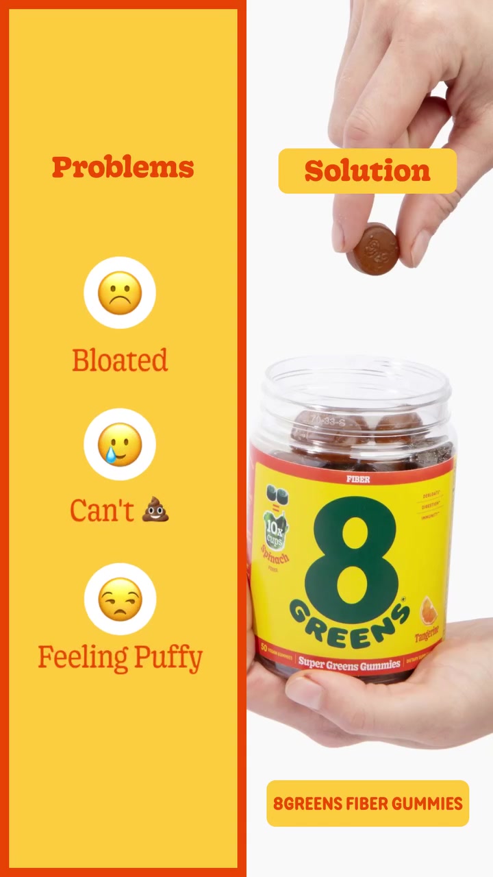
8Greens' ad is only 4 seconds long. A yellow panel lists the problems, and the panel next to it shows a hand dropping a gummy into the jar.

Ad data:
- Running for: 885 days (since June 2024), still active
- Impression rank: #9 of 8Greens' creatives
- Format: Video: split screen, demo
The hook: The on-screen labels "Problems" and "Solution", with no voiceover.
What makes it a good split screen ad: The two panels are the whole script. You read left, look right and you're done, which is why it can be so short.
Steal this: Try a problem and solution split with no footage on one side, just a colored panel and a short list.
2. DESIGNME Hair: a before and after opening for a mousse tutorial
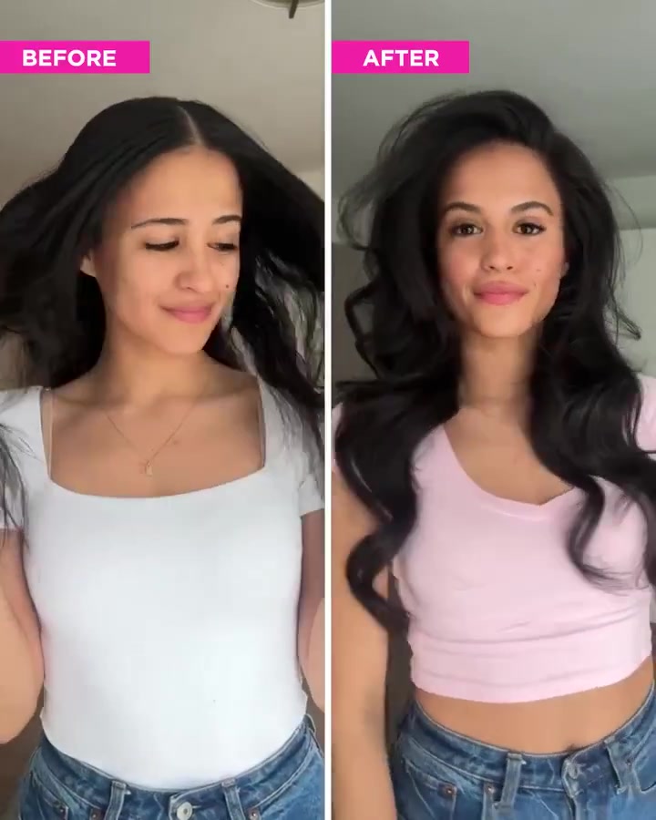
The ad opens on the same woman twice, with flat hair on the left and big hair on the right. Then it cuts to full-screen footage of her applying the product.

Ad data:
- Running for: 668 days (since January 2025), still active
- Impression rank: #20 of DESIGNME Hair's creatives
- Format: Video: split screen opening, demo, before and after
The hook: The BEFORE and AFTER labels over the two panels, with the ad's headline "Major Volume This Way".
What makes it a good split screen ad: It uses the split as a promise. The first seconds show the result, and the 22-second tutorial shows how to get it.
Steal this: Open a how-to on the finished result next to the starting point, then go full screen for the steps.
3. BAIIA: the same swimsuit on two body types
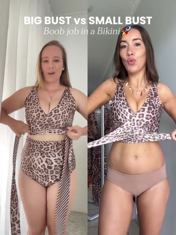
BAIIA holds the split for all 9 seconds. Two women tie the same reversible swimwear at the same time, under the line "BIG BUST vs SMALL BUST".

Ad data:
- Running for: 610 days (since March 2025), still active
- Impression rank: #386 of BAIIA's creatives
- Format: Video: split screen, model try-on
The hook: The on-screen line "BIG BUST vs SMALL BUST".
What makes it a good split screen ad: Nothing is being beaten here. The split answers a fit question that a single model can't: will it work on my body?
Steal this: If buyers ask "will this work for me?", put 2 different customers on screen doing the same thing at the same time.
4. Muravai: "you" against the other guy's shower
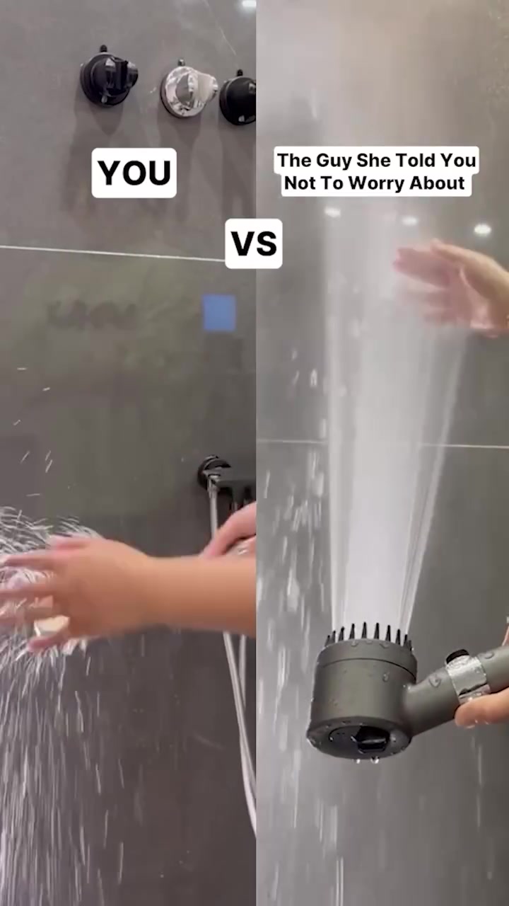
Muravai turns a product comparison into a joke. The left panel is a weak shower labeled YOU. The right is a strong spray labeled "The Guy She Told You Not To Worry About".

Ad data:
- Running for: 550 days (since May 2025), still active
- Impression rank: #78 of Muravai's creatives
- Format: Video: split screen opening, demo
The hook: The labels "YOU" vs "The Guy She Told You Not To Worry About", set to music with no voiceover.
What makes it a good split screen ad: The panels share one shower wall, so the only thing that changes is the spray. After the opening it goes full screen for features like its spray settings.
Steal this: Label your panels with a joke your buyer would send to a friend, not with product names.
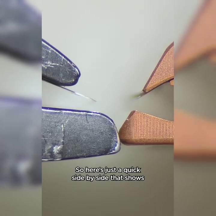
5. Henson Shaving: a side-by-side razor test
Henson's ad is the plainest demo here. Its 30 seconds show 2 razors in matched close-ups while a voiceover explains the difference.

Ad data:
- Running for: 475 days (since July 2025), still active
- Impression rank: #17 of Henson Shaving's creatives
- Format: Video: split screen, demo, us vs them
The hook: "So here's just a quick side-by-side that shows the Henson versus your typical safety razor."
What makes it a good split screen ad: It says what you're about to see, then shows it. The rival is "your typical safety razor", so there's no named competitor to argue with. We also feature Henson in our us vs them ad examples.
Steal this: Say "here's a quick side-by-side" in your first line, so people know exactly what they're watching.
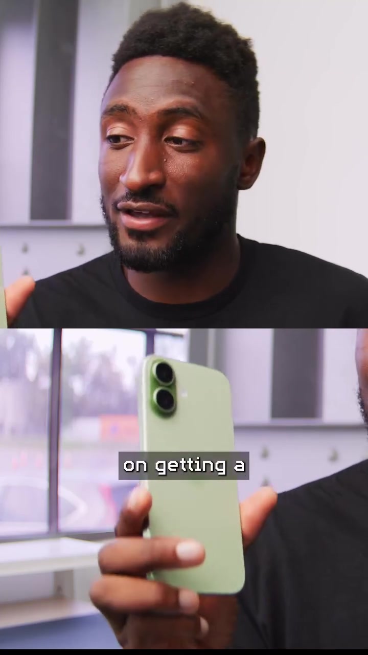
6. dbrand: a creator stacked over the footage
This is the one stacked example in the set. A tech creator sits in the top panel, with a phone in the bottom panel, for the first few seconds of a sponsor read.

Ad data:
- Running for: 408 days (since September 2025), still active
- Impression rank: #425 of dbrand's creatives
- Format: Video: stacked split opening, demo, us vs them
The hook: "If you are actively planning on getting a 17 series iPhone, then you probably also want some protection for it."
What makes it a good split screen ad: The stack gives the viewer a face and a product at once, which suits a tall phone screen. It's a good layout when the person talking matters as much as what they're holding.
Steal this: Stack your creator over product footage for the hook, then cut to full screen when you show the details.
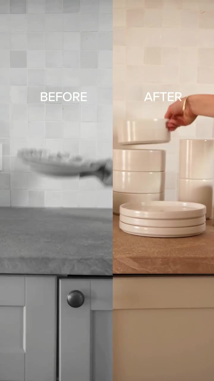
7. Far & Away: a dull kitchen next to a styled one
The ad opens with BEFORE and AFTER on 2 halves of one counter, with old plates on one side and neat stacks of white tableware on the other. Then it goes full screen.

Ad data:
- Running for: 385 days (since October 2025), still active
- Impression rank: #25 of Far & Away's creatives
- Format: Video: split screen opening, demo, before and after
The hook: "Tired of choosing between practical and Instagram-worthy?"
What makes it a good split screen ad: The panels line up to look like one kitchen, so the change feels like a single room being upgraded. The voiceover then covers what the picture can't show, like chip resistance and being dishwasher safe.
Steal this: Line up the background across both panels so the dividing line feels like a before and after in one place.
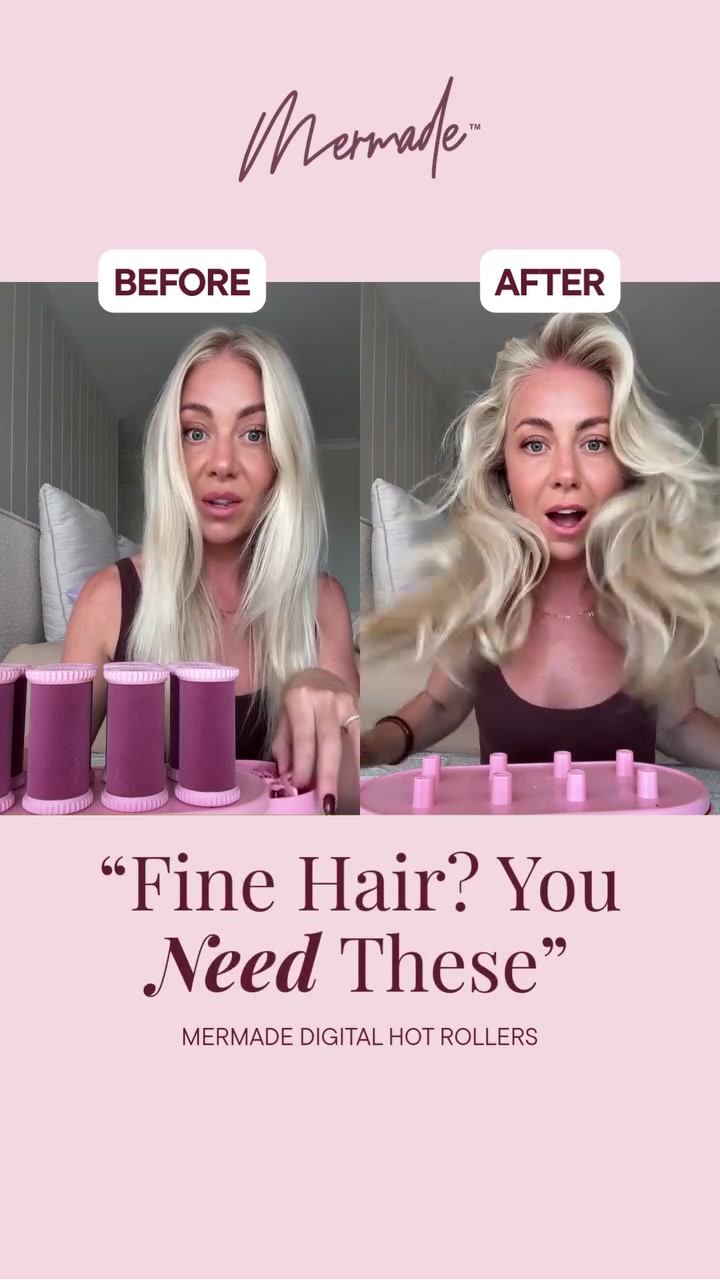
8. Mermade Hair: 5 seconds and one line of copy
Mermade's ad puts a 2-panel clip between its logo and one line of copy. Both panels show the same woman, before and after using the rollers.

Ad data:
- Running for: 275 days (since February 2026), still active
- Impression rank: #66 of Mermade Hair's creatives
- Format: Video: split screen, demo, before and after
The hook: The line under the panels: "Fine Hair? You Need These".
What makes it a good split screen ad: The headline calls out the buyer and the panels supply the proof. Framing the split inside a colored background also makes it look like a designed static that happens to move.
Steal this: Take a before and after static that's working and replace the 2 photos with 2 short clips.
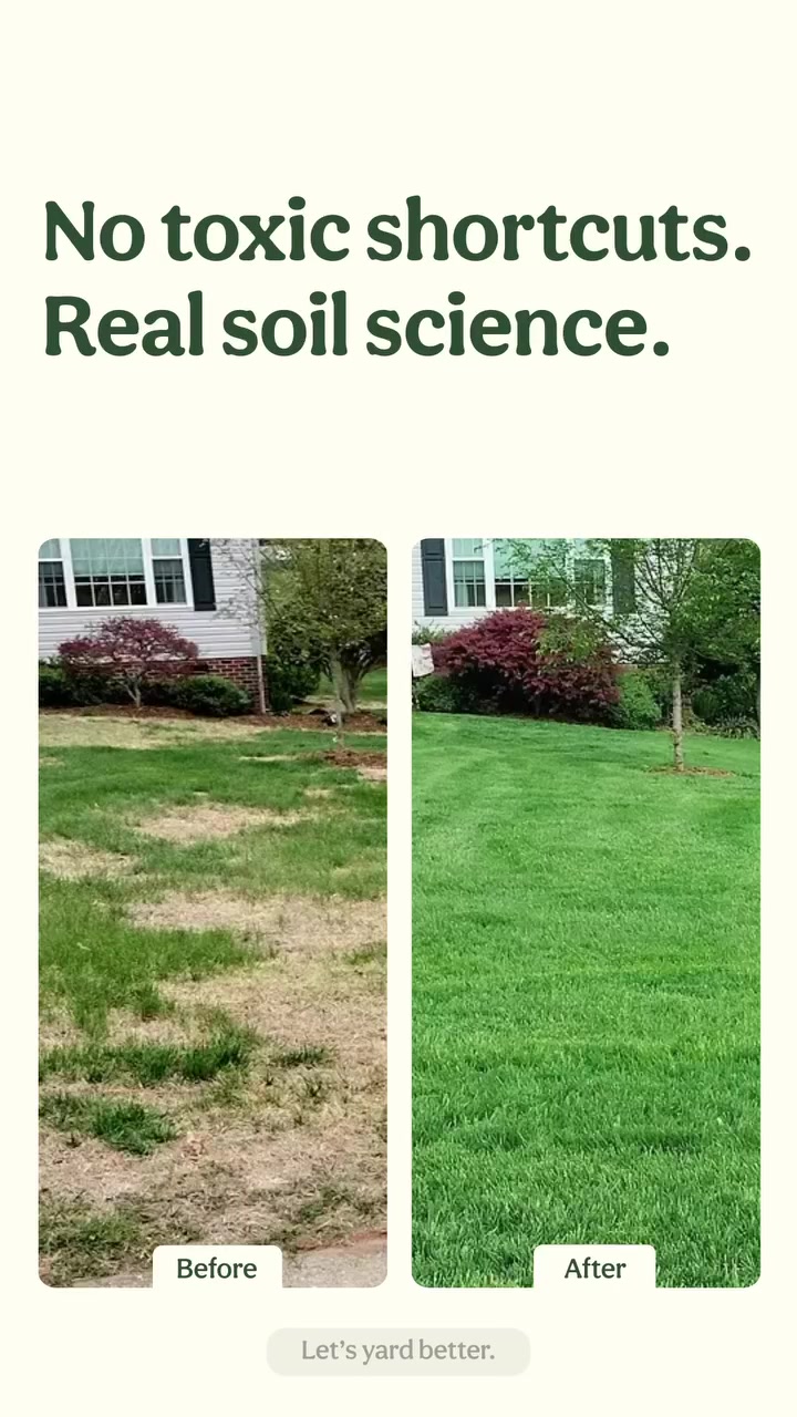
9. Sunday: 2 lawns for a whole 12 seconds
Sunday's ad barely moves. A headline sits above 2 lawn panels labeled Before and After, and that layout holds for all 12 seconds.

Ad data:
- Running for: 244 days (since March 2026), still active
- Impression rank: #8 of Sunday's creatives
- Format: Video: split screen, before and after
The hook: The headline "No toxic shortcuts. Real soil science."
What makes it a good split screen ad: Brown next to green needs no explanation, so the headline can sell the method instead of the result. It's the highest-ranked example in this set within its own brand's account.
Steal this: If the result is obvious in the image, use your headline for the reason to believe, not to describe the picture.
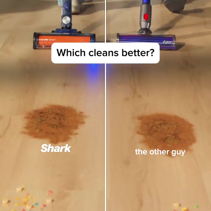
10. Shark Home: the same mess, 2 vacuums
Shark runs its PowerDetect vacuum next to "the other guy" over matching spills on one wood floor, and holds the split for all 10 seconds.

Ad data:
- Running for: 205 days (since April 2026), still active
- Impression rank: #59 of Shark Home's creatives
- Format: Video: split screen, demo, us vs them
The hook: The on-screen question "Which cleans better?"
What makes it a good split screen ad: Starting with a question turns the ad into a race you want to see finish. The mess, the floor and the angle all match, which makes the test feel fair. This creative is live in 120 ads.
Steal this: Ask a question in the first frame and let the 2 panels answer it.
How to make a split screen ad: step by step
Step 1: Choose what the split is for
Pick one job: a product test, a before and after, a fit comparison or a creator over footage. Each one needs different shots. If you can't say what the viewer should compare in one sentence, the layout won't save it.
Step 2: Film both shots the same way
Use the same angle, distance, light and background on both sides. Muravai's panels share one shower wall and Shark's share one floor. Lock your phone on a tripod and mark where the product goes, so only one thing changes.
Step 3: Make the difference visible in the first second
Start the clip where the gap is already showing, or will within a beat. Half a lawn, a thin spray or a half-cleaned spill all work. Don't spend the opening on a slow setup.
Step 4: Build the layout
Any editor with a layout or overlay tool works, including CapCut and Premiere Pro. Put the panels on a vertical canvas, side by side or stacked. Use a thin, clean line between them. Crop so the subject sits in the middle of each panel, because each one is now half as wide.
Step 5: Add short labels
One or two words on each panel is enough: BEFORE and AFTER, Shark and "the other guy". Keep them away from the top and bottom edges, where Reels and Stories put their own buttons, and check them at phone size.
Step 6: Decide how long to hold the split
Hold it for the whole video if the comparison is the entire message, as Shark and Sunday do. Cut to full screen if you need to show features or a how-to, as DESIGNME and Far & Away do.
Step 7: Test it against a single-shot version
Run it next to the same idea with no split, and compare hook rate. Then check how long your own winners stay live, and look at what your category is keeping live too. You can use our ad hook examples for opening lines to try over the split.
Split screen ad template
Copy this and fill in the brackets.
SPLIT SCREEN AD TEMPLATE (10 to 15 seconds, 9:16)

Left panel:   [your product / the after shot]
Right panel:  [the alternative / the before shot]
Keep the same: [angle, floor or wall, light, scale]

0-1s    Both panels on screen. The difference is already visible.
        Top label: [a question or joke, e.g. "Which cleans better?"]
        Panel labels: [BEFORE / AFTER, or brand / "the other guy"]

1-5s    The test plays out on both sides at the same time.
        Optional voiceover: "Here's a quick side-by-side."

5-10s   The result is clear. Hold on it for a beat.
        Caption: [one short line on why, e.g. the method or material]

10-15s  Product shot, full screen or in the winning panel.
        Offer or call to action: [one line]
For a creator over footage, stack the panels instead: creator on top, product on the bottom, and cut to full screen after the hook.
Common mistakes
- Mismatched shots. Different angles or light make the comparison look staged, and viewers notice. If one side looks rigged, the whole ad loses credibility.
- Two ideas, one screen. If the panels aren't being compared, the eye doesn't know where to go. Two unrelated clips side by side is just a busy video.
- Subjects cropped by the split. Each panel is half as wide as the screen. Film with that in mind instead of squeezing a wide shot in later.
- Labels in the wrong place. Text at the very top or bottom can get covered by the app's own interface. Keep it in the middle band.
- Claims you can't back up. A side-by-side test with "the other guy" is still a comparison claim. Run a real test on real products, and keep the footage.
- A slow start. A split that takes 5 seconds to show a difference has given up its main advantage.
Find split screen ad examples with Adspo
The Meta Ad Library can't filter by format, so finding split screen ads means scrolling through a lot of brands (here's how to use the Facebook Ad Library if you're starting there). Adspo tags creatives by visual format, which gets you most of the way there.
 Adspo's Discover feed with a Visual format filter applied, here set to Talking Head with active ads sorted by longest running, showing runtime badges of 735, 623, 586, 559 and 552 days
There's no split screen tag, because it's a layout and not a creative style. In the Adspo Discover feed, add a Visual format filter and pick Us vs Them or Before & After. The screenshot above shows the same filter set to another format. Sort by longest running and scan for two-panel thumbnails. Every ad shows its runtime, its impression rank in the brand's account and where it sends traffic.
Adspo costs $29 a month, or $19 a month billed yearly, with a 7-day free trial.
Frequently asked questions
What is split screen advertising?
On social media, split screen advertising means a video ad that shows two shots in one frame, usually side by side, so the viewer can compare them. On TV, it usually means something different: the ad shares the screen with the show, so viewers don't leave the program during the break.
What is split screen advertising on TV?
It's an ad shown next to the program, with the show shrunk to one part of the screen. Fox has tried it during American Idol breaks, and TripleLift sells a Split Screen product for connected TV. The rest of this post covers the social version, where both halves of the screen belong to the ad.
How do you make a split screen ad?
Film both shots with the same framing, then place them side by side in any video editor with a layout or overlay tool, such as CapCut or Premiere Pro. Add a short label to each side, keep the dividing line clean and make sure the difference is visible in the first second. This post has a full template.
How long should a split screen ad be?
The 10 examples here run from 4 to 30 seconds, with a median of 14. The 4 that only open on a split then cut to full-screen footage run from 16 to 30 seconds. The ones that hold the split for the whole video run from 4 to 30 seconds, and 5 of those 6 are 12 seconds or less.
Is a split screen ad the same as a before and after ad?
No. Split screen is a layout, and before and after is an idea. You can show a before and after one shot at a time, and you can use a split screen for things that aren't before and after, like a side-by-side product test. 4 of the 10 examples here are both.
Where can I find split screen ad examples?
Adspo has no split screen tag because it's a layout, not a creative style. Filter Discover to Us vs Them or Before & After, sort by longest running, and scan the grid for two-panel thumbnails. That's how we found the 10 examples in this post.
Wrapping it up
A split screen ad shows two shots at once, so the difference lands before anyone has to remember anything. The 10 examples above have run for a median of about 441 days, and half of them are 14 seconds or less. Pick one comparison, film both sides the same way and show the gap in the first second.
Try Adspo free for 7 days and filter to Us vs Them or Before & After to see what your category is running.